Roast My Website
Hello, Ive recently started my own Graphic Design agency, and Im looking for some feedback on my website. How it looks, functions etc. Im still waiting for google to index it so Ive included the link.
Any feedback would be great, thank you

Nice work getting this live. Quick conversion wins for a design agency site: (1) lead with one clear niche outcome in the hero, (2) put 2–3 strongest portfolio proofs above the first CTA, and (3) switch CTA to a low-friction first step (e.g., “Get 3 homepage ideas”) instead of a generic contact ask. That usually lifts replies fast. If useful, I can do a practical $1 teardown with exact copy/layout edits you can ship today: https://roastmysite.io/go.php?src=ih_roastwebsite_gdagency_20260330_1155_hv
I think you need to fix the slow loading website, or else you might hit a hard bounce rate. Peace
ah is it that bad. maybe its all the parallax action going on, I'll definitely investigate, thanks for your feedback. Peace
Personally, way too much black space in between sections.
Thanks for your feedback. I get you, I purposely left it like that though, I didn't want people getting caught up whilst flowing down the page. I might add some descriptive text here and there to break it up a bit.
I would add your work on the landing page.
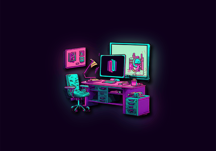
People might think that you only specialize in making neon graphics.
Hey, thanks for that. Ive recently added some previous work to my home page, and a button to take them straight to it.
Two easy fixes / recommendations:
Use consistent capitalization for your header menu options - every menu option aside from "previous work" is capitalized.
The subscriptions section is way too small - it's hard to read what each tier includes. You also have the pixel real estate to expand that section.
Thankyou, im getting straight onto that capitalisation , should never of slipped through to be fair. And you're right the subscriptions part is way too small, its not bad on a big monitor , but yeh on a mobile its a struggle to see. I,ll be rectifying this today, thanks for your feedback.
From a first glance, my recommendation is that the home page should actually show graphic designs you've completed. Looking at your home page, the only example I have is your home page. I have no idea of the breadth of your capabilities, and seeing options immediately would help. Otherwise, it feels like the only option I have is something similar to your home page. I'm a believer in WYSIWYG in a lot of ways, and here, what I see is your site, and nothing else. Users never want to have to find things that are important - they want to be shown.
And a small nitpick - I was momentarily slightly confused where I was - I would keep the banner visible rather than hiding it.
Hey thanks for your imput. Im currently making my previous work accessible from my homepage, because you was right, it was a bit " look at my pretty website".
Now it should function a lot better, thankyou.