Roast my website
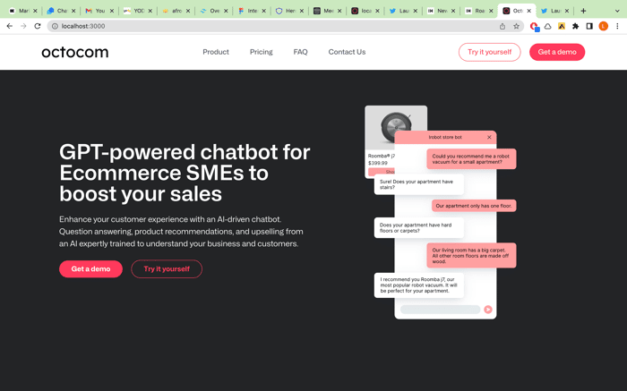
We just launched our MVP and it would be great if somebody could tell us how to improve our website.
- Is it clear what is our product?
- Is it okay that we link the "get a demo" button straight to Calendly?
- Any suggestions how we could improve it?

Hi.
I'm trying to develop a startup - design as a service. I've been designing applications for 20 years, so let me comment on your website.
Pros.
First of all, your page looks clean and modern; however, there is no "wow effect." Don't worry, it isn't necessary for an MVP.
Cons
Your hero section is technology oriented instead of user oriented.
"GPT-powered chatbot for Ecommerce SMEs" is quite heavy. I would prefer something like - "Our bot will speak with your clients for you"
I would expose integration part- which shops can you integrate with?
Your technology is hidden behind a wall. I don't have an opportunity to validate your product
Thanks!
There's a lot of text, you could probably simplify the first image by just showing blocks of colorful tech - replicating what most tech products do. Maybe a reduction in text of the the first paragraph too.
I'd perhaps change the wording to 'book a demo' to make it more clear.
Maybe changing the angle of the images so that the demo's aren't competing with the blocks of text next to them.
Just my 2 cents, good luck!
Thank you for the feedback!