Roast the crap out of my landing page 🚀
Hi Indie Hackers, I recently finished even more updates. If you didn't know, im building a bug reporting and user feedback service called Obeatow. It adds a little widget inside your site dashboard for users to submit feedback and find help resources easily. Just roast my site https://obeatow.com. and dont worry about reading before "IMPORTANT" if you dont want to.
Also, we plan on launching an app for Intercom letting you have the same functionality inside your Intercom chat for those of you who pay extra for Intercom. Its already built, just awaiting approval from Intercom.
IMPORTANT!!
Using ruttl or other service for roasting? dont forget https:// in front of url to ensure the link works.

I'm sipping my morning coffee and having a look at your landing page.
The logo looks odd and cheap. It reminds me of an old Nintendo controller.
The screenshot of your product looks low quality and the product itself shown in the screenshot looks unpolished, lacking any color.
In the "Start figuring out what to do next" area your logo looks even more pixelated and cheap.
I think the website and the product looks like they need a lot of polishing. I would perhaps start by expanding the text content on the website a bit, now most texts are just one line of text, and possibly adding some high quality icons to the site and product.
Hi @jv16, when you say cheap, you mean pixelated or what? I could see the biiger one over next to the Zapier logo looking a bit cheap as it is pixelated. Also how are the screenshots low quality? And you also mentioned something about the product its self looking unpolished. Well, I went for a simple look as every successful company is going simple for good reason. I looked at some landing pages I got of https://landingfolio.com for some ideas.
Pixelated and overall like something that came from "hottest free clip art" CD-ROM from 1998.
For example, the three colorful circles in the top left corner look horribly pixelated.
https://ybug.io/ seems to be one of your competitors. If you go their website and see the screenshot of their product, that look good quality.
I'm all for simple and minimal myself, but there is a line between simple and unpolished. For me, your product looks very more unpolished than minimal.
For example, there are literally zero colors and no icons in your app (as far as I can see from the screenshots). Again, if you compare with ybug.io, that's very simple too, but they use colors and icons to make the user experience enjoyable.
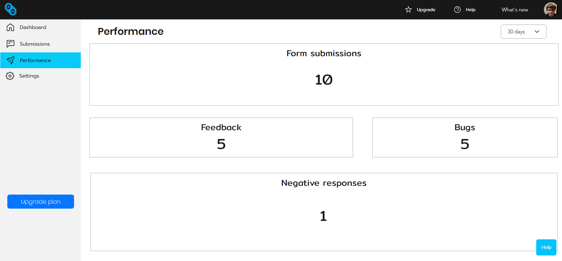
I cropped out the rest of the interface on the screenshots to focus on that specific feature more and now its looking like that was a bad idea as the actual interface looks like this:
As far as the logo goes, its suppost to represent data going in and out but I had no idea how to represent it in a simple way so I made this logo that kind of represents it, but not really.
Sounds like the problem might be that you are trying to design a logo when you are not a designer. You should consider investing into a designer who could design a logo for you.
The screenshot without the cropping does look better, but it's still a bit dull visually, only using shades of blue and the icons in the navigation bar on the left being all black. This is better than before, but it could still be a lot better, too.
Another thing is the screenshot is currently showing massive amounts of empty space. The main content area saying "form submissions: 10" etc could be shown with less than half of the space it now uses, if you'd trim down all that empty space. Ideally, a dashboard view like this should display the data visually, such as with charts. If this is a web app, ChartsJS would be a good place to start.
Hi, I've used Google Charts before back a while ago before I decided the chart thing was unessesary and busy looking. And I see where your coming from with the white space. I did that on purpose so I wasnt throwing a bunch of unessesary stuff at them.
Btw, just updated screenshots on landing page.
Alternatively, it might be better conveyed through a video than a screenshot.
"Trusted by some of the leading companies" should have far bigger text.
"Generate leads" image is very simple and low quality. I would use flaticon.co for your icons, you can then arrange them in canva for more complex shapes.
Image to text ratio is also too large. Shrink the images or increase the text. I would suggest first one.
Same criticism for "configure the widget with ease".
White space is too large. I would reduce the margin between each of the sections, especially the one under "configure the widget with ease".
"View bugs and feedback from your users" image should be the same color as the background, and the same criticism from above applies here as well. Overall, I think the last few images in this section can be reduced and condensed into one short video, which would give a good overview of the app.
"Start figuring out what to do next" is very low quality and I can clearly see it's a screenshot. It would also be more useful to show that iw could be integrated with almost any tool. For example, a whole gallery of screenshots showing it working in slack, hubspot, zapier, etc. And I would not use the tagline "start figuring out what to do next". Instead, state "integrate with any app".
On the integration screen, the Zapier inegration and Webhook integration images do not load.
Overall, I think there's lots of improvements to be made.
Speaking of roasting, I will be releasing my website soon and would love your feedback. FYI, I'm creating an AI API that allows devs easily build AI apps. I post a lot of it on Twitter and do building in public, so you can see it and follow here: https://twitter.com/therealetch
You can also find it here: https://www.indiehackers.com/product/evoke
Good luck on your product and congrats on your launch!
Hi @RichardGao, Just updated screenshots. as far as other feedback, I'm already aware of seven and eight, just been busy doing updates to Obeatow dashboard. As far as screenshot being same color as background, why that? And you say same critism about that if you refering to @SnowOwl s very bland statement that makes zero since.
The reason why the screenshots should be the same color as the background is because it they'd blend in with the website better, otherwise, they stand out and make your design look inconsistent.
Well then the color is the same now if you looked at new version ive released
https://obeatow.com
Much better now!
Seems like a solid start, it's pretty clean and punchy.
The large image just below the main message is a bit big and unwieldy.
Also the supporting text under tagline sounds pretty similar the the tagline itself. Maybe explaining who the user is (a mobile app developer, a web developer, etc.) might give you some more context to write about?
Hi, what about the large image is "big and unwieldy" ? I see landing pages like https://retool.com, https://planzer.io, https://renderform.io, etc. And its not clear what tagline issue you mean.
This comment was deleted 4 years ago
You just gave feedback right? All I was saying is I am unaware of what tagline your referred to. Btw never once said I was offended.
Oh in that case, what I'd call the headline is:
Collect bugs and support your users like never before
And what'd I'd call the tagline is:
Start finding bugs, gathering user feedback, and supporting your users all from one widget.
The two are a bit similar--the main add'l piece of info I gleaned from the tagline compared to the headline is that it's coming from a widget.
Re: the unwieldy-ness of the image, because the UI screenshot has a lot of whitespace, it blends in with the background of the landing page a lot.
Some ideas to distinguish the image from the background would be:
Hope this helps! Most of the rest of the site is clear and concise