SaaS designs comparison
Hi, SaaS makers!
I did some research once in Figma and created a comparison table with the screens of different SaaS services.
Last week I noticed that this file is still read and copied regularly after two years. I decided to add new services and additional value to this study.
Soon I will prepare a comparison of landing page changes - how companies have shifted focus and changed style since then.
In the last weekly update of SaaS landing page research (Pandadoc and Zendesk), I mentioned two patterns:
-
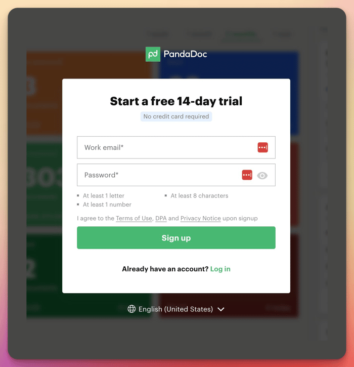
Sign up = free trial. When you click the button, you go directly into the product and see the blurry dashboard below the pop-up window. You feel like you can touch the product directly and are ready to fill out a form to unlock the content.
-
Adding reviews to features. Each feature has its own purpose and not all of them are useful for you. That's why it's important that you see the feature and the reviews/results of using that particular feature.
What other trends do you see in SaaS designs?
Check more here: https://www.figma.com/community/file/1015951208919546942/UI-Examples-of-landing-pages-SaaS-services
