See changes at a glance - improved comparison values are live in Betterlytics
Hey IH, here’s what we added in the latest Betterlytics release. This time, we focused on giving users more context, not just numbers.
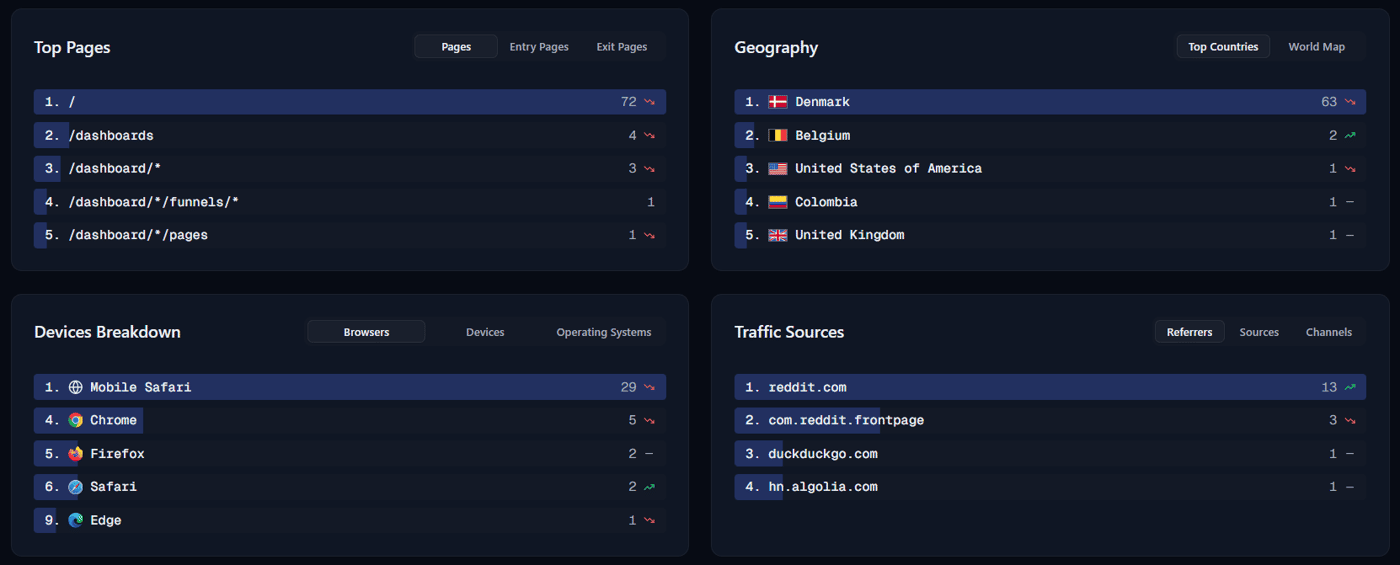
Previously, our dashboard primarily showed raw metrics, but interpreting trends or spotting changes quickly was harder than it needed to be. Now, most pages in the dashboard display comparison values, you can instantly see how your metrics changed over time, whether it’s an increase, decrease, or subtle shift.
Here’s what’s new:
Comparison values next to raw numbers (percentage change or delta)
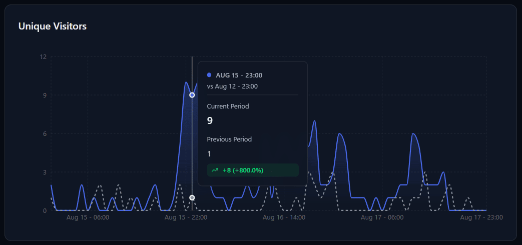
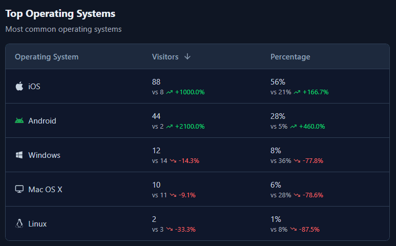
Visual cues to spot trends at a glance:
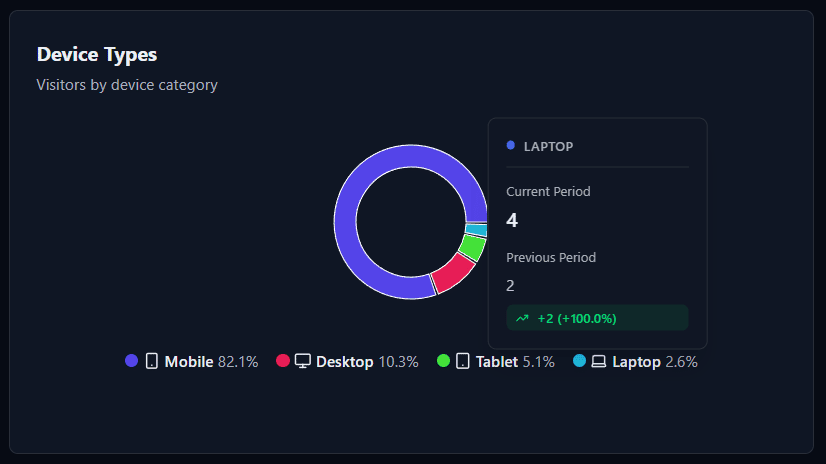
Hover-tooltips for charts & diagrams showing comparison values:
Why it matters:
Numbers alone don’t tell the whole story. Comparison values make decision-making faster and easier: you can immediately understand traffic trends, spot anomalies, and take action without digging through multiple reports.
We also rolled out world-map updates (as teased in our previous post) to make geographical insights clearer. Behind the scenes, we optimized our infrastructure for faster performance. Most of this isn’t visible, but it keeps the app smooth as we scale, and paves the way for some exciting new features for the world map.
We’re excited to see how you use comparison values to make sense of your data! If you try it out, we’d love your feedback — it helps us improve. Betterlytics is open source:
Website | GitHub


This is such an important point. Vanity metrics are one of the biggest traps founders fall into. I see the same thing with financial dashboards — revenue looks great on the surface but when you dig into cash flow and burn rate the real story is completely different. The numbers that matter are rarely the ones that look exciting on a graph.