ShadCN Checkbox Components to Improve Your UI
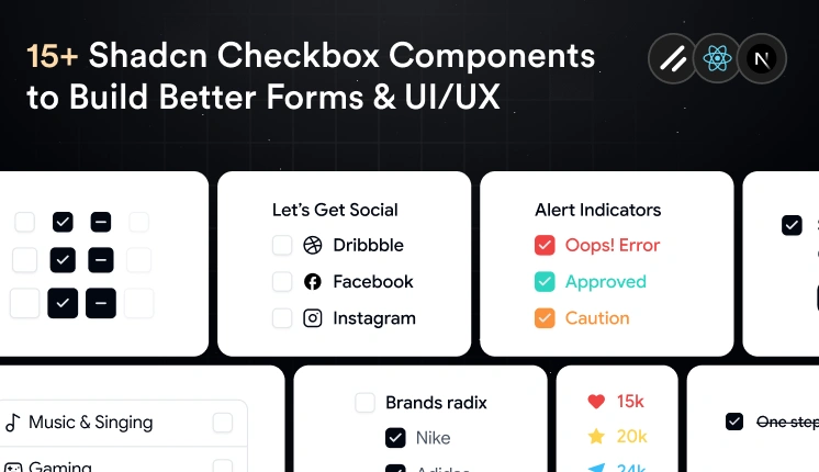
Checkboxes are a simple UI component, but they have a big impact on usability.
They make it easy for users to select options, complete forms, and manage settings without extra effort.
A good checkbox should be easy to see, easy to use with a keyboard, and easy to change for different needs. Since Shadcn uses React, Tailwind CSS, Base UI and Radix UI, you can build checkbox styles without starting from zero.
In this collection, we picked useful Shadcn Checkbox components for React and Next.js projects.
From simple checkboxes to tree views and avatar selection, these components can save time and keep your UI clean.
Why Developers Choose Checkbox Components
Shadcn Checkbox components are more than simple form controls.
They are built to be easy to use, easy to style, and easy to fit into different react projects.
Some of the biggest advantages include:
Built with React and Tailwind CSS
Based on Radix UI parts that work well with keyboard and screen readers
Easy to change with Tailwind classes
Works with different React state setups
Fits well with React Hook Form and Zod
Good for Next.js apps
Light and ready for real projects
Whether you’re building a SaaS dashboard, CRM, ecommerce platform, or admin panel, these components can fit into many kinds of projects.
Let’s Explore Shadcn Checkbox Components
To help you save time, we’ve collected useful Shadcn Checkbox examples for React and Next.js. Each one is made for a different use case, so you can pick the right checkbox for your UI.
Default Checked Checkbox
This checkbox component comes selected by default when the page opens. It can help when you want to turn on a recommended option right away, like default settings or optional updates.

It can also reduce extra clicks while still letting users change the choice later.
Selected by default
Easy to manage with React state
Works with forms and settings pages
Supports keyboard use
Easy to style with Tailwind CSS
Best For: Use this component for onboarding flows, default settings, subscription options, and forms where one choice is usually turned on.
Disabled Checkbox
This checkbox component shows an option that users cannot click. It can help when a feature is not available yet, depends on another setting, or is blocked by permissions.
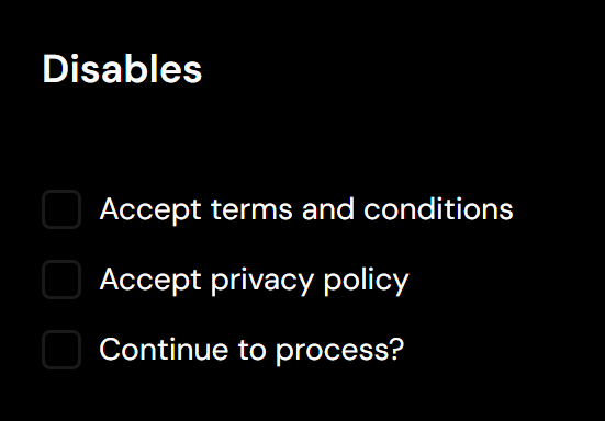
Instead of hiding the option, it shows users that the choice exists but is not ready to use.
Prevents user interaction
Shows unavailable options
Supports disabled styling
Works with permission-based screens
Keeps layouts consistent
Best For: Use this component for admin dashboards, enterprise apps, permission screens, and forms with locked options.

