Shadcn Tooltip Examples for Your Next SaaS Project
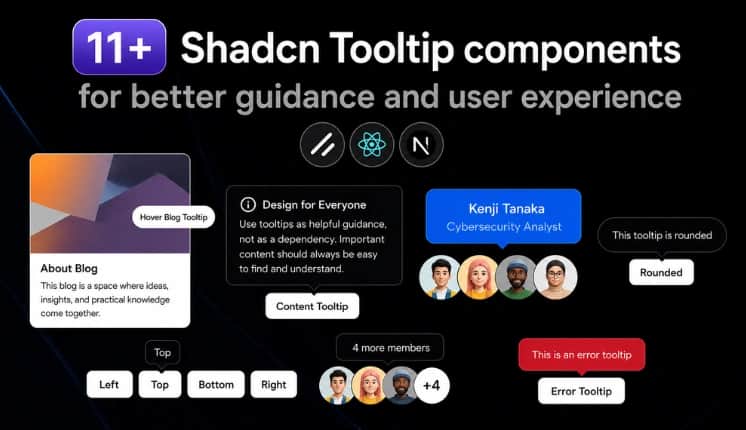
Shadcn Tooltip Examples, Usage, and Best Practices
Tooltips are not designed for every type of message or interaction. They are commonly used for icon buttons, navigation items, keyboard shortcuts, form fields, abbreviations, and other UI elements where users may need a little extra information. Tooltips are a simple way to provide additional context without adding more content to the interface.
Shadcn Tooltip provides a reusable way to add these interactions to React applications while keeping the component easy to customize with Tailwind CSS.
In this guide, you’ll find 11+ practical Shadcn Tooltip examples, different positioning and styling options, accessibility considerations, installation methods, and guidance on when to use a tooltip instead of a popover, dialog, or other UI component.
We’ll also cover advanced examples such as animated tooltips, error tooltips, disabled button tooltips, RTL support, keyboard shortcut tooltips, and lazy-loaded tooltips for interfaces with many tooltip components.
Why use Tooltips in websites & apps?
Tooltips help users understand UI elements without adding permanent text to the interface. They are especially useful when space is limited or when an icon, shortcut, abbreviation, or action needs a short explanation.
Shadcn Tooltips vs Other UI Components
Choosing the right component depends on whether you need brief contextual information, interactive content, or a focused user action.
Use a Tooltip when users only need a quick explanation.
Use a Popover when the content needs interaction or contains more information than a tooltip should display.
Use a Dialog when the user needs to complete a task, confirm an action, or focus on important content.
Use a Toast for temporary feedback such as “Changes saved” or “File copied.”
Use an Alert when the message should remain visible and should not depend on hovering or focusing an element.
How to Install Shadcn Tooltips?
Shadcn Tooltip can be added to a React project using several installation approaches. Developers can choose the method that fits their workflow:
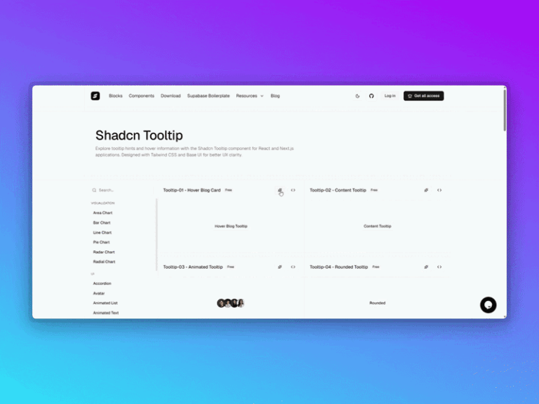
CLI installation: Install all the components below using pnpm, npm, Yarn, or Bun.
Code copy and paste: Add the component source directly to the project.
Copy prompt: Use a prompt-based workflow to generate or add the component.
Shadcn MCP: Use the Shadcn MCP workflow to discover and install the Tooltip component through an AI-assisted development workflow.
Tooltip Anatomy
All these Shadcn Tooltips combine a trigger, content, and provider to create a complete tooltip experience as below:
Tooltip
├── TooltipProvider
└── Tooltip
├── TooltipTrigger
└── TooltipContent
Note: Shadcn Tooltip requires TooltipProvider in the appropriate root layout or component tree before using individual tooltip instances.
Here are the best Shadcn tooltip components
These Shadcn Tooltip examples show different ways developers can use tooltips for contextual information, previews, shortcuts, validation states, navigation, and interactive UI elements. All these examples below cover both common interface patterns and more specialized implementations.
Image card tooltip
An image card tooltip provides a visual preview with supporting information when users hover or focus on an element. It can reveal extra content without requiring users to open a separate page or panel.
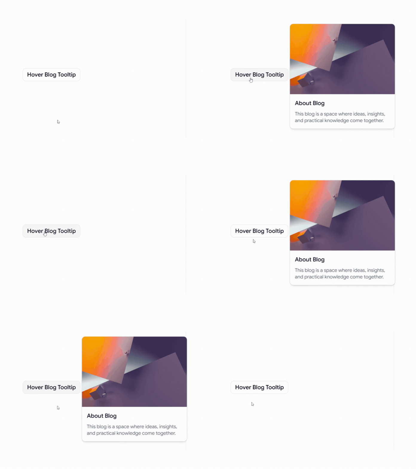
Use cases:
Blog post previews with thumbnails and short descriptions
Product previews with images and basic details
Content discovery in media or editorial interfaces
Portfolio items with additional project information
Best For: Blogs, content platforms, portfolios, and product interfaces.
Content tooltip
A content tooltip displays short explanations or supporting information when users interact with a specific UI element. It works well when additional context is useful but does not need to remain visible.
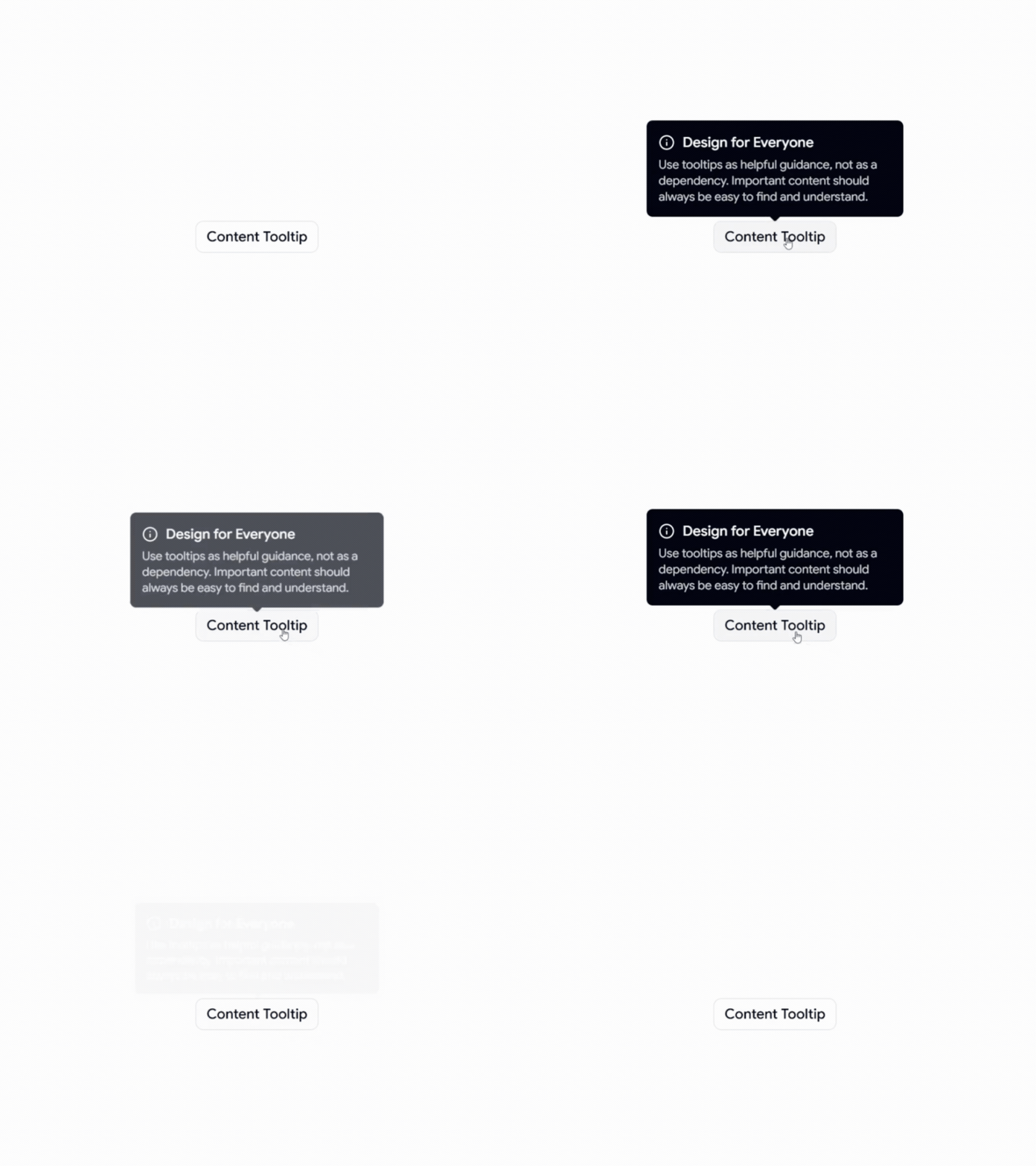
Use cases:
Form field explanations for unfamiliar inputs
Dashboard metrics with additional definitions
Abbreviations and technical terminology
Navigation labels for icon-based interfaces
Best For: SaaS dashboards, forms, admin dashboards, and data-heavy applications.
👉 Read the full Article Here → https://wrappixel.com/blog/shadcn-tooltips

