Share IH: the perfect analytics dashboard
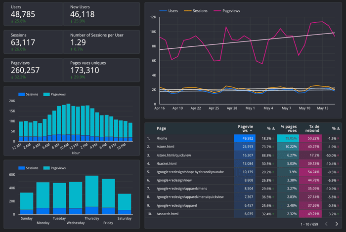
There are things that you postpone forever. But once you end up doing them, these things become an absolute necessity in your routine. It recently happened for me with Google Data Studio dashboards.
In short, Google Data Studio lets you build dashboards with data from a lot of different sources. These include your Analytics, Ads, a spreadsheet, Search console reports, and other wonders.
For many months, I did not feel the urge to build such a dashboard, fearing Data Studio would be complex to set up.
At that time, we did not track our analytics data on a regular basis. Of course, we had a check from time to time, but it was not consistent. Be honest with me, do you track your Search Console report as often as you do with your Google Analytics? It's a pain to have various dashboards to check.
After months of running indie projects, I gathered up my courage to open Data Studio.
At first, I didn't know where to start. The tool is so powerful that you can do pretty much whatever you want. You can for example:
- Retrieve acquisition metrics from Google Analytics
- Display your Ads data in a readable way
- Blend different source of data to combine insights from several tools
- Make pivot tables to segment your data
What I found worth sharing with the IH community is that you can copy dashboards to make your own. That way, you won't have to start from scratch. I am not talking here about copying a dashboard as a whole. You can in fact copy only the charts and tables you want. It will keep the formatting of the query, but will display with your own data, isn't it amazing?
This "Perfect Dashboard" from Louis Cuvelier, a French maker, is worth bookmarking:
https://datastudio.google.com/u/0/reporting/1kTrBbtmViJt7OZJg2BLkCisuRY9Ebgdk/page/YfAOB
To start, you can either copy the full template or take bits of it.
My advice would be for you to define which are the 7 key metrics you need to follow on a daily basis. Then, once you can start tweaking the dashboard. Otherwise, you will lose yourself in all the possibilities offered by the tools.
For example, Louis' dashboard is complete but there are many metrics that we did not care much about. For the one that interested us, we selected the chart, copied it, and pasted it in our own Data Studio. This is where the magic happens! ✨
You can learn how to build dashboards by reverse-engineering the existing ones. Data Studio has a pretty complete gallery of projects you can inspire yourself from.
If you can't access data in a simple manner, you will be able to track it properly. And as the saying goes, if you can't measure it, you can't improve it! If you'd like to learn more about my projects, start with Mailmeteor (https://mailmeteor.com) 🌠

Interesting. For myself I can't stand the idea of having to learn someone's API. GDS is probably the best in the market or perhaps Databox has even more praise. I use my own service at the moment. Like I made a 2 day product and wanted to have a funnel of the users journey across to websites (blog -> product -> product process) and all I had to do was put a
fetch('https://bashboard.io/cpconf/users', {method: 'POST', body: JSON.stringify('0-blog')})to each step (with different strings like '1-landing' and '2-step1'). All I need to know is the URL to POST to and that's it. The charts are available immediately here: https://bashboard.io/cpconf/users. No configuration, no figuring out anything. Bashboard isn't quite as powerful as Databox however, but 90% what people needs is there.Hey, the dashboard looks really nice and I agree as you said, measuring key metrics is important. I didn't know about Data studio but this template intrigued me. I would surely check the template out.