Shipped: ETF-vs-ETF Comparisons (fees, returns, risk & exposures) — fast
Hey Indie Hackers! 👋
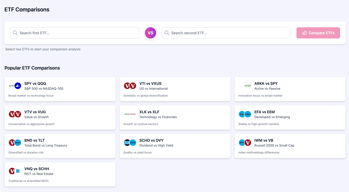
We’ve just shipped a new ETF comparison experience in PinkLion. It lets you line up two funds and answer the real questions quickly: Which one performed better? Which is cheaper? What’s the risk? Where is my money actually invested?
What you can compare (side-by-side)
Performance: YTD, 1-yr, 3-yr, 5-yr, 10-yr (aligned start dates), plus a clean cumulative chart
Risk: rolling volatility, drawdowns, and a simple Sharpe read
Costs & size: expense ratio, AUM, holdings count
Exposure: asset allocation, sector weights, country/region mix
Holdings: top positions to spot overlap before you double-up
Quick demos (popular pairs)
(If you have a favorite pair, drop it below and I’ll spin up the comparison.)
Why I built it
Most “compare” pages are either just two fact sheets or two price charts. That’s not enough to choose a core fund. This tool pulls together returns, risk, costs, and exposures in one pass so you can decide in minutes—not tabs.
What’s next
Holdings overlap score and “what changed” month-to-month
Save/share comparisons
Add more factor lenses (quality, momentum, dividends)
I’d love feedback:
Which comparisons should be one-click presets?
What’s missing for your decision process (tax, tracking error, distribution schedule)?
If you want to try it, ping me with the pair you care about and I’ll post back a live compare. Happy to hear all critiques UI, metrics, data caveats so I can tighten this up. 🙏