“Show, Don’t Tell”- The Secret Of High Converting Landing Page

One of the biggest reasons why many landing pages suck is the lack of clear communication.
You may have CTAs like subscribe, start a free trial, get a demo and many more.
But if your users find it difficult to evaluate what using the product is actually like, they’re less likely to convert.
The challenge?
Products with complex features are difficult to explain without using too much text.
The solution?
“Show, don’t tell.”
Help users visualize the product features or the benefits that users will experience once they sign up.
An example?
Here’s the image used on the home page of Wynter Games (provides message testing services).
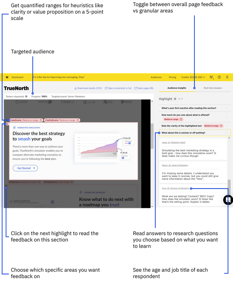
A little bit of context to understand the above example
With Wynter, you can
- “Conduct message testing for website, ad, and email copy.”
- “Test with verified B2B audiences.”
- “Get qualitative insights.”
Since Wynter is unique in its category, it may be a little confusing for users to understand the features and benefits.
So they added visuals that show all the possible features of using their service.
In a nutshell
To get this done for your products, ask yourself:
Is there any way I can show off the features or benefits of my products?
Remember: Don’t just images just for the sake of it. Add visuals only if that helps in clear communication.
Otherwise, it will lead to unnecessary doubts/friction in the visitor’s mind.
Another example from the newsletter Sign Up page of Exploding Topics:

That's it.

Thanks for sharing. Any idea what their conversion rate was? Or generally how much better high-context images do?
I don't have official data to prove the effectiveness. But my point was adding a contextual image improves the communication with the users.
And, in terms of how much, I would advise using images or product demo videos at least for features that are difficult to visualize when described in words.
A great example is the homepage of Notion.so
From my experience, all I can say that I am getting over a 15% conversion rate for newsletter signUps.
Will try it with my clients' sites and track the difference.
Thanks for the appreciation.