Show IH: RetryFix Update: New UI + Google Sign-In Now Live
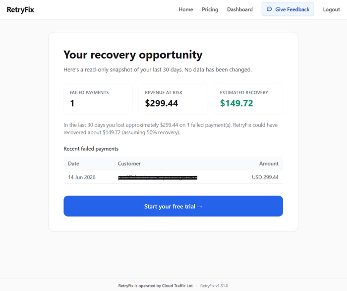
A couple of weeks ago I shared that we were working on a proper UI redesign and moving OAuth from testing into production. Both of those things are now live.
The goal of this release was simple: reduce friction in the first few minutes someone spends with RetryFix. Previously, the landing page felt a bit dated, the signup flow was quite manual, and the overall experience didn’t really reflect the product we’re trying to build.
What changed
-
Completely refreshed Landing experience
The hero, value proposition, and “How it works” sections have been rewritten and redesigned with much tighter visual hierarchy. The dashboard preview is now more prominent, the ROI calculator feels more integrated, and the whole page guides people more clearly toward trying the product. We also added a proper demo section that feels less like an afterthought. -
Google Sign-In on Login and Signup
This was the bigger technical piece. People can now sign up and log in with Google in one click. For a product that deals with Stripe data, removing even a small amount of friction in the first interaction matters. It also signals that we’re moving toward a more polished, production-grade experience. -
Cleaner, more consistent interface across the app
We applied the new design system to the main pages (Landing, Demo, Login, Signup, and key parts of the dashboard). Buttons are consistent, spacing feels more intentional, and the overall product feels more modern and trustworthy. Nothing revolutionary on its own, but the cumulative effect is noticeable. -
Updated legal pages
We also replaced the old minimal Terms page with proper Terms of Service and Privacy Policy. This was required to move Google OAuth out of testing mode, but it also makes the product feel more serious.
Why this matters
For a product like RetryFix, the first impression is everything. People are already skeptical when you ask them to connect their Stripe account. If the landing page and signup flow feel clunky or unprofessional, that skepticism only grows.
By making the initial experience smoother and more modern, we’re trying to reduce the number of people who bounce before they even see what the product can do. Early signals (from the limited preview dashboard and a few conversations) suggest the new flow feels noticeably better, though it’s still early days.
What’s next
We want to keep improving the post-signup experience — particularly the limited preview dashboard and how quickly new users can see value.
We’re moving in smaller, more deliberate increments now rather than big bang releases. The goal is to keep shipping improvements without breaking things for the people already using the tool.
If you’re running a SaaS business on Stripe and losing revenue to failed payments, I’d love for you to try the new flow:
Happy to answer any questions about the changes or the broader journey. What’s been the most impactful UI/onboarding improvement you’ve shipped on your own product?

Hey — saw you just shipped Google Sign-In on RetryFix. Nice timing to mention: I recently found and fixed an OAuth state-validation gap (login CSRF) on a production app — merged fix is on my GitHub, piush365. Happy to do a quick pass on your new auth flow if you want a second set of eyes before it's been live long, results in 48h.
Hey Piush,
thanks for the offer — really appreciate it.
The new Google Sign-In + OAuth flow is fresh, so a second set of eyes would be great.
One thing I am aware of is that it’s not fully registered with Google and my branding does not appear in the google sign on page. It’s under review and hopefully approved soon.
Happy to share the main changes here or in a follow-up comment if that works? Or you can DM on X @retryfix.com
Wahoo!!! I got verified, icon and everything now of my branding on Google signup!!