Show us your pricing page
Show us your pricing page and which pricing models you use.
We are in the process of creating a dedicated pricing page for our site and would love to see how you Indiehackers have done it, as well as what pricing strategies you use.
Feel free to elaborate on what challenges your setup has given you.
Trending on Indie Hackers

We have a very simple pricing. No hidden charges
https://promote.so/pricing
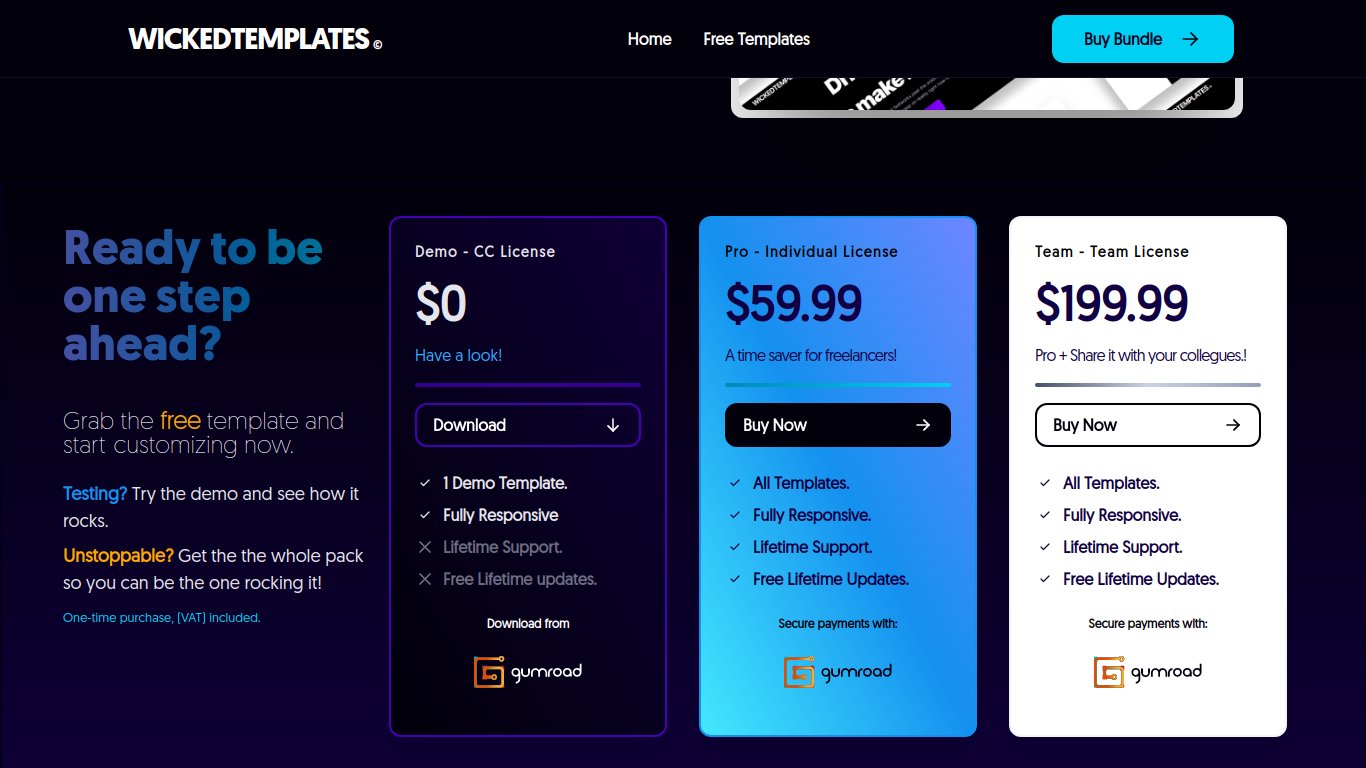
Yours is the best so far!
Thank you
Not working
Amazing. What plugin are you using for the lifetime reserved spots bar?
No plugin. It is a React app
we are currently redesigning our website and pricing page - it's a little busy right now @ https://www.courier.com/pricing
Honestly, I would recommend using clearer (and way less) sign up buttons and prompting for the Goog/GitHub/email option after they click sign up, on a separate page. Those buttons look like your social media links, not registration buttons.
that's great feedback @ezekg - much appreciated. sharing with @courtneychuang who's working on our redesign.
I like the idea and to give the customer as many details as possible. If I have to come up with my honest opinion here, for me it will probably be a bit too much as you write yourself. Maybe it makes sense to group each feature item into 5-10 different subcategories and then have a question mark icon where the customer can learn more about what the categories contain.
hey @dannydouglass @launchbeast @upat5_gustav @Michael_Andreuzza @Harsh21476 @abinaya @onurgenes @oliphant @AmrKafina @cordtech @danhulton - I made a video review of some advice for your PRICING pages all at once!
CLICK >>>

Thank you so much for the feedback. It gave me some real insight on how things should be. Subscribed to your channel.
You are super welcome! and thank you for your support!
@orliesaurus thanks you for this 🙏! this was a great breakdown of the pricing pages, great advice on showing the features and changing the CTA copy.
Glad I could help! Your pricing page was 9/10 just needs a tiny little tweak :D
Hey Orlie, thousands thanks for this.
I have redesigned the whole project just because of that pricing table. I was disgusted. Sorry, I felt just like you mentioned, it was too busy.
Something else, when you made the video, I wasn't ready but I had to deploy anyways. I put the free templates with the paid ones, is easier to maintain.
I will put a link as you said to the free template thanks to a lot man!
Love these videos, please keep going
Hi Mike, I think you've worked so hard in the last couple of months that it's normal sometime you can miss a little thing or so in the process! Keep it up and congrats on your successful PH launch
I won't say no, I am working my arse off actually..a lot.
I want to make it.
Thank you so much man.
Thanks for the feedback. I am glad that you liked the page!
@onurgenes thank you, it was a great example of use of icons and branding elements!
Thank you so much for your feedback. I'll fix the pricing page in a few days. 💯
I am glad I could highlight some improvements! Thank you for your amazing work on remoteleaf
Thanks a lot for your feedback! It was great seeing your live reaction to my page when you don't have any background on what the service offered is – helps put in perspective what new users might think when they first land on the page.
I guess I have some work to do!
Thanks! I'll be honest and say that indeed not having the full picture sometimes it makes my "work" harder, so take my feedback with a big grain of salt :D
@orliesaurus very cool - lot of great observations in that clip on our pricing page! thanks for the feedback.
@dannydouglass - cheers! I appreciate you taking the time to checking it out!
For now, we primarily operate with a straightforward model, but we’re exploring tiered pricing based on the complexity of applications, such as renewals and first-time applicants. One of our biggest challenges is balancing affordability with the operational costs of providing seamless and efficient services.
Looking forward to seeing how others tackle their pricing pages and strategies!
https://www.tabextend.com/pricing
very clean! dig the micro-animations.
I am actually reworking it!
this is before:
and this is now that it will deploy probably tonigh.
much simpler. However, I personally like price cards :-)
yeah, is much simpler. I like cards too, but I have been staring at it and now I redesigning the whole thing....just because a pricing card...
You know what. The more I look at the new design the better I think it look and do the job
Right? I think si too busy the other one...
We only have one option at Juicebox, so we went with this:
Because our pricing is based on number of employees, we built our page to have a sliding widget that is auto connected to our pricing database on our back end. We also auto detect the visitor's local currency (or default to USD if we can't) and give them the option of monthly or annual pricing.
https://www.hrpartner.io/pricing.html
Personally, I hate it when you click 'annual' on most sites and it just shows you the reduced monthly price and forces you to do the x 12 maths yourself, so we tried to show all our cards on the table with our page (without confusing the user too much).
Nicely done. Like all the small UX details that just make it easy to use and understand. Well done
We just built this. It's a work in progress: https://www.cartfuel.io/pricing
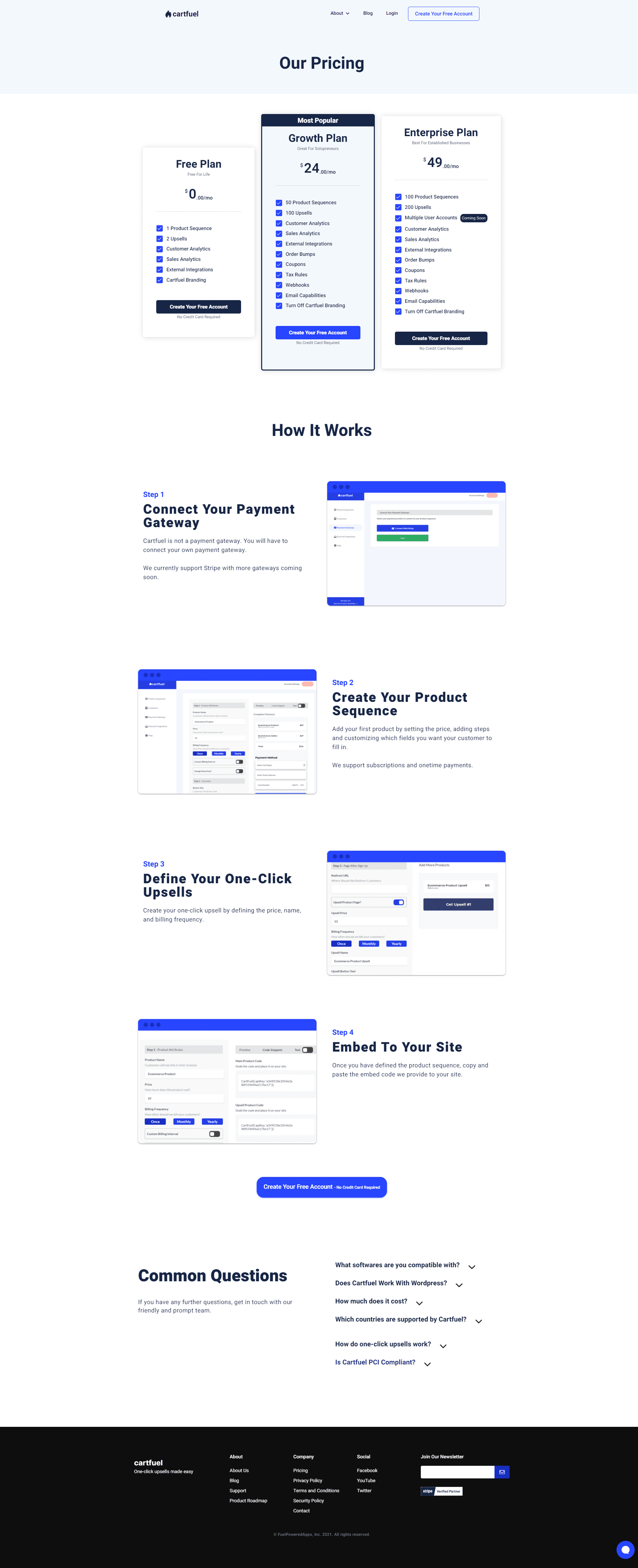
Thanks for sharing. I like that you have included "How it works" on your pricing page, it makes good sense that you can just get an extra take on how it works before deciding which plan to choose.
Yah of course. Yeah the how it works section below does exactly that. Helps persuade them a bit more just in case they weren't decided yet.
I'm in the middle of reworking the website in general, and the pricing page is definitely on the list. Would love some feedback:
Direct link: Nodewood Pricing
I think the CTAs are pretty good and highlight the difference between the two levels, but that is the only difference between the two levels, so it kind of feels like the rest of the list is just fluff, because it's the same for both. I've seen this used before, so that you can verify that no matter which plan you pick, you ensure you get the features you need, but there might also be other, better ways to represent this.
I actually think the site gets the job done. Simple, visually nice, there are not many things to consider in terms of features. Either one or unlimited projects and that's it.
If it were me it would leave the pricing page as it is. Great work
Here you go https://remoteleaf.com/pricing
Mine is a complete mess as of now at backgroundcut.co. Gotta rework it.
I love it. Super simple and easy. Do the job well. The only thing that wonders me is why not just make jumps from where the price changes, could imagine it is difficult for you to keep track of each individual unit in terms of payment provider and invoicing?
https://wakeque.com/pricing - We have a early and monthly toggle bar but only two pricing plans.
sometimes simple is the best
https://workspace.google.com/marketplace/app/foxy_labels_label_maker_for_avery_co/534005213458
I love your design @jaythecreator great visuals!
Thanks! We are in the process to change some designs for the front page and feature page so it will be more aligned. This is also where the pricing page will get its core design frame from.
Here is our pricing page for Payload.
https://payloadcms.com/pricing
It is a graphically beautiful site, but insanely unmanageable. It will make sense for a fashion magazine, but think for developers who often want information quickly and easily will find this page difficult to navigate. The actual price page is fairly easy to understand but still for me, a little too bombastic.
Of course, that's just my personal opinion, your users might disagree. But thank you for sharing your page!
We just deployed new pricing - https://www.liveagent.com/pricing/
Any thoughts? We tried to make it as specific as possible
The first thing that comes to my mind is a beautifully executed pricing page with appropriate information. When I start scrolling down I think holy cow too much information which makes it unmanageable for me to actually make a decision. On the other hand, I can see that you have tried to separate it, so if you want more info then there is also the possibility of it. However, just an unmanageable amount of info.
Maybe it will make more sense to only show the points where there is actually a difference between the plans. Almost all integrations are included in all plans, so why not just show them where there is a difference, which will clarify the difference more.
Thanks for the tip and appreciate the time! I have suggested to have a toggle button to just show differences!
https://www.themusicase.com/license-agreement/
https://minecraft-playdates.com/pricing.html
Simple and straightforward. Just launched, prices themselves most likely need tuning.
www.tryroamer.com/plans
You can check it out on the home page of https://threadmaker.co 🧵
Oh god mine's so basic compared to everyone else's 🙈
https://getsets.net/pricing
It is super simple but it gets the job done. The only thing I miss on your pricing page is a little more information about what every single feature means and gives of value, as otherwise, it will be difficult for me to see the difference in the value I get by choosing the ecosystem solution for example.
Yes, looking at it with fresh eyes I think I need to expand on a couple of points. Thanks!
I like the page's design, but not entirely whether the copy is good enough:
https://postmake.io/submit
https://www.fundstory.com/pricing
Curious to hear what people think.. Have iterated over this quite a bit. Anything that's unclear?
@ https://cord.tech/pricing
There's no pricing though...like Free to ..form...to a phone call? Is it because you haven't figured out a base pricing first?
We are debating whether to put something on there, its a very scattered market and use cases are still very early ... so we are trying to figure out whether to do it or not.
I'd say to make your pricing page super simple then
A) Label data for FREE & all the details
B) Call us to discuss YOUR enterprise-y needs and see if this tool is right for you
Got it. Thanks for those suggestions @orliesaurus, that's very helpful!
https://cleavr.io/pricing
I think it's a bit vanilla right now as we only have the one option.
But, I did make an update yesterday to add a testimonial. I wasn't planning on adding the testimonial originally to the pricing page, but once I saw it, it was too boss not to have on the pricing page.
I also checked out usage stats - our website might as well only be the home page and the pricing page as the numbers for those dwarf the number three page by a factor of 3 to 10.
https://www.highlyanalytics.com/
With MightyForms it's Freemium: Free plan, 3 tiers of paid plans that can be paid annually or monthly.
https://www.mightyforms.com/pricing
We've also adopted a Custom Plan choice. No matter how flexible a form builder, most entrepreneurs need something custom that will best fit their business, so we have that door open as well.
https://sparkyspot.com/pricing
We are about to test things during beta, so it's free)
Very clear and nice pricing page. What is your incentive not to show your prices for "Pro" and "Team"?
https://www.diecuttemplates.com/pricing
Very basic and I'll probably rework it when I increase the prices and optimize by highlighting more benefits - https://junoparse.com/pricing/
I am trying with the paid plan(s) to the left and free plan to the right. The other way around is more common. If anyone has any research on what works best, it would be interesting.
https://getpepp.com/pages/pricing
I haven't launched, so no data yet...
http://productroad.com/pricing/
Have you ever thought about enabling your customers to tick features on or off, depending on what they actually want to use?
Actually no, I think it's too complicated and my product costs not so much. For example, UserVoice can charge an additional $100 for custom domains, but the most expensive plan on Productroad is under $100.
https://portabella.io/pricing/
A few cool things to note from us:
This is a nice idea in terms of purchasing power, however, there may well be companies from, for example, the Philippines that have more money than an indie hacker from the US. Maybe you could focus on the size of the business or its revenue?
But for students, it makes sense.
Yeah totally. That's the nice thing about the internet, someone in the Philippines can charge the same amount as someone in the US.
I wouldn't be a fan of this if companies were taking advantage of my low pricing. It's mainly aimed at those for who the price is prohibitive.
Few days ago did my first pricing page with CSS/HTML for jobboardy.com :) 👇
Check it here: https://twitter.com/teodora_dobre/status/1350087177523372033
Nice when will you have it live?
I hope in a few days, we have some QA left!
https://shartric.com/#pricing
I might pivot to a pay per report in future, but I want to start simple. I will also add a 20% discount for yearly plans soon.
Your company name is hilarious! Shart Ric
Oops, today I learned a new slang 😂
🤣
Yes, we are also a little over our heads with whether it gets too much with all sorts of fancy and whether we really should just keep it simple. Like what you have so far at least.
Ours is https://www.growmysaas.co/#Pricing
We've introduced limited discount availability (visible on the pricing page) 👀 - and clearly indicated to visitors that prices will rise after every x number of orders. This has helped significantly with conversions.
Very visually clear page. I like that the features that the cheaper plans do not include are crossed out so it feels like you are missing out on something. Nice touch
https://www.24browser.com/pricing
I use simple pricing with 3 paid plans, one free plan. Currently support monthly plans only.
It's on the frontpage: https://wonop.com/
Currently we are doing beta sales, so there are two pricing sections.
Have you been testing with other forms of pricing as well?
No, I just launched 7 days ago, so I am still learning.
I am happy to receive any feedback you may have!
oh okay. I was just curious if you had tried with other business models, such as pay-per-use, etc.
The model is actually a mixed pay-per-usage and subscription. Base price for pay-per-usage is $0.01 per text message analysed. If you choose a subscription you get a monthly allowance at roughly 5x lower the price and if you choose to purchase credits while we are in beta it is a 10x in savings. On top of that, it is free to use the service while we are in beta and after that, you will get $10 pay-as-you-go credits such that you can test the service.
The thought behind it is that if you are just playing a bit around, $20 / month might be too expensive in which case you can purchase $XX dollars (or whatever you need) of credits to match your usage. The moment that you scale up, we offer a discount if you commit to monthly usage.
The thought behind the beta sales is that if you show us that you are willing to pay for our service at this point, then this is valuable information for us as it helps validate that the product is indeed something people are willing to pay for. In return for that, you get a very large amount of credits. We did specifically not want to do "Life time" deals as this could cause a problem for us if you become a high volume user. That said, our most expensive beta package gives you 55 years worth of Developer subscription so effectively, we do have a lifetime deal.
Hope that makes sense and as before, I am happy to receive any feedback on this.
Oh yeah, now I see that you have a pay-as-you-go-plan. This just testifies that visitors do not see and think the same as oneself, unfortunately.
Any suggestions on how to make this clearer?
https://datagrab.io/pricing
I use a hybrid pricing model for my cloud service, meaning that it is a monthly subscription with a base price, but it also follows a pay-what-you-use model above that (something similar to what MailChimp does). I think this is fairer than some predefined plans, for two reasons:
That being said, I have yet to find out whether this model really works.
Nice. I like the idea of giving the customers the control to assemble their own subscription plan. Have you thought about turning some of your features on-demand as well?
Thanks! Well, in my case, it's either a free browser automation (running the scraper in your local browser) for smaller projects or a scalable cloud service for higher data needs. Haven't thought about feature-based tiers, although some of the features (scheduling, automatic data delivery, data retention, APIs - which will come soon) are only available on the cloud.
Okay I see for now it wouldn't make that much sense :-)
https://pingr.io/#pricing
But I plan to move it to a dedicated pricing page with more options.
I'm still struggling a lot with pricing model.
Sometimes I think that I should just give up and use 1 random model :D
I have a dedicated post: https://www.producthunt.com/discussions/how-to-choose-correct-pricing-model-for-saas-service?anchor=comment-1245822
I love your sliders! It's actually something we ourselves think about doing but could imagine that it was difficult. Who do you use as psp?
What's PSP? :)
We can talk https://twitter.com/vponamariov if you want about it
payment service provider
Paddle
Thanks, never heard about them. Gonna look them up
This comment was deleted 5 years ago.
This comment was deleted 5 years ago.
This comment was deleted 3 years ago.
2 small tweaks to bring your pricing to the next level:
This comment was deleted 3 years ago.
Some copy/messaging that shows that if you're not happy with the purchase you're going to make it right with the customer that could be anything like:
These are all types of risk reversal that could help you get the pricing better stuck into the head of the audience
Basically ask yourself all the OBJECTIONS (or the main one) that people would have to purchasing your product and give them a direct answer to that objection.