Strip back your sign up forms to the essentials
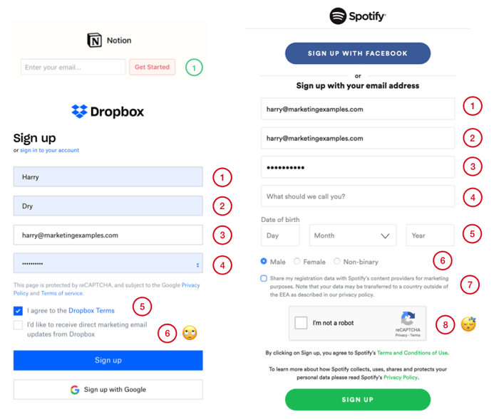
I signed up to Notion the other day and, it's quite an experience.
Notion doesn't save passwords. It doesn’t ask for your first name, last name and favourite color. There’s no boxes to tick. Literally just one email field and you're in.
This got me thinking about landing page conversion and how much companies leave on the table. For example, Spotify and Dropbox have a 6 & 8 step process to make an account respectively.
A one field sign up does not mean missing out on useful user
info. It just means waiting until after they've created an account.
This is conversion 101:
- Signup => Frictionless
- Onboarding => Leisurely
I ended up getting very into this and put together a more detailed case study if you want to more.

It's an interesting one. I agree that a lot of the information can be obtained as part of a multi-step registration or as part of the onboarding. For example, in my application, I walk the user through booking some holiday then invite them to update their details where I can capture their first name and surname.
For me, the big risk with multi-step registration is that it can appear deceptive. Potential customers think they only need to provide an email address to sign up and then are asked for additional information before they get to the product.
I'm sure there is a trade off somewhere between getting enough information to make the user experience as good as it can be without making it prohibitive.
Hmm, very interesting example.
Another benefit of such a small sign up is that you can drop it anywhere. Notion drop there sign up field 4/5 times throughout each page and even slide it into the header. I think you don't get this benefit with a multi layered sign up.
But I think it's definitely contextual and trade offs exist. Definitely depends on how sleek the onboarding is.