Tell me why my landing page sucks.
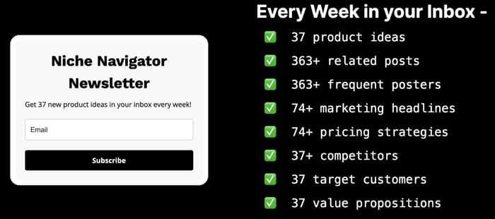
Im a developer, not a designer. 🙃
Link if you want to poke around more - https://nichenavigator.io/newsletter
Im a developer, not a designer. 🙃
Link if you want to poke around more - https://nichenavigator.io/newsletter

Short and to the point but two things this needs is a title/hero section and maybe a link below to the last sent newsletter as a webpage to get people intrigued to sign up.
Thanks! Just learned what a hero is!
Hello Matt,
Your landing for the newsletter goes directly to the point but…
Imagine the better results in conversions and subscriptions you could have with more structured and engaging content!
Here’s an example:
In this way your opt-in page will surely be clearer and will convert more!
For any doubts do not hesitate to contact me: I’m Federica, and I’m an expert Copywriter and Communication Strategist for tech and SaaS businesses.
I can't tell you why it sucks, because you had me intrigued with the weekly prospects. I'd say that's a pretty successful outing!
Cool, thanks for the feedback regardless!
Hey Matt, I love the simplicity but here’s how you can optimize it for conversion.
My first question is how do you drive traffic to your page? Because that might be a place to look at before optimizing your landing.
Here’s an idea on how to make it more benefit driven.
Headline revision: To make the headline more specific and compelling, consider focusing on the main benefit or unique value proposition that sets your newsletter apart.
Proposed headline: “Unlock Weekly Market Opportunities”
Subheadline: “Dive into niche markets with handpicked product ideas and insights—straight to your inbox.”
Body copy adjustments: To avoid repetition and maintain the reader’s interest, we can emphasize the uniqueness of the content and how it benefits the subscriber.
Proposed body copy: “Each week, we curate an exclusive selection of fresh product concepts, insider marketing tactics, and strategic insights designed to give you an edge in the market.”
Call-to-Action (CTA) Enhancement: Instead of a generic “Subscribe,” use action-oriented, benefit-focused language.
Proposed CTA: “Send me insights”
Design recommendations:
Landing Page Example:
Headline: “Unlock Weekly Market Opportunities”
Subheadline: “Dive into niche markets with handpicked product ideas and insights—straight to your inbox.”
Body Copy:
{Form}
CTA: “Send me insights”
Last but not least I would start with benefits first and then ask people to join. Give first ask later ;)
Hope this helps.
Redona
Choose distinct/unique metrics. I see "37" 4x and "363" 2x which just devalues the overall messaging and impact.
Plus, what everyone else said.
Few imperative things i could glean in the first glance:
overall it's clear and simple. i like it.
maybe play around with fonts, coz they look quite messy now.
Are you using the same font on the right side for a list? Also try not to use absolute white and absolute black color. That will make it a little bit more pleasant. Also if you check on mobile device the form block is sticking to the text. My suggestion would be - just use tailwindcss and add same gap to flex items depending on the screen size.
I don't think it sucks, but some improvements I think would be good are adding more information about your news-letter (This will help with SEO too).
If you need inspiration for some nice UX designs, try websites like dribble. Dribble offers a community of UX designers that share high quality work.
Too much to read - give me the value in a short sentence, then some detail if I want it (have now on a third look seen you put this on the sign-up from - its way too small and hidden).
No proof - just claims - show me some indication of quality/the content.
No trust/credibility - I dont know who you are or what you're about - I'm just being asked to send me email into the ether of that little sign-up box.
ChatGPT icons are yuk
The size of the sign-up form should be larger and more prominent - its the main event.
No T&Cs - I wont read them of course, but I except legit services to have them.
No visuals - draw my eye with imagery and a visual hierarchy to guide my eye from most to least important with different sizes and colours.
Just use Unbounce or whatever the new thing like Unbounce is.
There's not enough info about the newsletter. Who is the creator? What type of content is sent? Why should I care? Show me examples.
Adding anything will be a benefit