
If you know your customers well enough and you have a good product to serve them, then building your website with the right structure is like a magnifying glass for growth. Managing the impression of your product through an evocative landing page gets visitors to the next step of your funnel.
Why Structure is Your Ultimate Tool
If you structure your website in sections, it’s easier to focus on the goal of each section. Simple as that. Sections are self-contained, and can be edited without fear of being lost in the rest of the landing page. You can also tweak each individual page to obtain the best results. Let’s muse on some other reasons why this structure helps:
- Easier to change. If you have a defined style for the website, it’s easier to change the copy, images, explanations, features covered, etc than if it was all on one page.
- Easier to test. You can more easily test different versions of small portions of the website, instead of having to test the whole thing. On top of that, it’s faster to tweak smaller, self-contained sections.
- Easier to optimize. With sections, you can isolate variables more accurately to find out what’s holding the website back from obtaining better conversion rates.
- Easier to understand. By splitting your landing page into sections, you are basically breaking down your message into easier-to-understand pieces that you can change and test independently. You can answer your visitor's criticism more quickly as they navigate, and make the website sell your product for you.
First Impressions: Your Header
One of the most important sections of your landing page is the Header. It’s your earliest opportunity to create a powerful first impression. Make sure you can explain (briefly and succinctly) what your product does, but offer up some fresh ideas that people can chew on. (ie. “How could [my startup] help improve your bottom line?” or “Are you really working with your best option? Consider mine instead.”) Creating curiosity is crucial, as people tend to leave a website in the blink of an eye if they don’t find anything that grabs them.
💡 Pro tip: Try not to create a header where you cram everything the product can do in a single section; the key here is to make every section introduce the next one. This is so the visitor becomes more and more interested, and better understands the value you can provide at the same time. Think about your header as the first piece of candy on a trail into curiosity; you want your header to inspire your reader to continue down the path and read more about your project.
Here are three things to keep in mind while forging your Header:
- Clear terminology. Introduce the problem you are solving in the headline.
- Clear supporting test. Briefly explain the solution of you have crafted to solve the problem.
- Clear Call-To-Action. Implore the potential customer to sign on for your solution to the problem. Make sure your Call-To-Action (CTA) is visible and stands out; it’s vital that your audience convert their interest in our solution into dedication.
💡 Pro tip: Use this color pallet generator to help you select colors with good contrast, so your CTA stands out from the rest of your landing page.
💡 Pro tip: Use the text on your CTA button to manage the expectations for the next step; a little caption below the button might help explain more, depending on the complexity of your offer.
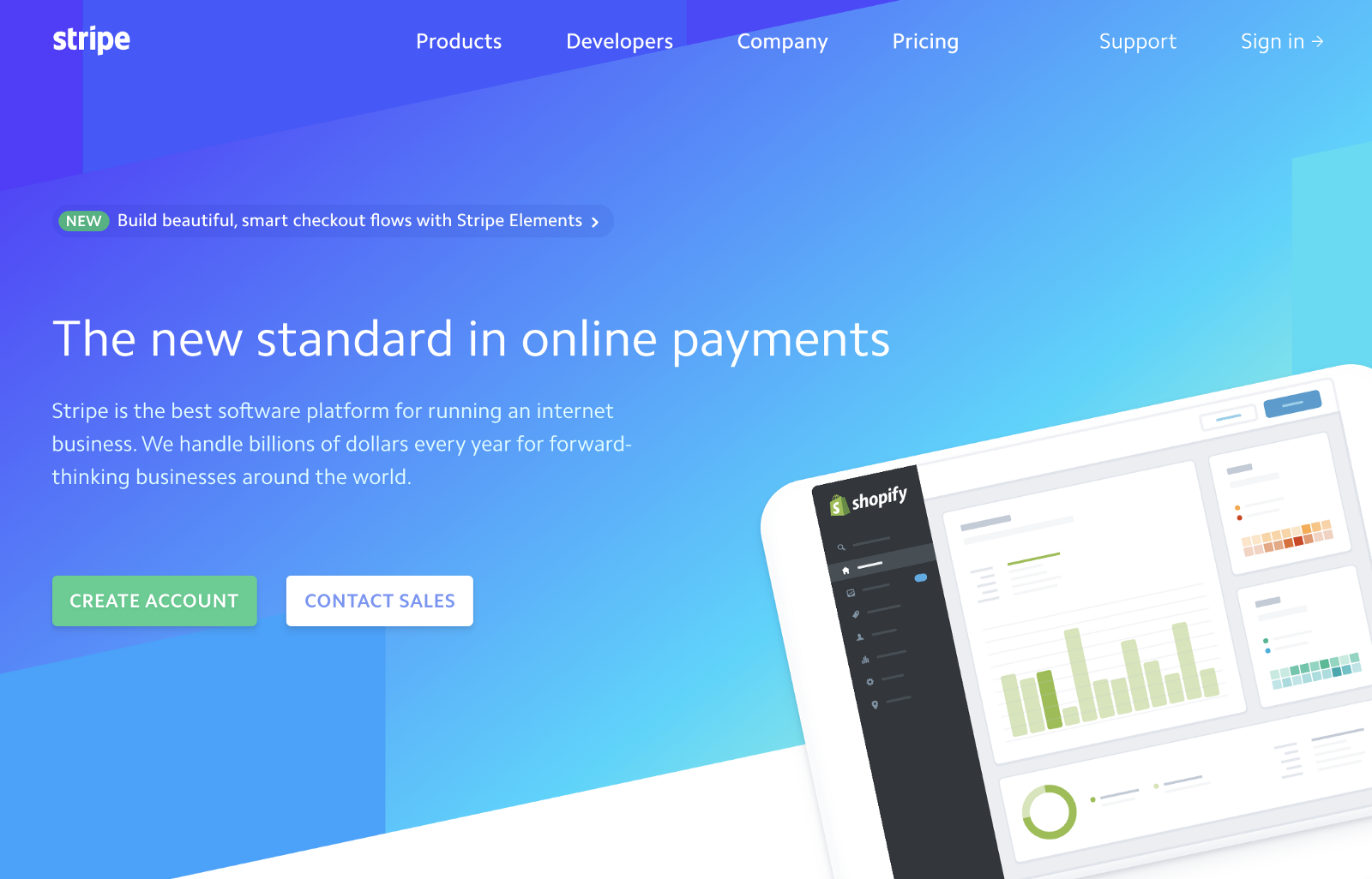
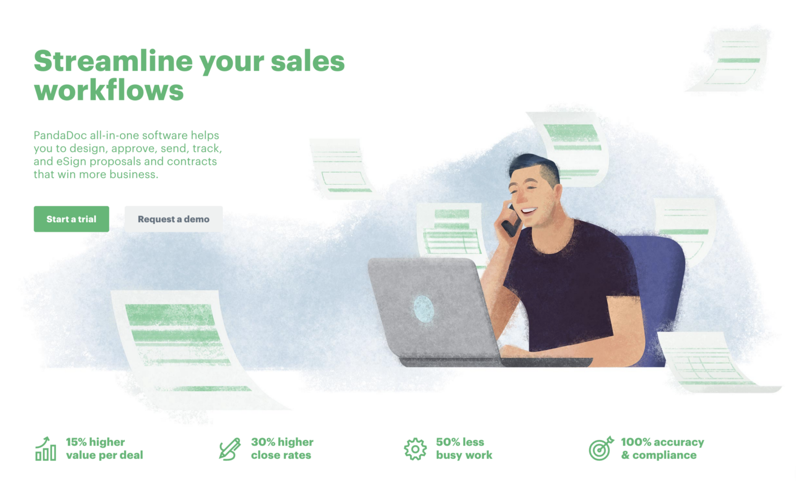
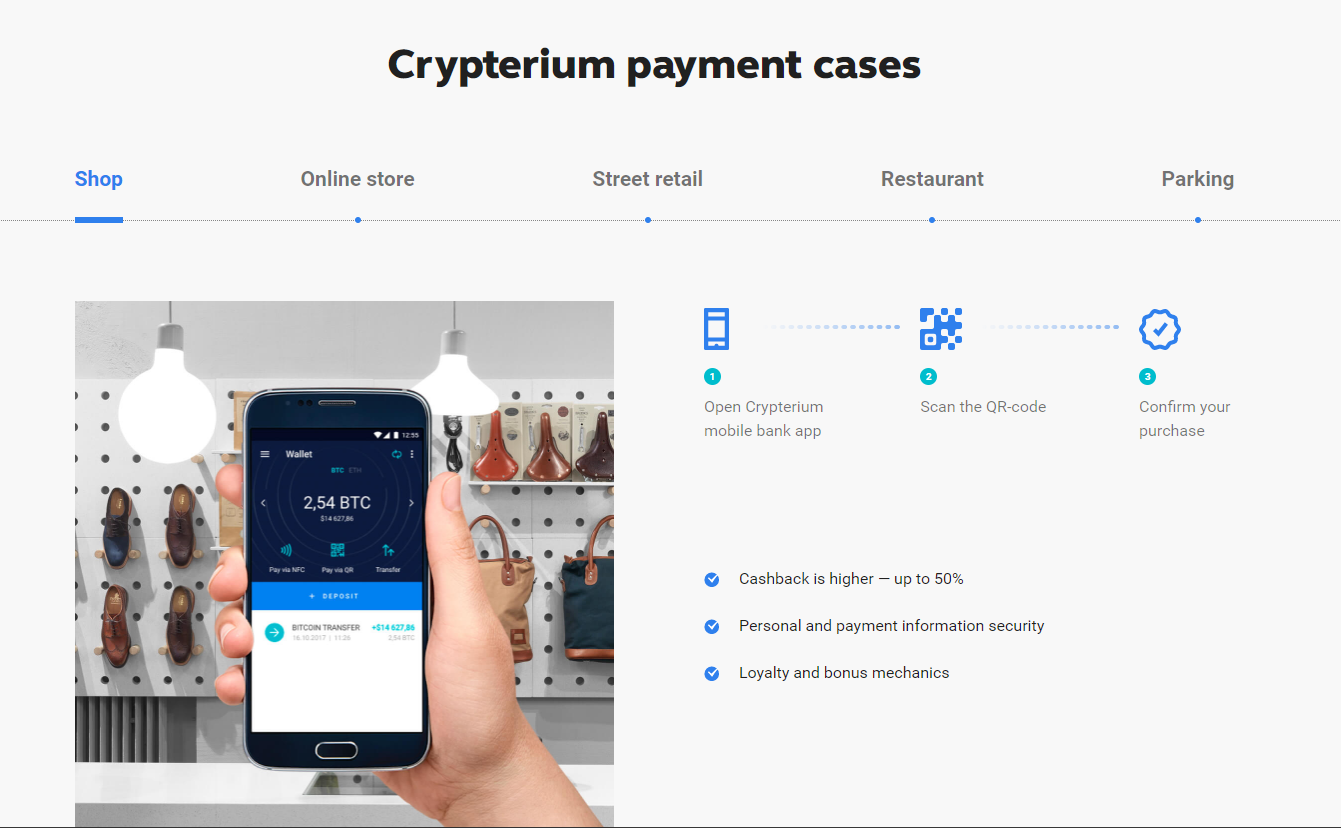
Look at the exceptional examples below. Both Stripe and PandaDoc have evocative landing pages that are sectioned out, and clearly emphasize their mission statements. Additionally, they have pulled attention to their CTA buttons with contrasting colors, and contextualized them with special text inside.
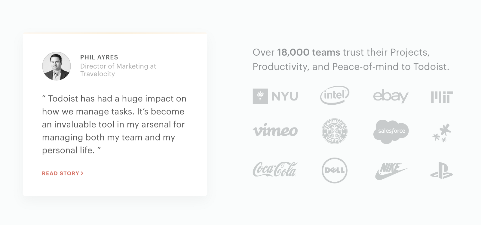
Establishing “Quick Authority”
Trust and authenticity are essential to a successful landing page. Creating these two X-factors (“quick authority”, as I call it) can be the difference between an explosive landing page and a lethargic one.
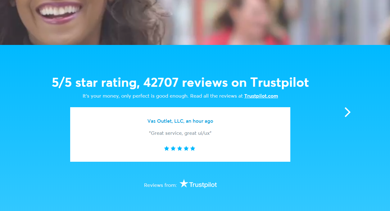
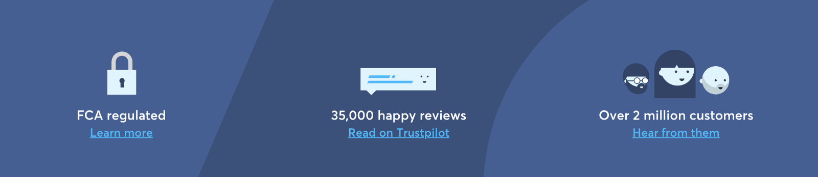
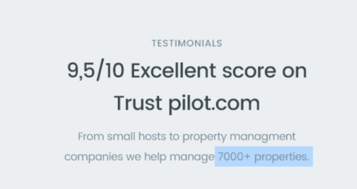
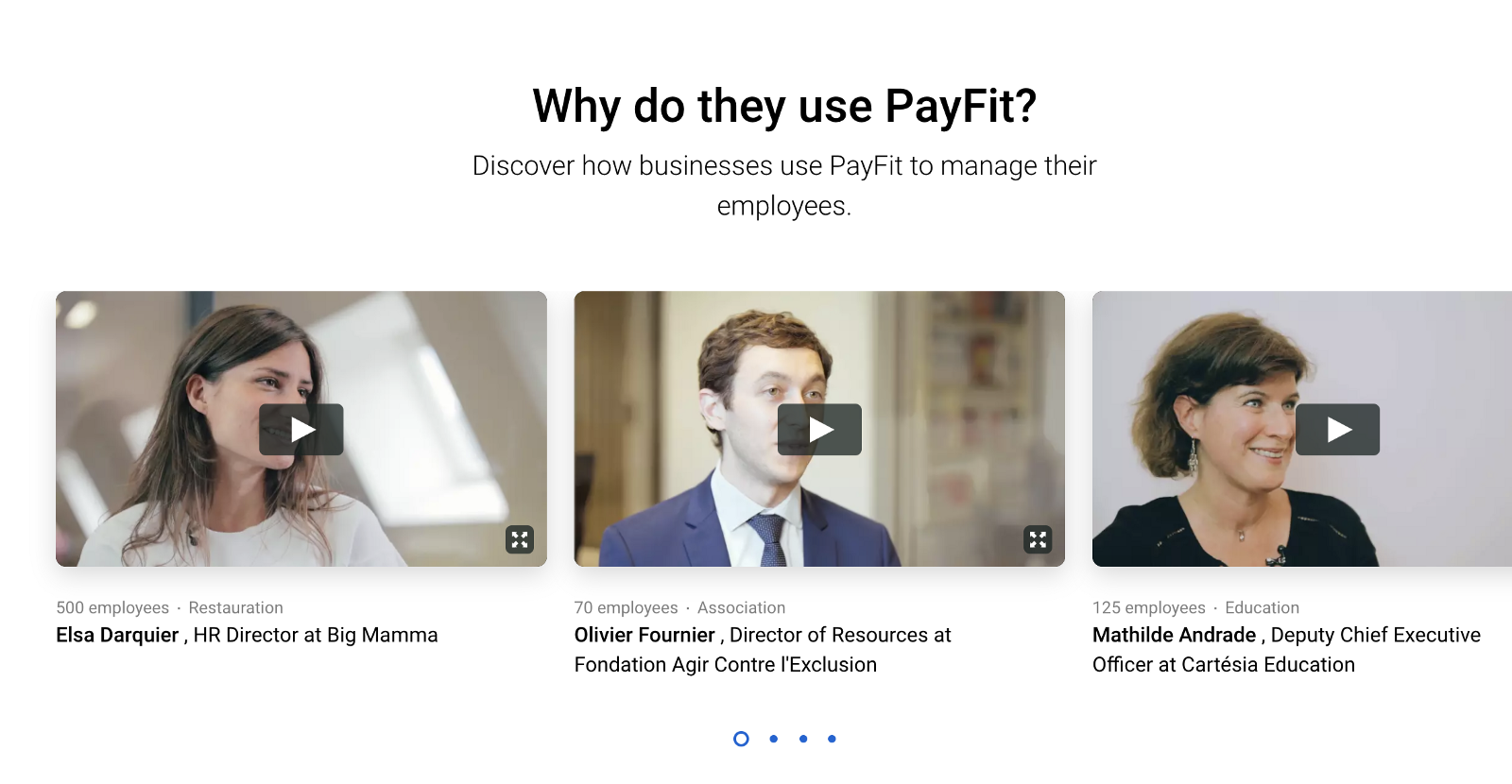
The best way to establish quick authority is carefully placing details throughout the website that create trust in your solution. Stats, graphs, social endorsements, and testimonies are all evidence to your hopeful success. By curating these details on your site, you draw more visitors into the realm of customers. If people see that you’ve had numerical success and that other people trust your project, they are more likely to also trust you.
A warning, however: if you focus too much on social endorsements you will encounter two huge problems: first, many visitors won’t get to read all of them (as they will leave quickly when greeted with blocks of text); and secondly, it makes it seem like you’re trying too hard to sell them something. Of course, you are trying to sell them something, but authenticity and trust plummets when customers feel they are simply the other end of the business equation. (Plus, too many testimonials at once reeks of classic “shock” advertising, which has grown toxic to the average consumer).
A healthy sampling of testimonials and endorsements is vital, however. Examples of these could be: press coverage; a small personal testimonial; a great mention on Twitter; or well-known companies using your product. It is up to you to distill the healthy number of testimonials vs. raw data that your landing page should have.
💡 Pro-tip: Every startup collects data. Deploy some of it whenever possible to contextualize the problem or the solution better. Numbers and stats have been shown to increase the consumer’s trust in your project.
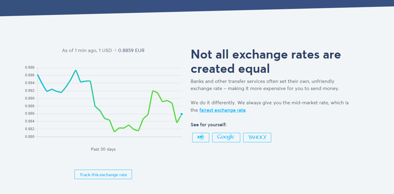
Looking at the examples below, both The Content Marketing Playbook and Transferwise blend their stats and endorsements into a cohesive product. Transferwise in particular creates different sections for stats and endorsements, and features a number of interactive graphs, lists, and charts for the user to explore (which creates that curiosity we are striving for).
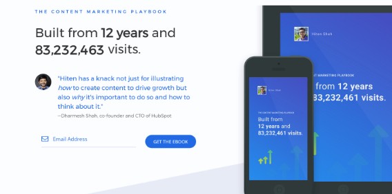
The Content Marketing Playbook
Nurturing the “Investment Mindset”
The alternative title for this section is “how to get results and not just interest”.
The “Investment Mindset” is the difference between visitors and potential customers. With your landing page, it is your job to nurture and emphasize the idea of investing, rather than “just looking”.
Think about it this way: you’ll get more results if you actively try to affect the visitor’s state of mind. For example, focus on “benefits” instead of a list of “nice to have” features. Remember, a “nice to have” business doesn’t grow and, even worse, doesn’t last.
Aim to engage your potential customer on your landing page. Here are some tactics that are perfect for you landing page:
Images That Relate To Content
The majority of your visitors will scan through your website, skimming for things that catch their eye. If you have good screenshots, gifs, and videos to complement the rest of your message, you stand a better chance at grabbing their attention and making sure they see something impressive about your product.
Break It Down
You don’t retain new information well when you are overwhelmed with it. Assume the same about your potential customer. Help your visitors learn about your product by breaking it down for them. Quick sample videos, easy-to-digest bites of text, evocative graphs; these are all ways to engage that customer’s brain without bogging them down in blocks of data or pages of explanation.
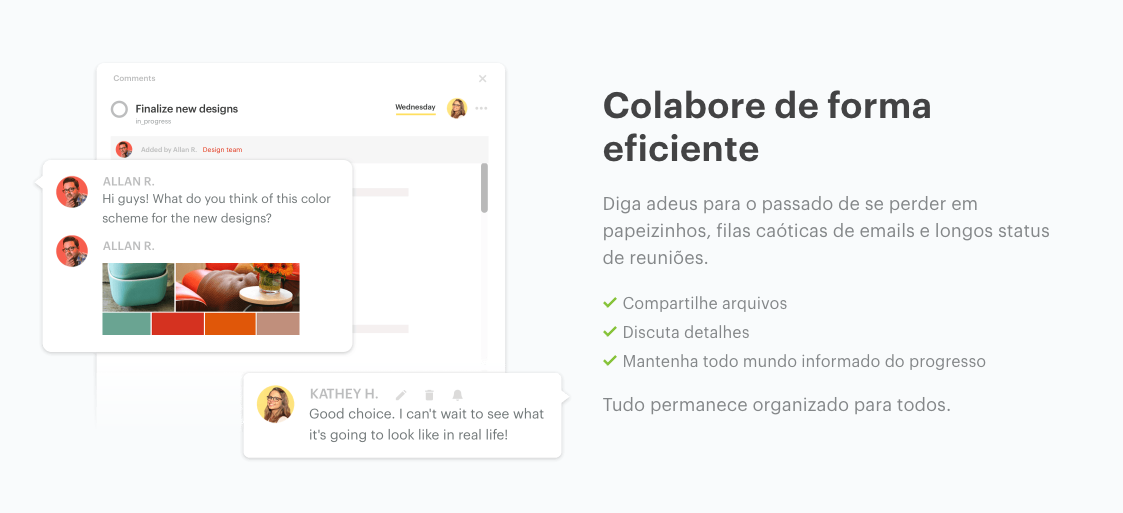
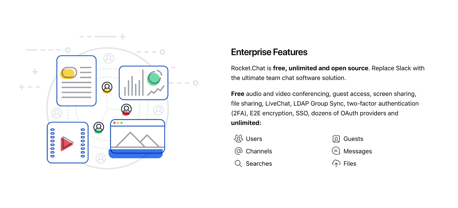
Benefits, Not Features
People don’t want to buy “features” from you, plain and simple. Investors want to buy their time back, eliminate their stress, simplify their routines, increase productivity… it’s an endless list of optimizations, and none of them are “buy features”.
By emphasizing benefits over features, you trigger the Investment Mindset, where the customer wants your product to get results, not offer features. If you don’t focus on benefits, you end up with price-conscious customers who don’t see your project as a need, but rather, a feature. Once a cheaper, “good-enough” alternative comes up they will leave you ASAP. (Which is sad stuff. 😥)
All three examples below emphasize the benefits of their product, and related it back to the bottom line of the customer’s operations.
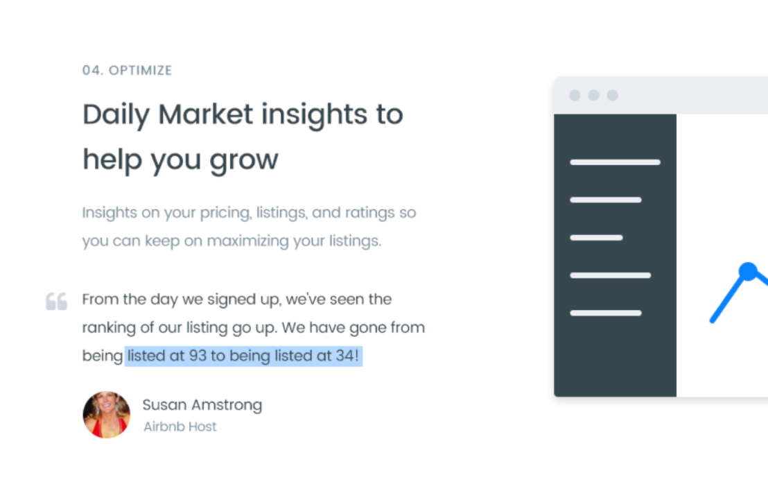
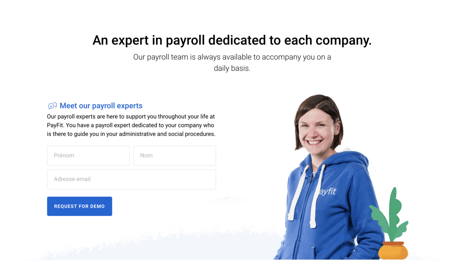
Employing Testimonials For Trust
The purpose of your testimonial section is to communicate this: “Look there’s already a lot of people getting results!” Trigger some FOMO (Fear Of Missing Out) while generating reassurance that your product the the solution for their problem.
💡Pro tip: To make this as effective as possible make sure your testimonials are results-focused. Nobody puts trust in biased personal opinions or “just works for me” testimonials. Like we said earlier, back up your endorsements with hard facts and data.
**💡 Pro tip: **To acquire results-focused testimonials, simply come up with two or three examples of how a testimonial should sound, so when people give you their personal testimonial, they will subconsciously follow what your guidelines (without it being fake). Additionally, you always ask directly, if you feel comfortable enough with the customer.
All the examples below emphasize the data that drives the testimonials from their customers. Smartbnb in particular highlights when a testimonial includes real, actionable data.
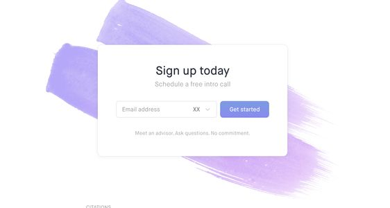
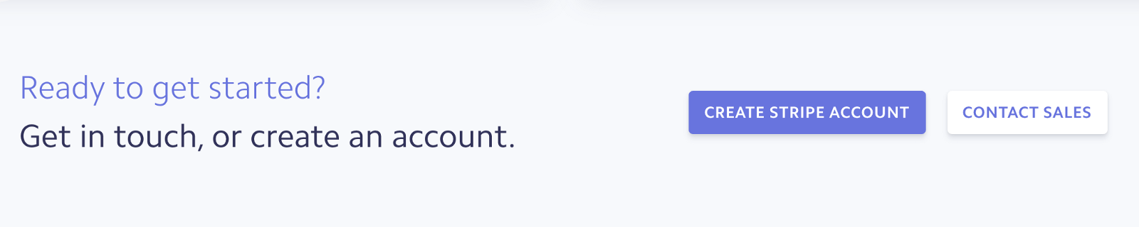
The Final Act: Your Call-to-Action
If you’ve followed along closely, you probably nailed the first impression about your product with your masterful sections, so make sure you grab their attention again as they prepare to convert to the next step in your funnel.
💡 Pro tip: Remember, it’s not the CTA itself that makes people convert; it’s the work you did before to make them want to sign up, get a free trial, or buy/schedule a demo. “The website is the worm and CTA is the hook.”
The examples below employ a contextualized CTA with text, a great contrast, and its own section.
Final Thoughts
The point of this article isn’t to show you that you need a designer or a developer to make a great product. (Although experts like that certainly help.) The point is to show you that you can craft an incredible landing page with a mindset focused on investment, flexibility, and growth. Use this framework to pivot, expand, and secure more investors for your own landing pages, and see your fledgeling project skyrocket.
How do you structure your page?
I’m sure other IndieHackers would love to hear your tips for forging a landing page. Let's start the discussion in the comments, and get brainstorming. 👇
Nice article. One small typographical error: pallet is the wood structure that holds heavy things for transportation and palette is the artist tool for mixing colors. I think you meant the latter in your link to the palette generator.
Thanks! Yes, that's what I meant :D
Hey, thanks for your article, I tried to add your blog to Feedly and it looks like you don't have an RSS in your website (or it doesn't work), it's a pity because I want to continue reading your articles.
Thanks man! You can connect with me on LinkedIn as I post every week day :D