The hard part of a cost calculator is making its assumptions visible
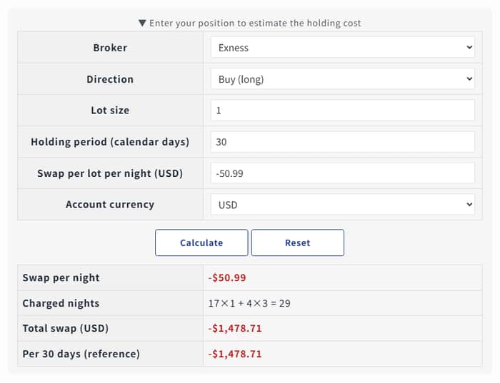
I have been refining an XAUUSD overnight-cost calculator, and the calculation itself is the easy part.
The harder product question is how to display a result that changes with direction, volume, account conditions, and holding time. A single prominent number is fast to scan, but it can look more general than it really is.
For this update, I am keeping the selected conditions near the estimate rather than hiding them behind a separate explanation. The aim is for a reader to see both the result and the small set of inputs that made it possible.
That sounds simple, but it changes the hierarchy of the screen. More context makes a result easier to audit; too much context makes the first view harder to read.
I am testing three questions:
- Which conditions have to remain visible beside the result?
- Which details can be one step deeper without becoming misleading?
- How should an estimate communicate uncertainty without looking broken?
For makers who show prices, forecasts, health metrics, or other conditional outputs: how do you balance a clear result with enough context to prevent false certainty?
