The UX made me lose half of the users.
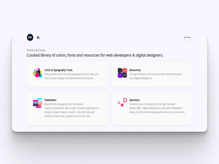
So around a week ago I had the idea to redesign the landing due to the quantity of cards in the landing page.
I implement 3 cards linking to.
- Newsletter
- Tools
- Resources
When a user clicked on the Tools or Resources card they were brought to another page with more cards to choose what they wanted to use.
This implementation made them go away because they had to click a lot before teaching what they wanted.
Before this issue I had 120 - 130 users around 08.00 in the morning, the past week I had half or less of that.
In fact today I had 14 users...i haven't seen this since the very beginning of https://www.colorsandfonts.com.
What did I do?
It was 5.17 in the morning and I stood up and fixed it. It just took an hour and I brought it back to how it was.
BUT, now instead of scrolling I used tabs without scrolling they see both sections, Tools and resources.
For the newsletter I readed an article that @volkandkaya dropped me on Twitter by @harrydry , about page.
While I had a landing page I am starting to implement his tips.
Https://www.colorsandfonts.com/newsletter.html
I hope this insights helps you with anything.
Have a great day.

Thanks for sharing. I hope you get your users back. In the meantime, just learn from your mistakes 🖖
Just added your sites to my design/resources favourites, I really like the font combination section.
You welcome Antonio. I Brought it back to what it was, just some small changes that not affect the UX. It looks like they are coming back actually.
In fact, I was refactoring the code in some pages, and I saw that after I was playing around it was missing maybe 3 tracking id's, in 2 important pages...
How kind was that.Thank you so much.
Do you have an A&B Test system setup?
Hey Sodux. I do not actually. Just working on the go. Did you had something in mind ?
You can do something simple with a service or create your own with a 50/50 randomization of the page between two different designs. Add a Google Tag labeling it something like design_1 and design_2 and review your metrics from that based on engagements, etc. It all depends if you have the time or budget to spend on it. If you have a little budget use a service and just test for 30-60 days to get an idea of what people are gravitating towards.
I didn't know about this actually. While the idea the is stunning I am afraid that c&f is budget 0. I am working on it just in the night time...
Thanks for sharing, @Michael_Andreuzza. I used to have a similar problem on my landing page too. Took me a couple of iterations to make it just right but I still have some doubts, haha.
Anyway, I hope you regained your users back. All the best!
Hey @qabil ! Well I was just updating the whole site and just pushed some updates.
I hope so too, to be honest... I'll give time to time.
Have a great one Yusuf !
It's a great site, it'll bounce back for sure.
Thanks, and you too, Michael!
Will see :-). Thank you for the kind words Yusuf.
This comment was deleted 5 years ago
Hey ! Well, anyone that uses the site, no matter what they do. If they are on the site, I count them as users.
I came to the conclusion that this is the right way to have it, all in the landing page. Mostly because the user comes the to speed up theire workflow and it has to go quick. So you can't have them clicking n clicking everywhere, it has to ho straight to the point.
In desktop I am using three columns.
The bog Newsletter is going to change I am just figuring out how...
Thank you for your feedback!