Thoughts on my landing page? (Medium & Substack competitor)
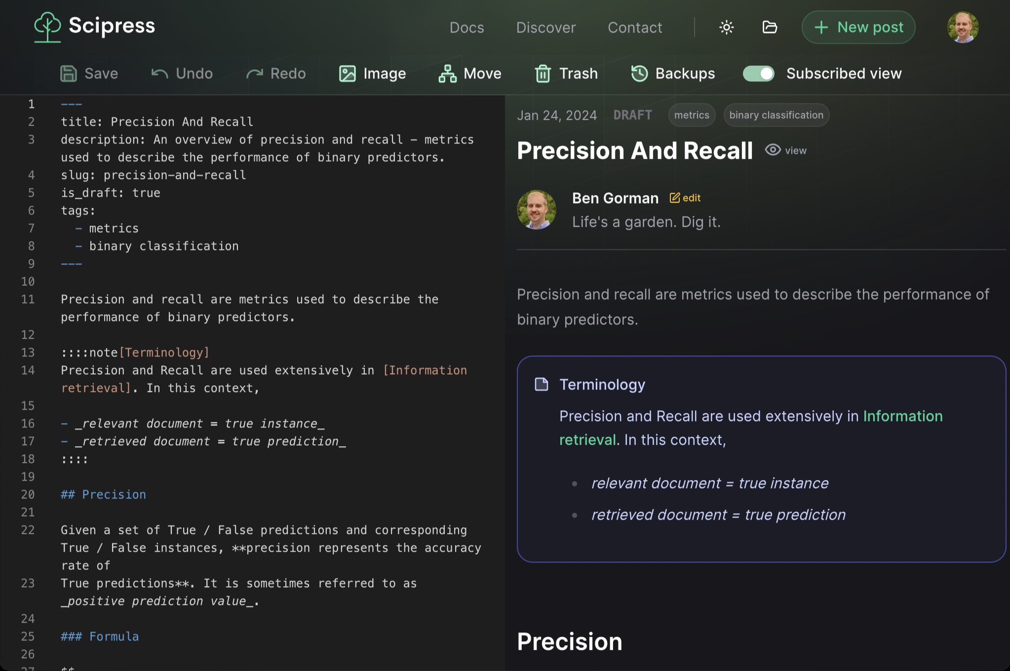
I built a Markdown-based writing platform for programmers and scientists.
Thoughts?
Trending on Indie Hackers

I built a Markdown-based writing platform for programmers and scientists.
Thoughts?
It's an excellent work! I'm not a pro, just an amateur, but looks great!)
My first thoughts were "cool", but "then what? why is it so different?"
I personally also didnt like much the video.
It would be cool to add more information if you already have it, e.g, number of authors and articles, readers and average earnings or something like that. I am pretty curious about that.
Definitely one of the best landing pages I've seen. The quick video walkthrough made it clear everything that the product was in under three minutes. Which means you have a great product just from that. Also, love the color scheme.
Nice Work Done. Must appreciate it.
It's really awesome landing pages i have gone through.
solid design ++ and as other commenter suggested I second the thought to have a cta above the fold, may be a/b test both scenarios.
This is a tailor-made, The green theme is perfect!. Awesome Product mate
First of all congratulations on making this far.
I share a similar sentiment as some other comments here. I "ended up" liking the product, but I had to scroll down for a closer look to get there.
I see what you tried to do with the video. But according to Donald Miller, "a caveman should be able to glance at it and immediately grunt back what you offer". And a 2+ minute video without title/description is way too long for that.
I really love the 3x4 feature grid you have right below that. One thing I would want to experiment is to make each of these a button, and display a mockup that showcases the chosen feature? I can see having that at the top of the landing page would boost more engagement.
Appreciate the feedback and great idea about making the features clickable buttons. I agree, my video needs work.
I am new to this product category, but from what I can observe
"Write and sell technical content with ease" - this seems to be in the right place
"Use our enhanced Markdown syntax and in-browser editor to create a blog, a book, documentation, ...whatever yourdesires" - this is about product and not customer so this go down
No out-of-pocket costs.
Only pay when you earn.
hence this should be on top
CTA required in the first fold - what if I am interested would you not want to capture my interest immediately?
Great feedback. Appreciate you taking the time!
I really like the idea of Scipress but I didn't fully grasp what the product was until I read your posts at the bottom of the page. Expanding on the 'Why' in your 'Introducing Cypress' post on a new section of the landing page might help potential users to understand the product quicker.
Also, since Scipress is a marketplace, visualizing your app from the subscribers view as well as the value prop for that half of your audience might be helpful as well.
I will second this. I like the post, but felt very overwhelmed / confused when I landed on the page. The headline is great, but the video grasped my attention and from there you lost my attention
Did you see the video? Perhaps it needs titles / captions to be more clear?
Regarding your second point, I thought about this too but my instincts are telling me to focus on acquiring writers to get the flywheel spinning. I doubt most readers will land on my home page; Presumably they will land on content pages. If I can get writers on the platform, they will acquire the readers for me. That's my thinking at least.
Love the landing page, it's clear and straight to the point. It also gives a nice summary of all the features. I got a pretty good picture of your product super quick.
The video however is super confusing. I didn't understand why you kept clicking the "new post" button and why it loaded a different article every time. On top of that, it seemed to display pretty slow loading times between pages.
I think you should improve the video, maybe add a voice-over?
Hey thanks! I'm working on my page load speed at the moment. And I totally agree - I need a voiceover or captions.
The first impression is, it takes a lot of time to load the website. Please work on it.
Appreciate the feedback. I didn't realize how slow the site was until people like you told me. (For me, it runs pretty fast.) Clearly this is something I need to fix. Thanks!
Did you create your landing page with Framer? I was surprised because it's similar to mine. We also had a long loading time for videos, and that's why we are now reworking it to use GIFs instead. Just a personal thought, but it might be good to increase the font size of the text descriptions below the video. Overall, I think it's very neat and clear.
Hey, thanks for the feedback! There is a bit of Framer incorporated, but not much. Also, I was going to use a gif but the file size is sooo much bigger than mp4.
Appreciate the light/dark theme toggle that appears to respect system theme too!