1
1 Comment

Tips for improving landing page
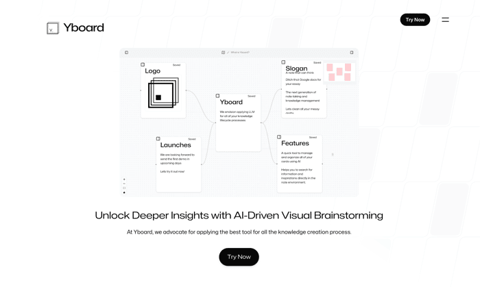
Here is my landing page for an app that turns rambling thoughts and brainstorm into the first draft quickly. https://www.yboard.ai/

I think I should add more content to the home page since this is where we attract customer first. Should I have more features demonstrations? If you have any other suggestions, please leave it below.

Thanks

on July 29, 2024
  1. 2

    Hi! I'm a huge fan of knowledge management apps and systems, so I look forward to your launch!

    I've checked your landing page and found the concept very interesting, but I think much work is needed to improve your design and user experience. Here are more detailed suggestions. I really hope it helps you improve your landing page and get more sign ups!

    What to improve:

    1. Remove pop-up on clicking cards in the "Yboard for everyone" section (as a user, I expect to see detailed description of the use case / knowledge base article, not the larger image that brings no value to me)
    2. Quick Tutorial Video — why do you use a different, button-like style for this heading? I was trying to click on it but then realized it's just a title of the section.
    3. Get Access Now section is confusing. I expect a button that brings me to your products, not a button that brings me to GMail.
    4. Your beta access form is way to complicated. I'd suggest making it as simple as possible to increase conversion rates - name + email. Why do you need my phone?