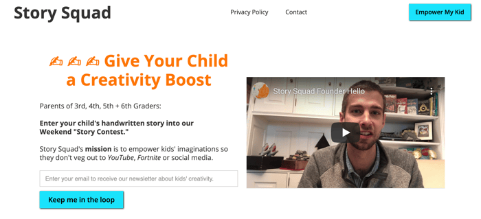
Too much text? Please share your immediate impressions of our landing page...
IH community:
Thrilled to be here! I could really use your help on my landing page:
https://www.storysquad.education/
Story Squad is a progressive web app is set to launch in a month, and until then, I'm trying to build a following by sponsoring free "Story Contests" for kids to do on weekends. Is that immediately obvious from the landing page?
The page was built in Webflow -- right now I suspect it's way too wordy. Given the amount of explanation required to explain the "Story Contests", can you think of any ways to streamline the message and get to the point sooner?
Additional context from talking to parents: Target demographic is parents of 3rd, 4th, 5th, 6th Graders whose chief pain point is having to constantly monitor kids' screentime on weekends.
Thanks for your scorchingly hot feedback. Seriously, let it rip!

Some of my first glance opinions...Yes too much text :) the blue shade on buttons is not in the orange color pallet you are going with and clashes, stick to a color pallet. Headers should never be sentences, a couple words max would be better. Privacy and contact make more sense on the bottom. The left and right logo and empower buttons should be left and right aligned to body. Check out a free logo generater for easy logo improvements. I would not put origin story section in lander. Icons are strange and out of place. Center text should not be mixed with left align text in same cards. I'd checkout bootstrap, and look into laying things out with cards.
Hey @FolsomDevs, thanks for such precise feedback. One followup Q: when you wrote, "I'd checkout bootstrap, and look into laying things out with cards", could you point me in the right direction, as I'm unfamiliar. Thank you from someone obviously fairly green. :)
Yes, certainly...For novices in layout and ui, for DIY web guys like yourself, bootstrap is the easiest framework to build web-ui with (outside of services like webflow)...Layout and spacing is the most important design element to dial in correctly. Bootstrap uses card layout that with pre-canned sizes and layout strategies that can improve designs that are looking to place blocks in grid like layout...here's what I'm referring to: https://getbootstrap.com/docs/4.3/components/card/
Awesome. Thanks for schooling me.
Start with containers and have them wrap up cards:
https://getbootstrap.com/docs/4.3/layout/overview/
This comment was deleted 7 years ago
Nice idea. Landing page not great. Discard 75% of text. Drop the twee handwriting icons. Drop the "Meet Billy" text. Put the whole "Story Squad's Origin Story" on another page.
I like your personal video (tho its small which doesn't promote confidence) but without a shadow of a doubt the "Meet Billy" video should be upfront and centre - THAT VIDEO IS 50% OF YOUR LANDING PAGE !
I think you could provide the theme each week. Big challenge for you is how do you keep the losers coming back?
Suggested sections ...
Header
How it Works:
Each weekend we run a free story contest based around a different theme.
Benefits:
Testimonials:
Thanks for such comprehensive feedback, rab. I appreciate the better hierarchy. "without a shadow of a doubt the "Meet Billy" video should be upfront and centre - THAT VIDEO IS 50% OF YOUR LANDING PAGE !" That's super helpful to know. :)
Hi Graig,
What's the main objective of the page? Is it to get people onto your mailing list?
Hey Ian:
Great question! I'm struggling to define CTA hierarchy. Ideally, I'd like parents to see the call for Story Contest submissions, help facilitate their kiddo to write one by hand, snap a photo, and then email it in. This is obviously a huge ask in such a condensed format, which is the reason why the landing page has "too much text."
Does anyone have suggestions for a more effective onboarding hierarchy? Something like, 1) make landing page CTA entirely aimed at collecting emails, and then 2) migrate the harder problem of getting parents to send in their kid's story through email drip sequence?
Thanks for any advice.
If the pain point is reducing screen time/replacing screen time, call it out in the header!
Replace screen time with imagination
Finally, a no-screens activity your child wants to do
Are screens taking over your weekend?
Some good copy advice I've always heard is remind your customer they're itchy, then scratch it. Call out the pain, then talk about how you can fix it.
Overall love the mission, love the service, good luck with your launch and let us know how it goes!
Re: 2. LOVE THIS IDEA. Thanks for sharing it and for the encouragement. I'll keep you posted on how this "story prompt" idea goes.
Re: 1. "Are screens taking over your weekend?" That's copywriting gold, Nicole. Thanks for making things itchier. :)
Hey Graig,
I think the idea of storysquad is great, although I also like to play some games, or scroll through social media^^
I would start with a heading that describes your product. And then I would try to create a website that has a story just like your storysquads you get from the children. A picture says more than thousand words... You could probably get some neat illustrations done with some fancy characters and then make a step by step introduction in how the product works with just 1 sentence to each illustration... Thats just an idea... keep up the good work ;)
And in no way are we trying to demonize video games or social media in a vacuum, just the potential for it to lead to endless loops for elementary-aged kids who lack self-regulation skills. Sorry if that caused confusion.
No, I totally understood that part before, I was joking and hoping that my ^^ will do the job... I really like the idea of your website :)
Love the creativity of this suggestion, Lukas. It's a bit meta, being creative about creativity. :)
Yeah, probably not to easy to create, but as always, a good story will stay in the mind of a visitor, so probably worth a shot?
This comment was deleted 7 years ago
Hi Sherry (and Edward):
Thanks for the encouragement and for the feedback on how ambiguous our value prop. currently is being communicated. That's super valuable, as I'm pretty lost in the details that I'm having a hard time seeing the forest.
In response to your questions:
Thanks for the orange text boxes comment. It does look wonky on mobile. Ahhh, the joys of being a no-code ex-academic hacking something together on Webflow! :)
This comment was deleted 7 years ago