Top 5 Mistakes Medtech Founders Make in User Onboarding
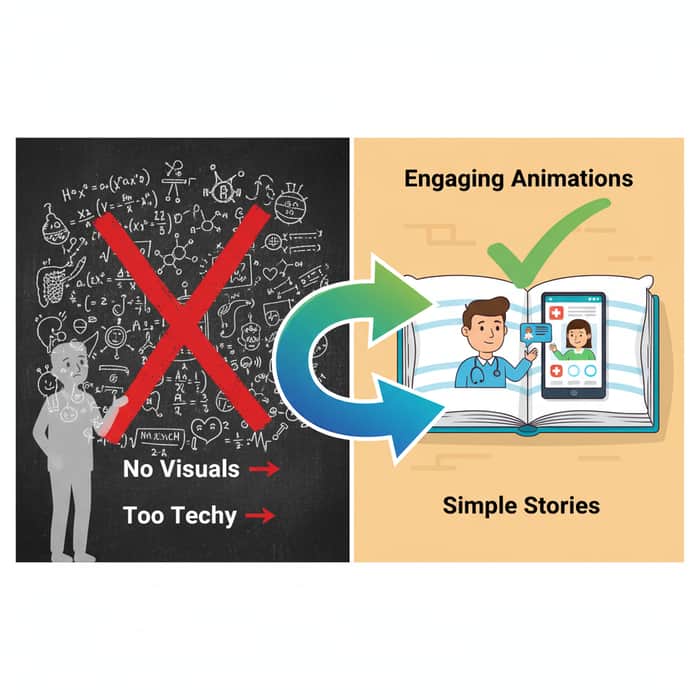
Medtech app confusing users like a maze with no exit?
Like teaching a teen algebra without pictures, boring!
- Mistake 1: No visuals – fix with animations.
- Mistake 2: Too techy – simplify like bedtime stories.
- Mistake 3 that costs 40% retention?
Boost onboarding success now.
P.S. Avoid pitfalls – check www.ayeansstudio.com

Visuals and animation can definitely make onboarding feel less intimidating, especially for users unfamiliar with clinical terminology. That said, animation works best as one tool among several rather than a universal fix. For users managing health conditions, particularly older patients or those in a heightened emotional state, motion-heavy interfaces can sometimes add cognitive load instead of reducing it. Static, well-sequenced screens often perform just as well, if not better, depending on the audience.
The same nuance applies to simplifying language. Reducing technical jargon is generally good practice, but certain information in medtech, such as dosage instructions, device calibration steps, or consent details, needs to stay precise for safety and regulatory reasons. Simplification works well when it clarifies without removing necessary detail.
Onboarding drop-off in healthcare apps is rarely caused by a single design flaw. It's usually the result of several smaller frictions adding up across the user journey, which makes it worth looking at onboarding holistically rather than fixing one element in isolation.
absolutely!!!