Tribulations and Triumphs: How we Redesigned our Landing Page ✨
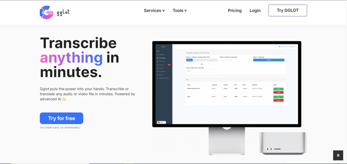
First time entrepreneurs focus on product- second time entrepreneurs focus on distribution, as it’s been said. Of course, as a marketing intern product wasn’t my main focus; the distribution of said product (an online transcription and translation software in my case) was. It was also quite difficult, as all things worth doing are. For such a service based almost entirely on the web, a landing page is essential to ensure visitors are engaged, return for more, and perhaps even become customers. How does someone go about it, and how do they do it well?
Here’s my personal experience during my first two weeks at Gglot, including what I learned and what I should have done. Hopefully it helps other budding entrepreneurs, designers, or anyone in need of a website get the traction they need to succeed.
Where Have I Been Working, and What On?
Gglot.com is a transcription and translation service, capable of creating captions, subtitles or simple transcripts out of audio or video files for a wide variety of purposes.
- It’s currently used by over 200K users (about the size of Jersey City!),
- Supports an expansive variety of import and export files
- And translates over 35 languages,
But if you search “Transcription Services” or something similar online, it doesn’t show up in the top results- or anywhere on the first page, really. Those spots have been taken over by bigger players, like Veed.io, Rev and Happy Scribe; companies that have proven themselves with sites that advertise and attract people to their services. That was my task, to design a website that would attract today’s viewers and bring back tomorrow’s customers. And so, on my very first day I learned to:
See What Works First
To design a website, or do anything at all, the first thing you need is an idea, a plan of action. While it’s incredibly tempting to create something the world hasn’t seen before, first and foremost you must consider what people want, both in a product and a website. After comparing our site to several others, here’s what I gathered:
- The best designs are light, have appropriately blended color schemes, and have both rounded images and text boxes- in other words, imitate MacOS UIs.
- Sites need call to action buttons on the top, bottom, and one or two in between.
- Sites need a lot of embedded links.
There are, of course, a few more things you need to do to get your website to the top, but those are the basics. To put it simply, websites need to look good (something you discover by looking at sites offering similar content to yours), have excellent call-to-actions (buttons, linked text and other methods that convince people to try your stuff), and if possible, explain everything your product can do through embedded links. After I finished my report on how other companies designed their sites, I set to work on redesigning my first page. As I soon discovered, or rather, expected, it was much easier said than done.
Don’t Hesitate to Ask for Help
It’s a simple message, one that a lot of people (including me) are hesitant to do. Some think that asking for help means they’re weak or unqualified, foolish- which usually isn’t the case at all. Asking for help is a sign of strength; it tells those around you that you’re willing to cooperate, to learn, to reinforce your skills- and a fool that’s willing to improve is better than a fool that’s willing to stay silent. Most importantly though, ask those who are more experienced than you for help (the internet has plenty of professionals)- that way you can share your skills with other novices who needed the same help you did.
In my instance I was lucky enough to have been working with two other interns, one of whom had much more experience with King Composer Wordpress than I did. Thanks to him we were able to get a base aesthetic all three of us iterated upon, and learn how to use Wordpress much faster than if I attempted it alone. With these new skills under my belt (and some more over the next week by continuing to ask questions) I finished my redesign, and set to work modifying several other pages, implementing a tools page and creating even more sites to be linked in the coming days. It was incredibly tedious work, but necessary for our site to be successful.
Create Templates
In almost any industry it’s best to serve a wide variety of professionals, from almost any region of the world. In the case of transcription services it’s best to have software that can import any sound-stored file and export any text-based file (the ones that contain captioning capabilities and metadata too!) as well as translate to as many languages as it can. To fully show off your software’s capabilities you’ll need tens, if not a hundred pages to display every little thing it can do, like .MOV to Text, .VTT to .SRT, Chinese to English, Russian to French…or whatever else your software provides.
King Composer’s HUD allows easy integration of features like buttons, spacings, text boxes and images- but the more you build, the more complicated it can get. You can have tens of inner rows, all with unique features like colors, margins, etc…rebuilding them from scratch can be a nightmare- and here’s where templates can save you a great deal of time and effort.
First, build your template. King Composer’s drag & drop system makes it intuitive to assemble components and make a site that matches your style. Secondly, you export your components (located on the left-hand toolbar) into .xml files, and finally add your .xmls back to King Composer. There's a bit of coding that goes into it, and it's shown here:
https://docs.kingcomposer.com/prebuilt-templates/
When you access the sections/templates library underneath all your components, you should be able to access and integrate your component in a single click! There is a much lazier way to do it, and that’s to just put all your components in one base row, copy it and paste it to another site. It comes at the cost of confusion though- you can accidentally overwrite your template, or add it to the wrong site, or just totally forget what goes where- I got muddled up a few times- so it’s better to have global templates for ease of access. Copy, paste, rinse and repeat about a hundred times and congratulations! You have a website worthy of attention and retention.
Some new problems do arise when you complete all your pages though, such as:
How do I make it easier for users to navigate my website?
And why did my footer get so long?
Editing Headers, Footers and Everything in Between
At this point your website should be almost done. You’ve chosen a theme/design, you’ve created a landing page, added a ton more pages to show off your product’s capabilities, and now you have the problem of having a homepage that’s way too long. Luckily, there’s an easy fix for this.
First, go to the Appearance tab on the left hand toolbar and click on Widgets (This tab only appears if you’re the creator or an admin of the site).
Next, look for the widget used for your footer. In my case it was Footer Sidebar, but depending on theme or even platform it might be totally different.
There seem to be two ways to add/remove certain sites in this instance; you can add it in with custom HTML, or remove it by putting the page ID in, which you can find when editing said page. Regardless, both methods work (although I recommend ordering the numbers before putting them in for ease of access in the future).
As for the header, you enter the Customize tab, go to Menus, and edit how and where your header links redirect your users with its drag and drop system. Once you finish doing that, don’t forget to add a tools page! Also incredibly tedious as you have to put every single page in, it’s well worth the effort and will really help people explore your site when you finally publish and advertise it.
And Thus, My First Two Weeks
By Friday, July 1st, the website redesign was complete. With a new theme, new text, and new pages to put all of Gglot’s capabilities on display, it was well worth the effort. To conclude, here’s a few more things I learned to do while redesigning:
- Create your own images. While using stock photos is fast, making your own designs helps customers associate your art with your company. Plus, no watermarks!
- Use SEO tools to find out what needs to be done first. Using Google Analytics & Ahrefs was very useful in determining who uses your product and where they’re located, as well as how much traffic goes through the keywords you’re looking to service.
- Explore the capabilities of your website designer! Find out which button does what, how that color would look, and what certain HTML or CSS lines will do to your text (like <span class=gradient> </span>).
Overall, it’s been a fantastic learning experience, and it’s time to put the team’s work out there and see how well it does!

Veed IO has been a great influencer on IH! It's amazing to see how many other entrepreneurs these UK folks have inspired!
Great article. Thanks for sharing this meaningful milestone!
This Is Great Article, Thank you for your kind information you have shared with us. Ezytor is an online editor for Developers with a simple, intuitive drag & drop feature and ready-made themes you don’t need to code. Save tons of time, choose one of our great Themes, and build a stunning website in just a few minutes. Try EZYTOR.com