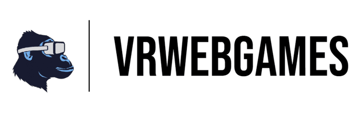
Updated branding + logo for VrWebGames
https://www.vrwebgames.com/
Made a new logo for our site, plus some minor changes to the game list. Having a hard time figuring out if the top nav bar fits with color scheme?
Also the 3-column about section; should it be cut from the page?
Not too design-experienced, let me know any thoughts you have!

Hello,
I'd use no header bar, just the logo and VRWEBGAMES in the center of the screen, with a heading below saying The #1 Site for Free VR Games
Since you have only 12 games at the moment, I'd suggest you compress the entire page's layout in one screen. So when a user visits your site, he can't scroll down, but he's going to be focused only on the games you display. If you want to add more games later, make it a slider, showing games 3 by 3 or 1 by 1.
Below this, put the button saying Submit VR Games (in dark blue color same as logo color)
Experiment by using a white gradient mixed with blue or something similar, find one at Pexels or Unsplash
For the Games Thumbnails, try to get somewhere on internet decent looking thumbnails, kind of HD and 3D, it doesn't have to be a 100% example of the game, you need to make the visitors curious enough to click it.
Consider putting a Top Bar or Pop UP displaying any affiliate offer you can promote related to Gaming Installs, VPN, stuff like that.
On Bottom Left put Privacy Links & Terms - Generate them for free online
On Bottom Right put Socials
Hi Ayahuala, thanks so much for the in-depth advice! Really helpful. I think I completely agree on the removing top nav bar - I don't have enough content or pages to justify the nav component.
I think I'm going to go the route of making it a single page with better color choices like you pointed out. The hardest part will be implementing the slideshow of games to where it's intuitive to use the arrows or how to scroll the games.
And I struggle with the thumbnails. You're correct, right now they are just in game screenshots. I'll have to put some thought into that, I don't have much photoshop/illustrator skills to make an image for each one.
as an ordinary user site doesn't looks appealing to me visually may be use some professional template lot of them are free you don't necessarily need to buy one.
logo is fine however my first thought as a user was am i the monkey wearing the vrspec? it could just be me as others have not reported anything.
Hey there! I'm guessing that the landing page is new, and there are several things that you might want to add or change in there.
But to your logo design alone, I think it's pretty smart to use a combination mark, knowing that it makes the application of your logo (on your website) better looking.
However, if you're going to publish the logo on other marketing materials, will you include both the icon, the division in-between, and the lettermark? Or will you leave the icon as the representative of your logo design?
If you did leave it alone, is the monkey icon originally made or it's just a vector made by someone else?
Hey Trey, thanks for the specific critique on the logo. Actually, it was made by an AI generator, and unfortunately it's just a PNG. Hopefully I can transform it to a vector file in the future... I overlayed the Logo on top of the division + lettermark for the use in the top nav bar.
Agreed on making it a combination mark. Just having a Ape with a vr headset on might not be clear enough for social marketing.
I see. I'm actually running an Ai-powered based logo maker called Instant Logo Design. We offer different types of file format with customizeable elements (colors, symbols/icon, layout, font), so I'm not sure why it's just PNG.
Let me know if I can help out, and I'll give an exclusive discount voucher for you!
Cool logo!
I think overall I would work on your white spacing. You could give each section some air. Turn up the padding as well in your top bar.
Lastly, there is some horizontal scroll, maybe because of the top bar. Not sure.
Appreciate it Phillip, agree on the padding for top bar. And haven't experienced horizontal scroll, but will try with other browsers and try to fix that.