Users kept asking “can you zoom?” — the feature was already there
I've been building Showesome, a free Chrome screen recorder (no watermark, local MP4 export).
One recurring support pattern: people loved the recorder, then asked whether it could highlight a button or zoom on text during a tutorial.
The answer was yes — Focus Mode has been in the product for a while. The real problem was discoverability, not capability.
What Focus Mode actually does
While you're recording:
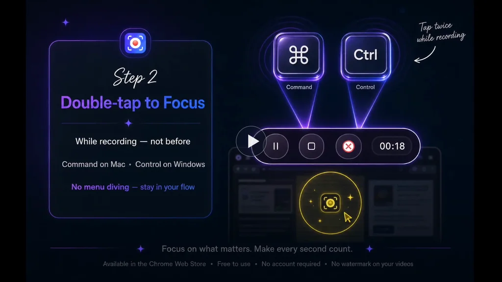
- Double-tap ⌘ (Mac) or Ctrl (Windows/Linux) to enter Focus Mode
- Click a UI element to spotlight it
- Select text to zoom in automatically
- Shift + drag to spotlight an area
No post-production arrows. No re-recording because viewers missed the control you meant.
What I shipped this week
I put together a narrated 60-second walkthrough on our site — the flow I wish every new user saw on day one:
https://recorder.showesome.com/watch/focus-mode-zoom
The lesson (for me, not a lecture)
Simple UI ≠ obvious product.
A minimal popup feels clean. It can also hide power features until someone files a support question or churns quietly.
We've been investing in interactive onboarding and short demos instead of adding more chrome to the popup. The goal isn't more buttons — it's showing the product while teaching it.
If you want to try it
Free Chrome extension, recordings stay on your device by default:
https://chromewebstore.google.com/detail/showesome-screen-recorder/edkbakgompfknhmbidmgmfbkgmdegjmk
Written tips: https://recorder.showesome.com/blog/focus-mode-tips
Building in public as a solo/small-team project. Happy to answer questions about Chrome extension recording, local-first storage, or tutorial UX.
What do you use to guide attention in screen recordings — editing after, or something during capture?

Simple UI makes everyone's life easier. We could use a tool like this, sharing it with my team to see how it performs.
Appreciate that 🙏 — and that’s exactly the use case I’m hoping it fits into.
If your team does try it, I’d be really curious what feels obvious vs what still needs explaining. That gap usually shows up fast once real workflows kick in.
Happy to hear how it performs in practice.
Hey,
A couple of feedback after testing it with my team.
1- Audio toggle could be bit smaller, it was odd and in result it got confusing what this toggle was about.
2- When I am on any other tab, there was no indication about the screen being recorded. Also, I would have appreciated fix hovering controls, not matter what I am browsing through.
3- The process to share which tab/window needs to be recorded could also be integrated on the setup menu instead of opening a new tab for it.
4- I used maxed out setting to record videos but I think the video quality could have been better.
That's all from my side, I hope this helps you in anyway possible.
Hey, thank you so much for taking the time to test Showesome with your team and share such detailed feedback! 🙌
This is genuinely really helpful, especially the specific points you mentioned. I’ll definitely keep these in mind and consider improvements around the audio toggle, recording indicator/controls, the tab/window selection flow, and video quality.
Really appreciate you trying it out and taking the time to write this up — feedback like this is super valuable while I’m improving the extension! 😊
The support ticket as a signal is an underrated concept. The scarier version is users who had the same question, didn't ask, and just stopped using the feature or quietly churned. You only hear from a fraction of confused users.
This is a pattern worth tracking deliberately: how many people hit a step in your onboarding, don't complete it, and never file a ticket? The gap between "feature exists" and "user successfully used the feature" is often invisible unless you instrument specifically for it — page load and click events don't capture whether the interaction actually resolved. Sounds like your walkthrough video is the right fix, but it's also worth watching whether new users who watch it have meaningfully different feature activation rates than those who don't.
That’s exactly the part that worries me most—the users who never reach out. Support tickets are helpful, but they’re probably just the visible tip of the iceberg.
I’m planning to track this more closely now. The walkthrough is one experiment, and I want to compare feature activation between users who watch it and those who don’t to see if it actually changes behavior. If it does, it’ll be a much better signal than just counting views.
The bigger takeaway for me is that shipping a feature isn’t the finish line—making sure people actually discover and use it is.
One of the most frustrating product lessons is discovering that a feature can be valuable and invisible at the same time.
Users usually don't complain about the feature they can't find. They complain about the outcome they can't achieve.
That’s such a good way to put it. In my case, nobody asked for “Focus Mode” specifically—they asked, “Can I zoom?” or “How do I highlight this button?” They were describing the outcome they wanted, not the feature they were looking for.
It definitely changed how I think about onboarding. Instead of explaining features, I’m trying to show people how to achieve the result they’re after.
What's interesting is that both of those requests sound like feature requests on the surface.
But they're really signs that users are trying to complete a job and getting stuck somewhere along the way.
Those two things can send product decisions in very different directions.
This hits home. I’ve watched you iterate on Showesome for a while, and the “can you zoom?” questions always felt like a UX signal, not a missing feature problem. The walkthrough makes the flow obvious in a way the popup never did — double-tap, pick color, then click/select/drag is way clearer once you see it once. Curious if you’ll track whether support tickets on Focus Mode drop after this ships. Nice work.
Really appreciate this — and yeah, you nailed it. The feature worked; the path didn’t.
I’m not tracking “tickets” in a strict sense yet, but I am watching whether Focus Mode questions drop in feedback and whether people actually find the guide/watch page. That’s the real test for me.
Thanks for being along for the ride while I figure out the balance between simple UI and obvious power.
This is a good reminder that feature discovery is part of the product, not just docs. I’ve had the same lesson with Kinetic Override: “macro recorder” is abstract, but “record taps/swipes, replay the loop, local profiles, no ads” tells Android users exactly where to look and why it matters.
That’s a great example. I think users naturally think in terms of outcomes, not feature names.
“Focus Mode” doesn’t immediately tell someone they can zoom into text or spotlight a button. Explaining the result instead of the implementation has been a big lesson for me, and I’m trying to reflect that more in the product and onboarding.
A feature users can't find doesn't exist. You don't have a capability gap, you have an activation gap, and that is actually the good news because the expensive work is already done. The 60-second walkthrough helps, but most people won't watch it, so don't make discoverability depend on them choosing to. Surface Focus Mode in context: the first time someone records, drop a one-line prompt "double-tap Ctrl to zoom" right where their attention already is. The other goldmine is sitting in your support inbox. Every "can you do X?" ticket where the answer is "yes, here's how" is a list of exactly what your onboarding should show on day one. You already ran that survey for free, so read it back.
I really like the way you framed it as an activation gap—that’s exactly how it feels in hindsight.
I agree that contextual discovery is probably the long-term answer. The walkthrough was the quickest thing I could ship, but the next step is surfacing Focus Mode at the moment someone is likely to need it instead of expecting them to go looking for it.
And you’re right about support tickets too. Looking back, every “Can you zoom?” question was basically users telling me what the onboarding was missing.
This resonates a lot. I’m building a local-first Mac asset manager, and we face the same 'simple ui vs. discoverability' hurdle.
The 'no post-production' angle is the real winner here. In a world of over-edited content, a tool that lets you guide attention during the flow is the definition of frictionless. Also, big respect for the local-first storage - keeping data on the device is a great trust-builder for pro users. Nice work on the shortcut implementation!