Using the "Coming Soon" Sidebar Hack to Build Anticipation 🚀
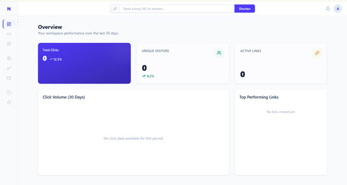
Continuing to build NanoURL in public! With the Spring Boot backend humming along, I shifted focus to the React frontend.
As a Senior SWE, I can write backend logic all day, but getting the UX right is always a fun challenge. I wanted the onboarding and link-creation process to feel premium.
Here are two UX wins I implemented this week:
-
The Seamless Modal: Instead of relying on easily-missed toast notifications, the "Create Link" modal smoothly transitions into a "Success State" component once the backend responds. It presents the new short link, a copy-to-clipboard button, and the generated QR code right in the center of the screen.
-
The "Coming Soon" Psychology: I haven't built the Billing, API Keys, or Workspace settings pages yet. Instead of hiding them, I put them in the sidebar but rendered them as disabled <div> tags with lower opacity and a softly pulsing "Soon" badge.
It makes the app look feature-rich from Day 1 and subtly communicates to early adopters that the platform is actively growing.
This is live check here :: https://nanourl.link/
Curious: What is your take on showing disabled "Coming Soon" features in your SaaS navigation? Does it build hype, or do you think it frustrates users who just want to click things?
