UX mistake #3: Radio-Buttons vs. Drop-Down 🧐
This is part of UX mistakes, a weekly newsletter.
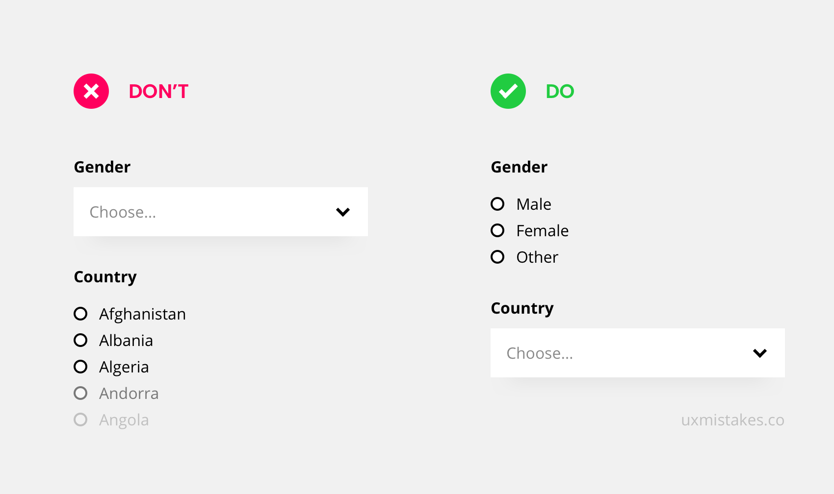
Radio-Buttons vs. Drop-Down
For single-answer-questions in a form, you can either place a drop-down or go with radio-buttons. A list of radio buttons shows all possible answers but can take a lot of space if the list is long.
Use Radio-buttons for a few options like the selection of gender. Use Drop-downs for many options like a selection of a country.
Take this action
Check your forms. Make sure to use radio-buttons for up to 4 options. With 5 or more options, it is often better to go with a drop-down.
Was this helpful? Something to add? Give an upvote or write a comment
👉 Subscribe to the UX mistakes newsletter
Trending on Indie Hackers
