⚡️ UX tip: How to design destructive actions (e.g. delete, turn off)
If the action is reversible
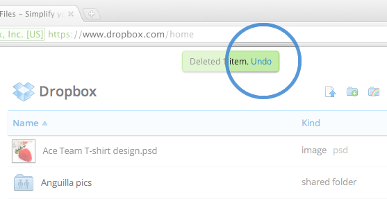
Just complete the action immediately and let the users undo it somehow.
Examples:
- Undo shortcut in MacOS - Cmd+Z
- Shake device to undo gesture in iOS
- Undo text link in toast in web apps
- Undo action in Snackbars in Android
If the action is NOT reversible
Is it VERY serious and will have a major impact?
Then throw an alert asking for confirmation in a very explicit way.

Is it less serious and won't have a major impact?
Throw a basic alert asking them to confirm.
Or make confirmation part of the UI interaction
Example #1: Turning off an iPhone - Slide to turn off

Example #2: Removing an app from MacOS dock - Hold for 2 seconds and release to remove

Example #3: Deleting an item from a list in iOS - Swipe all the way to delete

Get 1% better at UX every week
Subscribe to get notified when I publish new UX articles
Trending on Indie Hackers

In some products (more technical, archived, or code oriented) I find useful to add both the explicit alert and once they accepted another alert asking them to confirm.
Anyway, I usually like to add a trash can on that second step (for 48h) they can recover that, is like an external “undo” and they might need to add some external efforts to add that again if it was a big delete.
And even sometimes when there’re people involved in an action (shared folder or something like that). I like to add a confirmation to the other users or if the “admin” delete it at least sending an email to the other people involved with the “external undo” if they need to recover that.
Some nice tips here. Thanks for that!
Happy to help!
I actually think this is a bad tip — the user ends up forming a habit to mindlessly confirm after doing the delete action. In general, it's better to allow the user to undo: https://alistapart.com/article/neveruseawarning/
Obviously, that doesn't work for truly destructive actions. But when something can be easily and quickly reversed, like removing a dock icon or deleting a screenshot, just get out of their way and let them undo if they make a mistake!
I totally agree and I realised the way I described it is misleading. Undo is 100% a great UX practice and good to follow.
Also asking for confirmation is a great UX pattern but it depends on the context of use (for example how much impact can the deletion of an entity can have - e.g. delete github repo)
Now that I think about it again I feel the good / boring UX approach wasn't that good of an idea to present these 😅
Thanks a lot for the feedback! 🙏
P.S. Updated the article
Do you have any suggestions for how to do this in a typical web app? Obviously iOS-like touch interactions are not typical on a web app. Thanks!
The delete could be done by dragging a UI item and dropping in a "Trash bin" icon that shows up once you start dragging it.
For mobile web you can also copy the ones from iOS and replicate them.
I will try to search for some examples and will update the article if I find any :)
Thanks!
Maybe a toast notification with the option to undo last change? That's what I'm thinking of implementing in my app.
I think this is the most common practice, and I think it's ok, but I'm not a huge fan. I'm not sure if I can think of anything better though.
That's a good idea indeed - just delete the item and let them undo it if they want
These are some really interesting examples @jimzarkadas!
I'm thinking of creating couple of such new interactions for my product ruttl as well! You might wanna check them out!
Thanks! Will check it out
Cheers!
This comment was deleted 3 years ago.
Damn my bad that was a typo - fixed and updated it :)
This comment was deleted 3 years ago.
As I commented above to @jakelazaroff I will update the article cause the way I presented the ideas was finally misleading.
Undo and asking for confirmation are both great UX patterns. The parameters that defines which method to use are:
Thanks a lot for your feedback and will update it soon!
P.S. Updated the article