We Added 5+ New Shadcn Switch Components
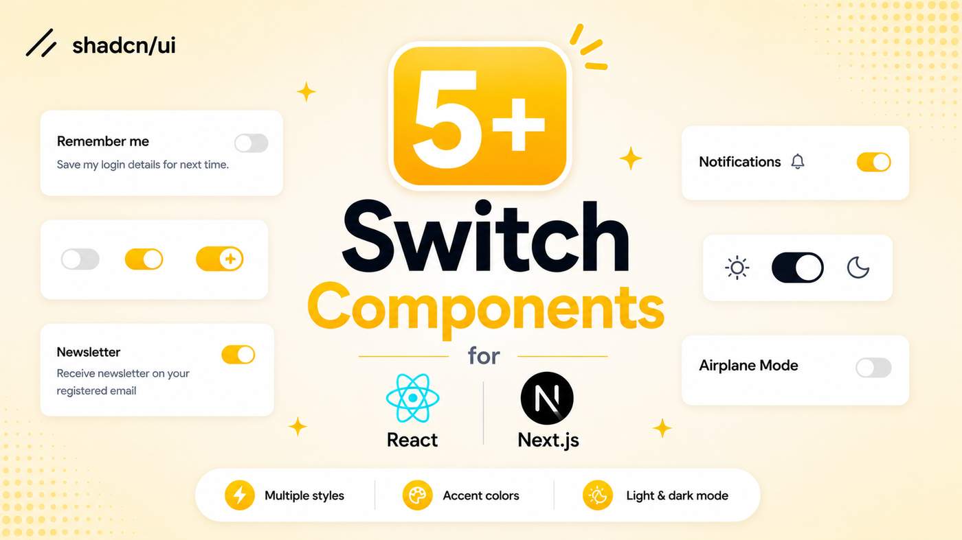
Explore our collection of Shadcn Switch Components featuring modern, interactive toggle switch variants built with React, Next.js, TypeScript, Tailwind CSS, Base UI, and Radix UI.
Here Are 5+ Types of Shadcn Switch Components Included
Switch Active Effect
A modern switch with a smooth active animation, perfect for settings pages and interactive controls.
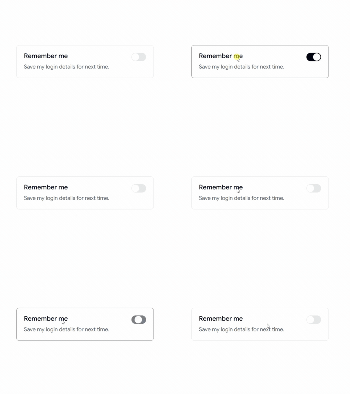
Switch With Icon
A switch featuring icons to clearly indicate enabled and disabled states.
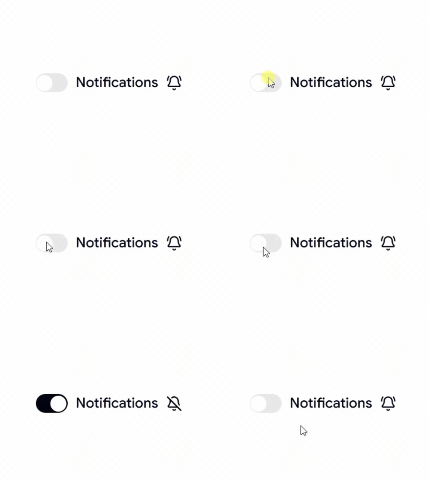
Switch Toggle Theme
A dark mode and light mode switch for modern websites and dashboards.
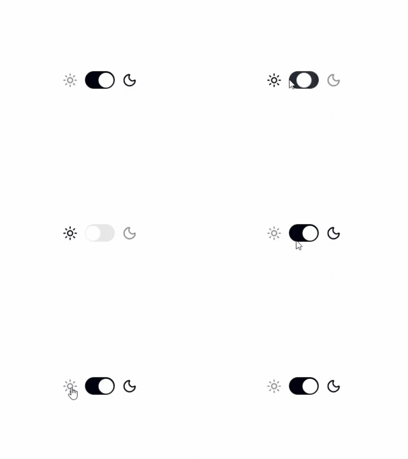
Switch With Description
A switch combined with descriptive text to provide additional context for each setting.

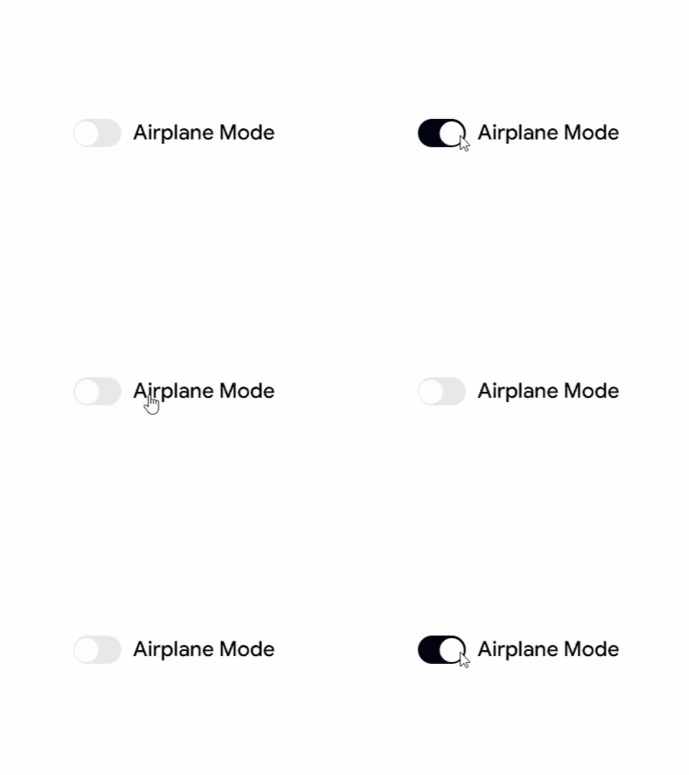
Switch With Label
A clean switch with labels, ideal for forms, preferences, and application settings.
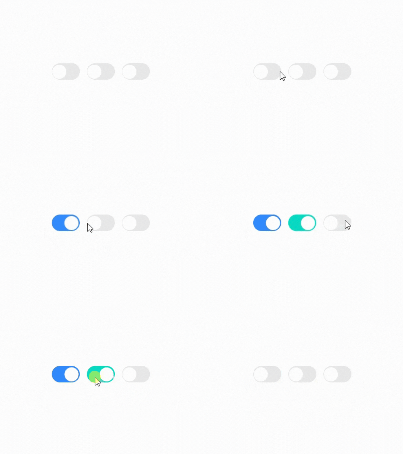
Switch Custom Colors
A customizable switch with different color variants to match your design system and branding.
Why Developers Use Shadcn Switch Components
Switch components provide a simple and intuitive way to enable or disable features, preferences, and settings without adding unnecessary complexity to the user interface.
Best For
React Applications
Next.js Projects
Shadcn UI Websites
SaaS Products
Admin Dashboards
User Settings Pages
Dark Mode Toggles
Feature Flags
Preference Panels
Modern Web Applications
Check out Shadcn Switch today

