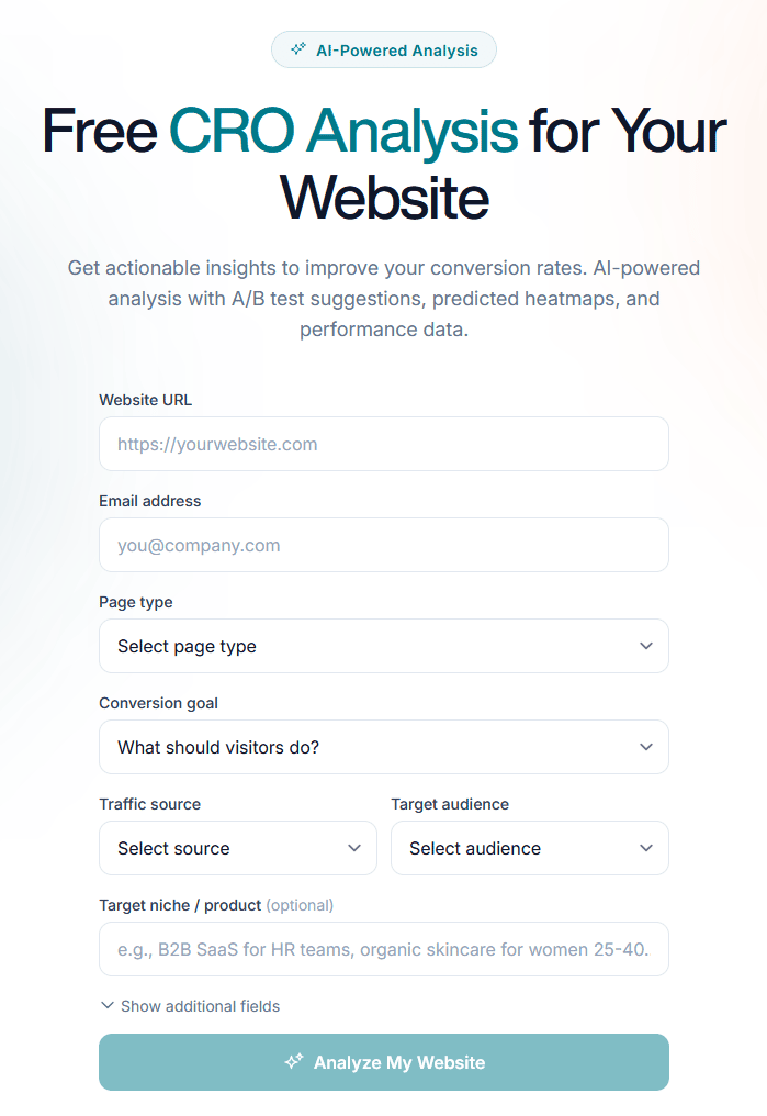
We built a free AI CRO tool that audits your landing page in 60 seconds
Ever wonder why visitors land on your page but don’t click "Buy" or "Sign Up"?
Usually, the answer is hidden in your copy, layout, or UX—but finding it takes hours of manual auditing. Not anymore. Let Spectry handle the heavy lifting for you.
We just launched an AI-powered CRO Analysis tool that gives you a comprehensive audit in under 60 seconds.
How it works:
- Drop your URL.
- Define your audience.
- Get a breakdown of conversion opportunities and actionable recommendations.
- Ask follow up questions.
Its 100% free, no sign up required.
Whether you're a founder, marketer, or designer, this is the quickest way to find the "leaks" in your funnel.
Try it out here: https://spectry.io/analyze


This looks interesting, and I got a peculiar "critical" note; maybe you can help explain the logic behind this. Here's what I got
Impact
The hero section features an email input field and a 'Sign up' button, implying an email capture or soft lead. However, the conversion goal is 'Sign Up/Create Account'. This creates friction and confusion for Small Business visitors from Organic Social, as they might expect a full account creation process or a clearer indication of the next step after submitting an email.
Recommendation
Replace the email input and 'Sign up' button with a single, prominent 'Create Free Account' or 'Sign Up Free' button that directly leads to the account creation form. Clearly communicate the immediate action.
I fail to see how a "sign up free" button is clearer than the current "sign up" (which is also accompanied by a help text of "Start with a free account - no credit card needed.")
Still, the other comments seemed more logical and worth checking out and A/B testing. Cheers!
I checked this further now. AI feedback did not hold up for this specific case. It was over applying general heuristic "email input in hero = potential ambiquity" without considering content next to input elements. I'll have this improved as fast as possible. Thank you again for the feedback!
Glad this helps!
Thanks for pointing this out, feedback like this is very valuable for us. Our tool still have rough edges and improvements are coming. I will check this out and tweak the reasoning logic.
Nice wedge. The most interesting bit to me is not “AI CRO audit” in general, it’s that you’re compressing the first diagnosis into 60 seconds with no signup friction.
A couple things I’d test next:
1. On the results screen, show one clearly ranked “fix this first” recommendation above the full list. Most founders don’t need 12 ideas, they need confidence about the next ship.
2. Add a tiny evidence strip under the score like “based on copy clarity / CTA hierarchy / trust / offer specificity” so the output feels less black-box.
3. Create a visible diff/progress angle for repeat users. A lot of value comes after the first scan, when someone changes the page and wants to know if it actually got better.
4. If false positives are a known early failure mode, say that openly and give users an easy “this was wrong” button. That honesty probably increases trust more than pretending the model is already perfect.
If helpful, I run very cheap manual landing-page teardowns for founders who want a human second opinion after the AI pass: https://roastmysite.io/go.php?src=external_manual_ih_spectry_croaudit_apr20_usd_presell_hv
the false positive AresE flagged is the failure mode every ai audit tool hits early. a static heuristic fires on a pattern without checking what's 3 lines around it. ive seen the exact same thing in code audits. model flags a security pattern in isolation and misses that the helper right next to it handles the validation. the multi-pass context check is where most of the actual quality lives. you thinking bigger context window or a second pass as the fix?
Strong angle: “60-second audit” is clear and appealing.
But careful: promising CRO without real context (data, traffic, behavior) can feel superficial.
To increase value:
Show real examples (before/after with impact)
Explain what powers the analysis (heuristics, benchmarks, etc.)
Prioritize output: not 20 tips, but 3 highest-impact changes
The real value isn’t just finding issues… it’s helping users decide what to fix first.
Love this — most CRO audits either cost $500+ or take 2 weeks, so a 60-second free version is genuinely useful for early-stage founders.
One thing I appreciate about the approach: asking the user to define the audience upfront. Most AI audit tools ignore this and give you generic "make your CTA bigger" advice that applies to nothing. The audience context is what turns it from a checklist into an actual diagnosis.
Two questions before I test it on a landing I've been staring at too long:
Does the tool account for landing pages in Spanish/Portuguese, or is the analysis optimized for English copy specifically? Conversion patterns differ across languages — translated CTAs that work in English often underperform in Spanish, and I haven't found a CRO tool yet that handles that well.
When you say "follow-up questions," how deep does that go? Can I push back on a recommendation and have it reconsider given more context, or is it one-shot analysis with clarifications?
Also curious about the underlying model — are you running a single pass with a prompt that includes CRO heuristics, or is it a multi-step pipeline where different "agents" audit different aspects (copy, layout, CTA hierarchy, trust signals)? Asked because I've been experimenting with agent pipelines for a different use case and the single-pass vs multi-step tradeoff is something I keep hitting.
I'd push back a bit - the audit time isn't the real bottleneck for most teams. The hard part is figuring out which fix to ship first when the list has 15 items on it.
60 second audits on landing pages is the format that actually gets founders to pay attention. The challenge we've seen on the Shopify side is that a static snapshot misses the moving parts. App changes, theme updates, new products pushing older code around. One scan shows you the state, but the value compounds when you can diff between scans and tell the founder what broke this week vs last week. Curious how you're thinking about returning users. Is Spectry a point-in-time tool or are you building toward continuous monitoring?
I like this. First of all, its a great way to grow your email list, I signed up right away. You give quite a bit of free advice without making someone pay to upgrade. My site, Podsplice dot com, got a 58/100. Some of the suggestions were not bad. But the top recommendation was,
"Hero Video vs. Static Image
high
If we replace the current hero background with a short, engaging video demonstrating the product's ease of use, then the Sign Up/Create Account rate will improve because small business users will quickly grasp the product's value and functionality visually."
The thing is, my site does have a video loop playing and it's not a static image. Also, I think the analysis should include uniqueness and an assessment of how it looks visually. So many new sites all look like it was obviously an AI vibe-coded site. Those would be ok, except for the fact that almost every site looks the same.
I'm curious what mark your site gets /100 if you run the test on your own site.
Great idea though, and I think a few tweaks could really improve it.
Excellent presentation 👏
The product feels polished and ready to scale.
We help digital products grow through creator partnerships and targeted campaigns 🚀
Would love to discuss opportunities.
This is actually a strong idea most founders know they have conversion issues but don’t know where to start. Curious, are you planning to go deeper into implementation fixes or just audits?
This looks really useful, especially for founders who don’t have time for manual audits.
One quick UX thought - tools like this are powerful, but a lot depends on how clearly the insights are prioritised for users. If everything is shown at once, it might become overwhelming instead of actionable.
Where did you get this idea?
This is a really interesting approach
Love the focus on speed here — most founders know something’s off in their funnel but never get around to actually diagnosing it.
Curious though — once someone identifies those ‘leaks’, how are you seeing them validate which fixes will actually move conversions vs just improving surface-level UX? That gap feels pretty real for early-stage builders.
I’ve been seeing some founders run small, high-intent experiments (fixed low entry, capped spots, strong upside) alongside tools like this to test what actually converts — surprisingly effective for turning insights into real revenue.
Feels like that layer could complement Spectry really well. Have you explored that?