We built a terminal-style SaaS UI on purpose. Here’s why.
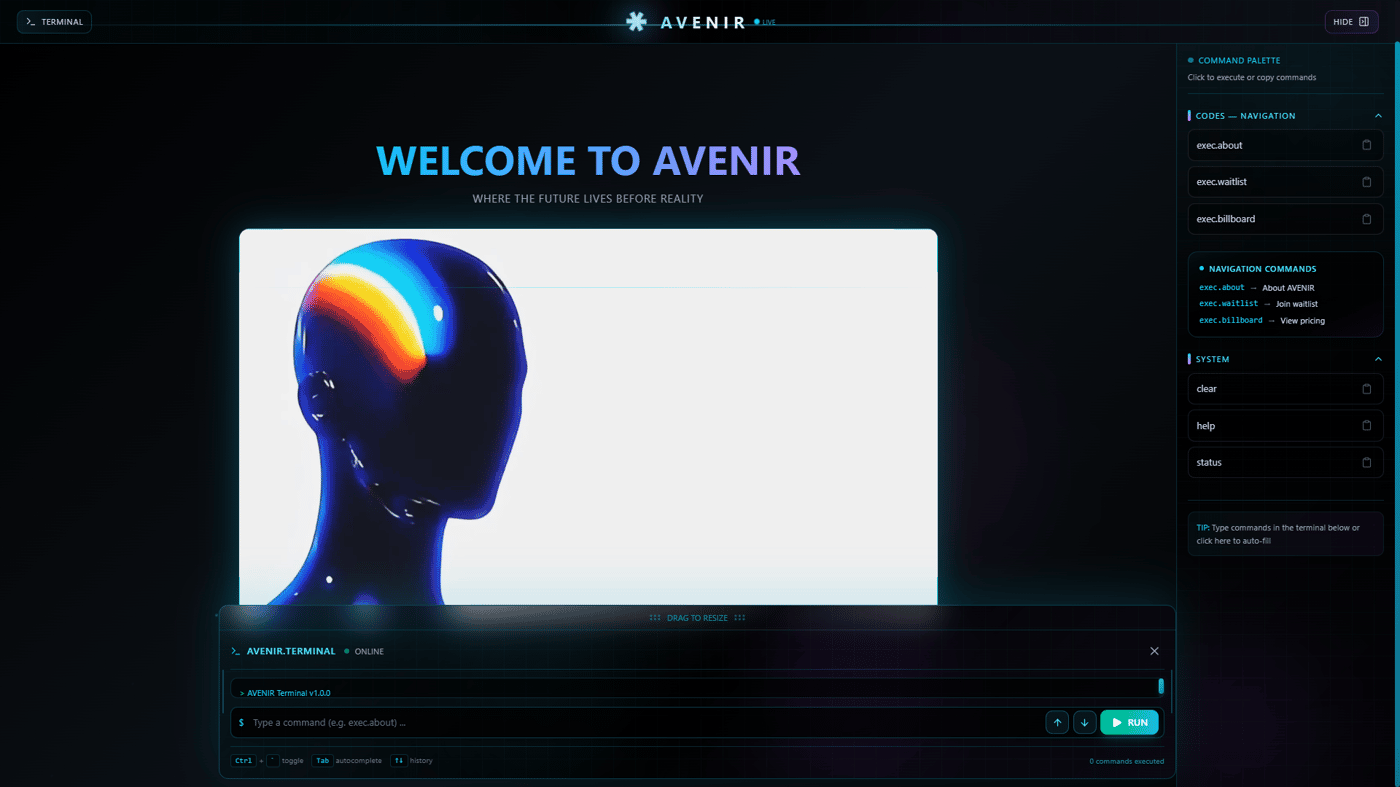
Avenir doesn’t look like most SaaS.
No landing-page fluff.
No “friendly gradients.”
No fake simplicity.
We chose terminal navigation because it reflects how builders actually think:
Direct
Intentional
No unnecessary layers
Every command exists for a reason.
Every screen forces clarity.
This isn’t nostalgia.
It’s a design filter.
If a product needs excessive explanation, it’s already broken.
Good products:
Expose intent immediately
Remove decision fatigue
Respect the user’s intelligence
That’s the same philosophy we apply to ideas themselves.
If your product vision can’t survive:
public exposure
minimal explanation
real scrutiny
…it probably shouldn’t exist yet.
You can explore the system here:
👉 https://avenir.reym.tech/
And ask yourself a harder question:
Does your product deserve attention — or are you designing around avoiding truth?


Love the look super sexy! Bold choices makes impacts.
This design philosophy is a user-centric product mindset, and it's an essential skill that developers must possess.
it's really cool man !