We rebuilt our on-boarding, because of mobile.
You don't really know, until you know.
We built our first iteration based on a lot of assumptions. One of them was that because we had a cyber-security related product, we thought office desktops would be our main source of traffic. Wrong. Mobile visits are double desktop visits, but conversions from mobile are lower than desktop.
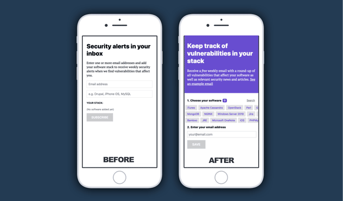
So, while we made sure that the mobile experience was useable, it was definitely not a top tier experience. You had to add your software stack by typing it in a search bar. Typing on mobile is horrible of course.
So we came up with a list of the most popular software that people have entered into the system and are likely to enter. We then made lots of buttons so people can just scroll through and select their stack without typing. Of course there is still a search if it's not in the list.
We are hoping this leads to more mobile conversions.

Mobile-first. As much as we want to think Google is just trying to control the Internet when they say, "We're focusing on mobile-first", there's a reason and that reason is likely backed by millions of users' data... pretty sure they are on to something!
It definitely looks nicer and more UI-friendly :)
Thanks! Yeah you’re right, which is why they are pushing AMP and PWAs hard I guess.
@trike Looks great and more usable. Have you tested putting email into its own step after the user selects the software of choice.
Hey mate, we had a think about that and thought an extra step might be another point of abandonment. But that’s something we could test. Do you think it would help?