We redesigned our dashboard… and now we’re not sure it was a good idea
We recently did a UI overhaul for Betterlytics (our open-source analytics tool).
It’s not live yet - we’ve been sharing it with users and gathering feedback first.
The result? Mixed responses.
Some people love the fresh look. Others prefer the “old but familiar” version. Some people find the previous version more visually appealing, while some find the new one more professional.
And a surprising number said they don’t really care, as long as the insights are accurate and fast.
A few takeaways so far:
UI polish matters less than we expected for an analytics-heavy product.
Changing base-theme and layouts feels riskier than just visual tweaks.
Early user feedback is brutally honest (and that’s a good thing).
We’re stuck between:
Shipping the redesign because we personally feel it’s better.
Iterating further and risk delaying forever.
Keeping the old UI and focusing only on features.
Curious if anyone else has been through this:
How do you decide when a redesign is “good enough” to ship?
Have you ever shipped a redesign and regretted it?
Would love to hear how other founders handled this.
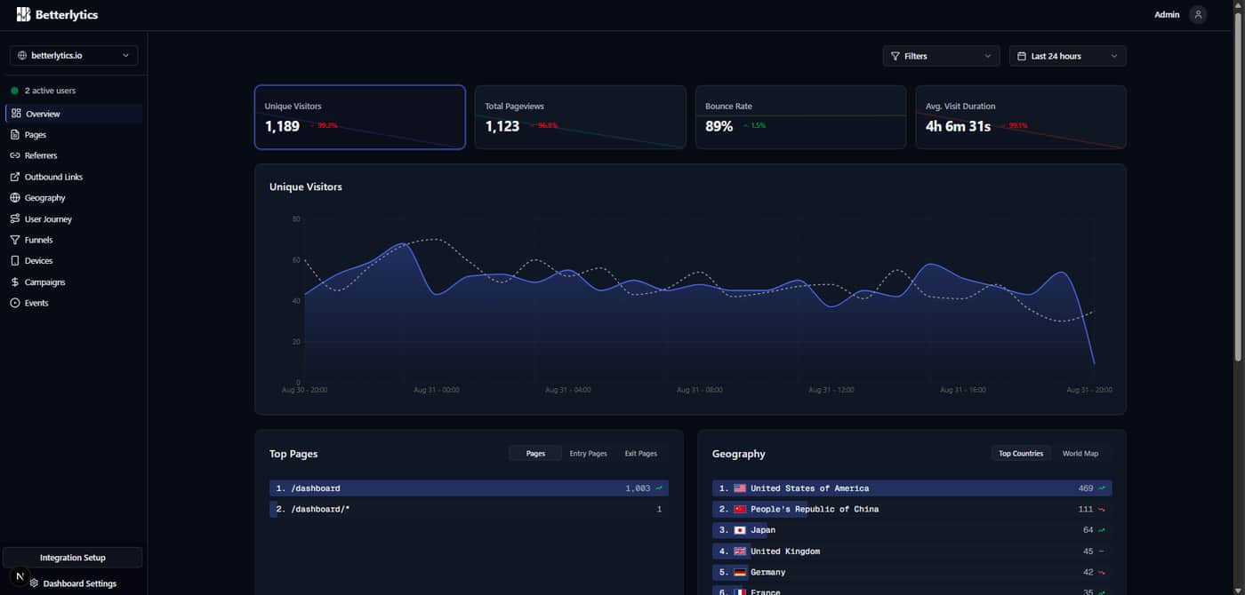
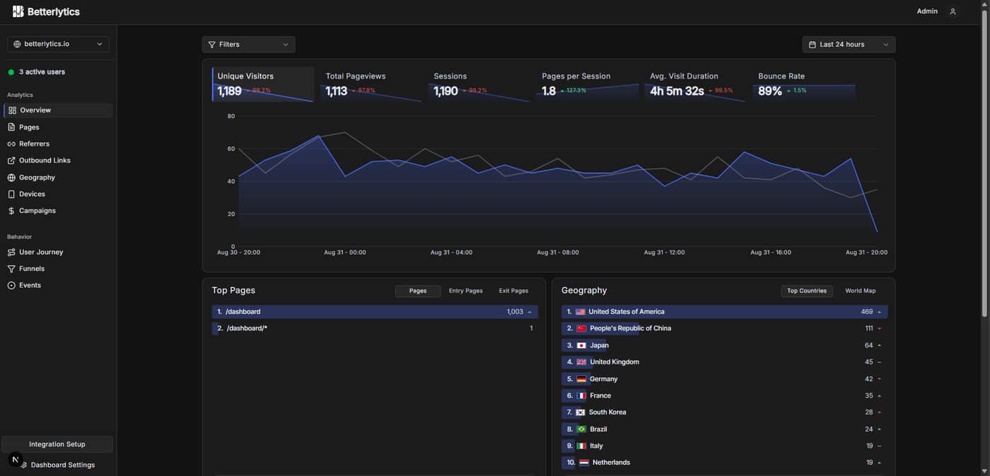
Here's the before and after of our UI overhaul:
Before:
After:


Yea this seems like one of those cases where overthinking can happen. I would keep the old design, slowly integrate any good parts of the new design. such as the brighter green dot. The older design has strengths, looks more readable .. but overall the changes should not lead to any delaying of shipping...
Agreed 👍 We even considered doing an A/B test just to get the new version out and see how people actually use it. That said, since we’re a larger team, we’re able to keep building other features in parallel while feedback comes in, so progress isn’t blocked either way!
There are merits to both designs, the left hand nav is clearer for the user on the after, but overall the before layout has a bit more and and feels friendlier and less cramped, I also prefer the shade of the boxes on the original and the deeper black/blue colour way, feels more polished. I see why you have moved the filter box to give it balance but it still makes more sense being next to the date filter.. If you wanted to fill the void you could have a small title in that space .. eg. overview . That being said these are small things and if you are overall happy with what you produced and are confident that it's for the greater good of the user, sometimes you just need to push forward.
Thank you for your feedback! We're continuously iterating the design while listening deeply to feedback.
Love the transparency here..
I personally like the new UI re-design!
Feel free to launch this on ProofStories as well to drive some additional traction - we also just launched a directory!
Thank you, much appreciated :)
The difference between the two UIs isn't tremendous, so I don't think you run the risk of shipping and frustrating existing users.
I like the additional metrics at the top of your new layout where you're now covering everything most people would want to see at a glance. The addition of the Behavior heading in your left column is good and makes the list more scannable.
As for users who find the old version more visually appealing, I am going to make a couple guesses as to why:
(1) The stats at the top are easier to read on the old version. In the new version, the brighter lines with gradients underneath make the numbers slightly harder to read. However, they do make the lines easier to "read" at a glance. Both versions work. The only question is whether you think users prioritize the values or the trendlines for easiest reading. Neither approach is a dealbreaker, and both look good.
(2) This might sound odd, but the curved trendlines on the old version probably read as "friendlier" to some users than the more jagged lines that go point-to-point.
Good luck! Both versions look great.
Thanks for feedback! All your points are great and will definitely be taken into consideration!
I’ve been through something similar. The truth is most users care way more about speed and clarity than design polish. In my case shipping the redesign and improving it later worked better than waiting forever. How much feedback is holding you back versus just preference noise?
We actually found the newer design more appealing ourselves, mainly because the old one felt overwhelmingly blue (blue background, blue-tinted cards/sidebar, blue primary, etc.). It started to feel blue-monotonous, so we tried to revise the scheme to highlight our primary color more intentionally.
That said, about 80% of the people we’ve spoken to still prefer the previous version and find it more visually appealing. That puts us in a tricky spot, we don’t want to ship something the majority of feedback is pushing back on. Right now we’re iterating based on all the input we’re getting, with the goal of landing on something that’s useful, intuitive, and visually appealing!
Very good question. I'm not a user and I like the old UI a little bit more. You will always have users who don't like UI changes, and that's okay. They will get used to it. In this case I would say it doesn't really matter which design to keep, they are both good. So rather keep focusing on developing real impacting improvements.
product build not vs product sustained