We updated the landing page. What do you think?
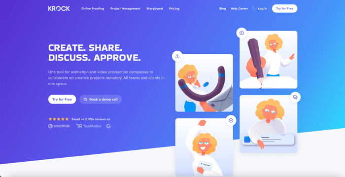
We've updated the landing page of http://Krock.io
What do you think?
#LandingPage #buildinpublic #uiuxdesign
We've updated the landing page of http://Krock.io
What do you think?
#LandingPage #buildinpublic #uiuxdesign

Overall, pretty nice looking page!
I find the cartoons a bit confusing - it took me a while to figure out the first one is a slingshot and I'm still not sure what it's meant to convey.
The help Ukraine footer is quite large - on my older 2nd monitor it takes up almost half the screen. Could you tighten it up (a bit shorter text, smaller heart image, cut out one of the buttons or make them smaller so it fits on one line) so it takes about half the height? That would make it more in line with what I've seen elsewhere. The paragraph about what your product does doesn't need to be in that banner (that's what the rest of the page is for!) and I think detracts from the help Ukraine message.
Thanks, we are going to replace characters with infographics.
Nice work, I like the colors that you're using! 😍
When I tried opening the website on my phone, it wasn’t immediately obvious to me that you could swipe to see more content for these sections:
Perhaps you could automatically advance to the next item on a timer? Pitch’s homepage has a good example of this if you’re looking for some inspiration. Alternatively, you could take the content out of the carousel and display it all vertically?