What can I do to improve my landing page?
Hello!
This is a side-project that I am working on. I had built the backend service to solve my own itch. Thought of launching this as a SaaS product after I learning about micro-SaaS.
One comment I have received is to add social proof, but I do not have a lot of customers now.
Does this page clearly communicate what it does?
If you are someone who can use this service, is there enough credibility that would prompt you to sign up?

Hey Prasanth, glad you're turning your tool into a micro SaaS. Good luck!
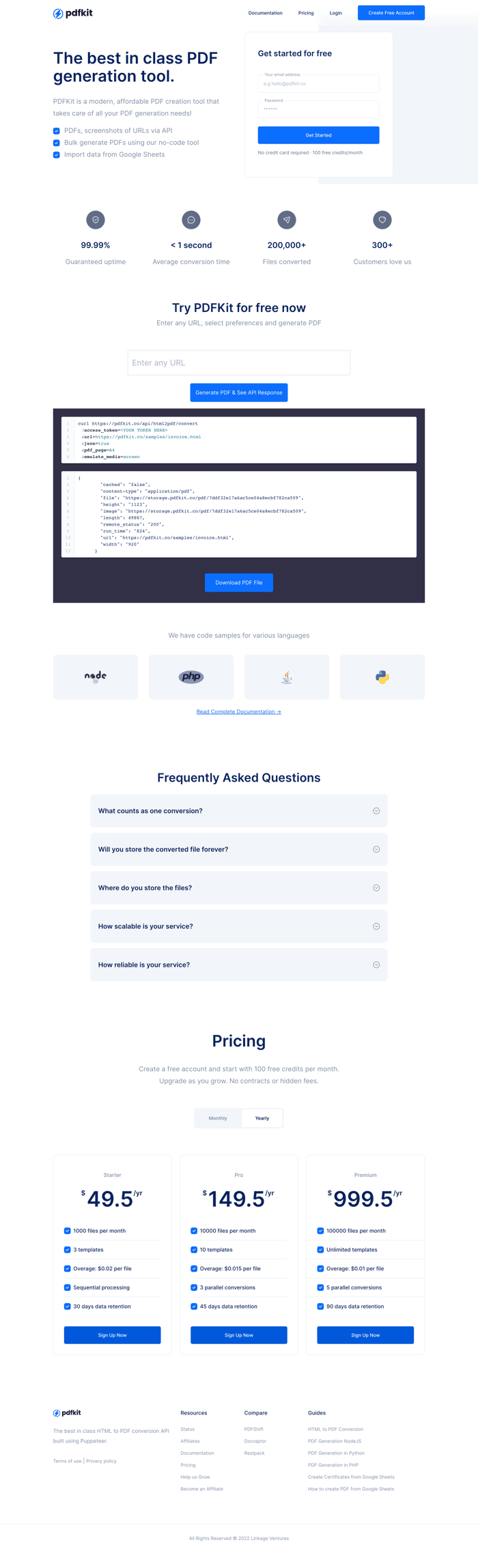
Some mandatory roast below. I will mainly focus on the banner section as it determines whether or not I'd scroll farther, and so far, I would not.
In the subtitle, instead of telling me it's modern and affordable, which are quite subjective, maybe tell me what it actually does.
The bullet points under the subtitle.. The first point "PDFs, screenshots of URLs..." really confuse me. Up until now I kind of thought I had an idea where this was going and here I am totally lost.
I don't know what that means, even though I am a developer who has programmatically generated PDF not once.
Bulk generate? What's the use case for this? If there's one, mention it. Sell the benefit (== solved problem) not a feature
Import data from Google Sheets.. Same as above I guess. I don't know what Google Sheets date has to do with PDF generation. Maybe it does. Show me.
In the sign up form on the right you say I get 100 free credits per month. I have no idea what these credits are. Is it too much? Is it too few? This is overly arbitrary. I don't even know what 1 credit costs.
Maybe say something like "Generate ~5 average sized PDFs / month for free"?
In the pricing section $ signs are too small. I first thought the prices were in a different currency.
Like the overall look, plain and simple. If you do want to spice things up a bit, I'd go with introducing a new color for the C2A buttons.
Like the name, simple and to the point.
That's it from me. Hope it helps.
If you want to roast me back, here you go: https://www.indiehackers.com/post/roast-my-landing-page-i-will-roast-yours-6b35f5f999
Fantastic feedback @mzrnsh ! I will incorporate these into my page right away.