What did the first version of your logo look like?
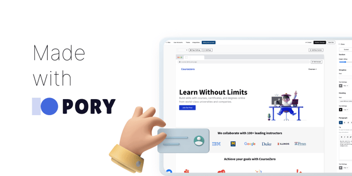
What happens when 2 engineers come together to try and design a logo? As you may have suspected for Pory, it was literally the "copy" icon. 🤣
We took another stab at redesigning it over the weekend into something that resonated more with our vision - Make software development accessible to everyone.
What are your thoughts on changing logos/colors into something unrecognisable? Am I overthinking things?
Most likely procrastinating from my endless list of todos. 😅
