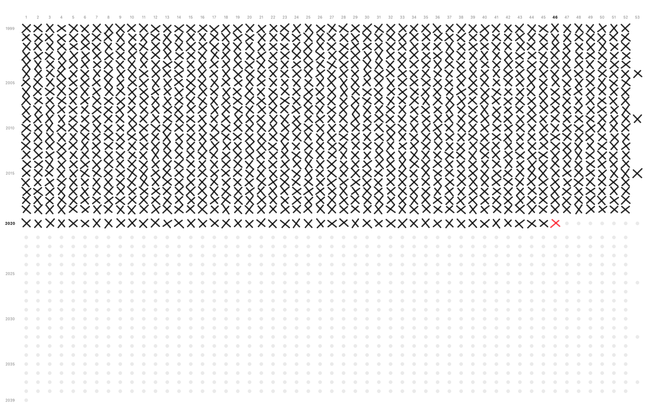
What do you think about my app? Heard about Tim Urban?
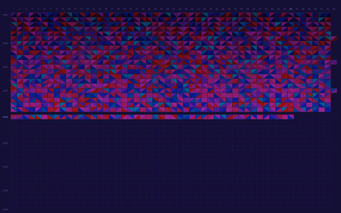
Hi, IH! As I’m trying to keep my promise – build in public and be active in the community – I'm sharing my idea of the app I'm working on. I'm looking forward to your feedback, please ask me anything if you have a question.
Procrastination
I have problems with procrastination, and a lot of people have it too. At times, I check applications that promise to fight procrastination and improve productivity.
But they don't work for me. I can't force myself to be a better me because of notifications and graphs showing my "progress".
I see a lot of people struggle here. Many don't want to acknowledge that a decision to be a better self is taken only by yourself. This decision is not taken by productivity apps either. But some things can help you reach this decision, for example a good metaphor.
Useful Desktop idea
For a while I had an idea – make your desktop useful, draw something more valuable than pictures on it.
I saw people putting site snapshots on their desktop before, but it only seems like another distraction for me.
I want something more dynamic and personal; something that doesn’t push you to anything is important too.
Metaphor: Your life in weeks
It resonated with me immediately when I stumbled upon Tim's post about procrastination - life in weeks calendar.
P.S. You should read his blog.
In short, a person who will live for 90 years has around 4,680 weeks. Each week is precious and you decide how to spend it. Each box on a calendar represents a week in your life. Seeing it helps you be more oriented and appreciate your time.

The metaphor of a life in weeks is embodied in a desktop calendar. Everything you can get from a poster on a wall plus all perks being drawn on a screen.
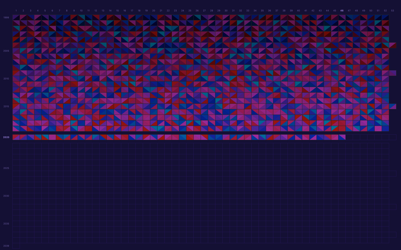
You can cross the calendar week by week, leave it empty as a good reminder about time, highlight important events, mood tracker, etc.
The calendar will be always in sight, even on the lock screen; no need to open and check the app.

The boxes can also be a reminder that life is forgiving. No matter what happens each week, you get a new fresh box to work with the next week.
– Tim Urban
Don't feel anxious about the finiteness of your life, embrace the time.
Product Page
Also I'm building a site prototype in Figma. It's super raw, so texts are clumsy.
Are you making the most of your weeks, fellow hackers? Will users understand the product from the site? What do you think?

I like this idea. In fact, I was ready to download it from just reading your post here when I saw the bright colored version screenshot. I procrastinate so this resonated with me. Then I realized it was just a protoype at the moment. Doh. Priced right I'd still buy it :)
I think the page design example needs work:
"Designed to help you stop procrastinating and motivate you to work on your goals, every day"
Let me know when you go live.
A silent update: I'm running a beta test right now, please check it out.
Oh, my language let me down. The app is already built actually. I was just trying to showcase what a landing page might be and validate the idea.
I'm going to post here to get some help with beta testing. Write me if you are OK to test it; I'll send you a test version.
Your points are great, I'll take them into account.
Some folks didn't notice that the link to Figma is actually a site prototype, just scroll it down, not horizontally
Looks interesting. Looks a bit busy. Hard to see what is happening. What do the different colors represent?
For now, it's just randomly generated colors; think of it as generative art. It would have been too boring If I had made them same. Some visual glitches could appear too.
The app has different themes