What do you think of our new website and tool?
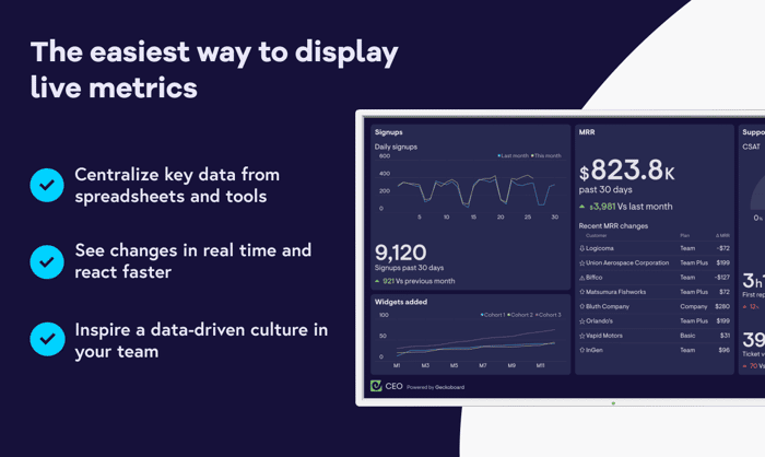
Looking forward to hearing your feedback on our new website and on the updated version of our TV dashboard tool.
Link to website: www.geckoboard.com
Looking forward to hearing your feedback on our new website and on the updated version of our TV dashboard tool.
Link to website: www.geckoboard.com

The website looks great ! I love the color palette, and the illustrations & icons look unique.
Here what I noted however :
This might also work better on a mobile considering that the images showing the dashboard look quite small on a mobile layout.
I hope this helps !
Cheers
Dhiksha
Dhiksha, thanks a lot for the feedback. You're right about the product video! We already working on the optimisation of the mobile version.
I'll keep this short. Illustrations are killer. Color palette is unique. And typography is on point. Well executed.
Thanks Brett!
Hey n! I like the handdrawn "metrics" background and the overall drawing style icons. The illustrations of people are superb as well! It's a really cool product too with flexible drag and drop!
I would have liked to see the actual TV frame or stand, as that makes it self-evident it is not a simple data analytics dasboard.
The value offerings of collecting data and visualization, and the easy way to get your monitor screen on TV.. Both are strong. But maybe TV screen one comes on the top since that seems like your primary offering?
Really good point regarding the TV frame!
I think the site looks nice. The colors and typography are on point. The Illustrations and blobs that highlight certain parts of the headlines look nice, but they seem to be pretty contrasted with the clean and tidy appearance of your actual product.
Do you ever find that people hesitate to throw up these charts because it actually makes them look like a failure? Do only really successful businesses like to use this sort of public display?
I guess I'm just thinking of a big screen in the middle of an open office somewhere, but I'm sure people also localize these dashboards to conference rooms and offices as well.
"Do you ever find that people hesitate to throw up these charts because it actually makes them look like a failure? Do only really successful businesses like to use this sort of public display?"
I see. I once worked on the UI for a dashboard like this at an agency I worked for. I think they wanted to promote more "fun" stats like "# of coffees drank."
This is one way of using a dashboard tool, but I think if you really want to improve your teams's performance you should also show them areas in which they aren't good.