What does IH think of our product/landing page?
Hey IH!
Hoping for some feedback on our new landing page (went live today) and product idea.
Our philosophy was to make onboarding as streamlined as possible, so we deviated slightly away from the traditional landing page approach.
Any thoughts, feedback or comment would be much appreciated.

My 2 cents -- I really liked the way the images flowed, but here is my take.
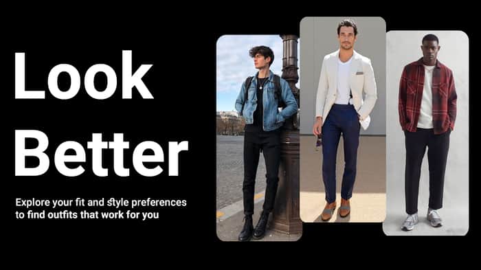
I did not understand what your product does from the hero section. I found that all the images were only for men, and I did not relate to it. So I was not convinced to go through the entire onboarding process.
I selected 5 styles within 3 rows, and I was wondering why the scrolling did not stop and what if I selected more than 5 styles.
hey there. Yes, we have debated internally whether to launch with both men and women, or just with one gender. We decided it'd be better to go the men approach for 2 reasons:
Thank you for the feedback on not understanding what the product does. We're going to create a demo product video and update the copy which will help the explanation.
Regarding the styles, you can pick minimum 5. Nothing really happens if you select more than 5 apart from the recommendations/personalisation having a little bit more information on what it is that you like
If the H1 says it's for men or women shopping for gifts for men then you will hit the right vibe.
So I love the onboarding experience. Super cool! However, the landing page needs better copy at the top. You need to explain first what the product does. That is missing. I didn't understand exactly what this product does until I went into the onboarding process. You get it when you go through the process.
A few more sections could be added explaining the process and how it works before they hop into selecting all the options they like.
If you want to talk more, I would love to chat. I work exclusively with early-stage SaaS startups on GTM. Happy to hop on a call and give some advice.
My contact info is here saasxsrb.com or in my profile.
Hi. Thank you for your thoughts. Seems to be common feedback that people don't understand what the product is doing, which is obviously incredibly valuable for us to know. We'll add a product video which should help people understand better than additional copy.
Wouldn't mind chatting, but since we're bootstrapping, funds be tight. Let me know if you'd be open to a different kind of arrangement.
A video would be very beneficial, just keep in mind that everyone consumes information in different mediums. Some love text, some love graphics, some love video.
I typically work with only bootstrapped founders, so I totally understand funds being tight. Let's setup an intro call and see how I could help.
One thing I noticed with the design at the top of the page is the waves don't go end to end for me. Not sure if that's intended but it does look a little off to me. (on desktop)
I did have one idea for a headline, "Find a Brand New Look in 90 seconds". You could of course change the 90 out for another number but the idea was to show how quick you could find a new look. In general when writing copy try to tell how your product will help people get from where they are now to where they want to be.
I think I saw someone else mention this but, I had to scroll down for a while to see all the styles, a carousel style layout might help here.
Best of luck with the product!
Hmm, they seem to be end to end to for me! Could you maybe send a screenshot, your screen dimensions, and OS/Browser information so I can test specifically for that?
Big fan of the time-bounding in the header. We had it on our old landing page, but decided to reduce the copy as much as possible for this version. Definitely worth adding it back in to A/B test.
Regarding scrolling down to see all the styles, just want to understand whether we're on the same page. It isn't a gallery -- it's part of the onboarding process itself. The point is for you pick a minimum of 5 to continue onboarding. Was that unclear for you?
Sure thing. I'm using 1920x1080 Firefox and windows 11, hope that helps.
The onboarding process made sense to me yes and I think what you have now works fine. Thinking about it more now the carousel idea probably wouldn't work the best on mobile so never mind that.
Hey @envy how did you build your website?
Next/React using Tailwind
"Select 5 or more outfits you like."
This part is beautiful and good sell,
After that you should continue with the same style and not move to a lifeless black and white survey.
"Look, Feel and
Dress Better.
Explore your style preferences to
find clothes that work for you."
This copy isn't very good.
IDK exactly what you do but some ideas:
Something that's powerful like that
That gallery in the middle is a turn-off, both bad implementation, bad pics, bad copy, not needed if you can power up point #1
Thank you for your feedback. Hope you don't mind me asking some followups.
A bit of context since the landing page didn't convey what we do effectively: we're a product that personalises & recommends outfits/looks to an individual. Then, users can search for items within that outfit and find items at the price point that works for them.
I've slightly updated the copy for the header and sub-header but kept it along the same lines we had. Imo the "Look and Dress Better" is a powerful value prop so valuable to hear that you didn't think it was so clear. Hoping that some other users share similar feedback so it can help us refine the landing page.
Regarding the gallery/carousel in the middle -- you're advocating for straight out removing it? Wouldn't that lead people to have less of an understanding of what we're building?
"Find your next look"?
Maybe I didn't pay attention, is this male focused?
When are men most likely to engage with this? If you have two specific marketing / traffic patterns you might want multiple landing pages changing that text.
I'm trying to push the text to a bigger outcome for the user vs semi official terminology your trying to use.
Honestly at the end of the day no one know what would convert better without a/b testing and if that changes drastically for different traffic sources/ demographics/whatever cut
You say "Select 5 or more" but after the first the button appears
If you have a full gamified process that is fun, easy, quick - selecting pictures that are relevant to the product itself I don't see the need to explain in further, I'd remove that carousel, the question is can you make the carousel be more impactful than the process itself? Should you? It's a distraction to the CTA and experience. Look if you carousel was awesome and the process is long and painful like it currently is, than invest in the carousel