What is my website missing?
Hi fellow hackers 👋
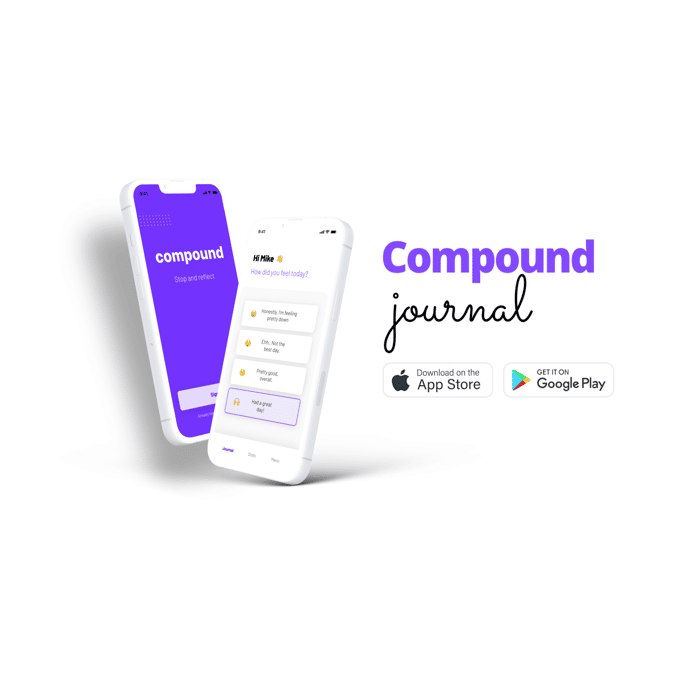
About a month ago we launched Compound Journal for iOS and Android. The app is designed to be an end-of-day journaling app that is quick and easy to use. At the time, I had thrown up a quick landing page with a few links to download the app. Nothing special, but it "got the job done..."
Fast forward a bit, we have recently crossed the 100 download mark! Now I'm starting to feel like the right thing to do is make the website a bit more ...professional?
So I figured I would see if I could get some feedback on the current landing page. What's missing? What should I add? Tips and tricks to create a more compelling landing page? Any feedback would be great :)
Oh, and of course, if you'd like to give me feedback on the app that would be AWESOME! You can sign up for a free 7 day trial.
Website: https://www.compoundjournal.com/

The primary problem is that the landing page doesn't tell me a lot about the product other than "it's a journal app," not what problems it is solving and how it's one-upping the other journaling apps.
For example, I am interested to see what is behind the "stats" tab of the app.
These are my quick 2 cents; always happy to help out. Contact info is on my profile! 🚀
Thanks for the feedback, Twan! I copied and pasted your comment in my figma file :)
Hey there! +1 to all of the earlier recommendations, especially about the lighthouse performance score, features and benefits. But I just want to add the 'About Us' on the task/menu bar (so people will have better idea of your history, mission, and vision.
And most importantly, the copy for the whole site - mainly for content and SEO purpose. My team and I at Instant Logo Design thought it's fine if we can simply launch with very few copy on the landing page, but later realized the need to add more, so search engines can easily read and identify our brand.
As others already mentioned, I would also highlight the benefits of your app or what makes your app unique compared to other journaling apps.
More screenshots would also be useful to showcase all the features your app offers (e.g. the stats screen). Maybe even a short video :)
Even on the App Store and on Google Play you show the sign-up screen as the first screenshot of your app. Personally, I don't think that this adds any value in promoting your app and would remove it from the stores and landing page and instead show screens/features that bring value to your users.
I hope this helps and wish you the best of luck!
your footer section needs more touch. cheers
List the rational benefits.
But most importantly;
What emotional benefits will people using your product gain?
Synthesize rational and emotional benefits.
-feeling better
-Having status
etc
Position it with emotional benefit. Differentiate from your competitors.
If you want to think in more detail, I suggest you read "cognitive biases".
Good luck.
I was checking out your landing page & app and I think your landing page is not convincing enough.
I use keep notes, notion for journaling & a diary to plan my day. Why should I buy a journaling app? What are some benefits are u offering? For me If an app could ask me questions like what I did in every hour and at the end of the day it could analyze my day and show me results like how many hours I worked, slept, read, wasted, took break and others thing then it will be really useful to me.
Best of luck. I hope you would build something useful.
I don’t know it’s mobile only, but when viewing the landing page the logo is displayed above every section and feels a bit repetitive. Maybe have like a “mood” picture above the headings so you accompany the segments with a feeling the user should acquire when viewing/reading every segment.
Do you have any paid user?
Neat website and really liked that 'compound journal' logo at the top, looks really well done.
Thanks!