What users secretly judge right after your hero section
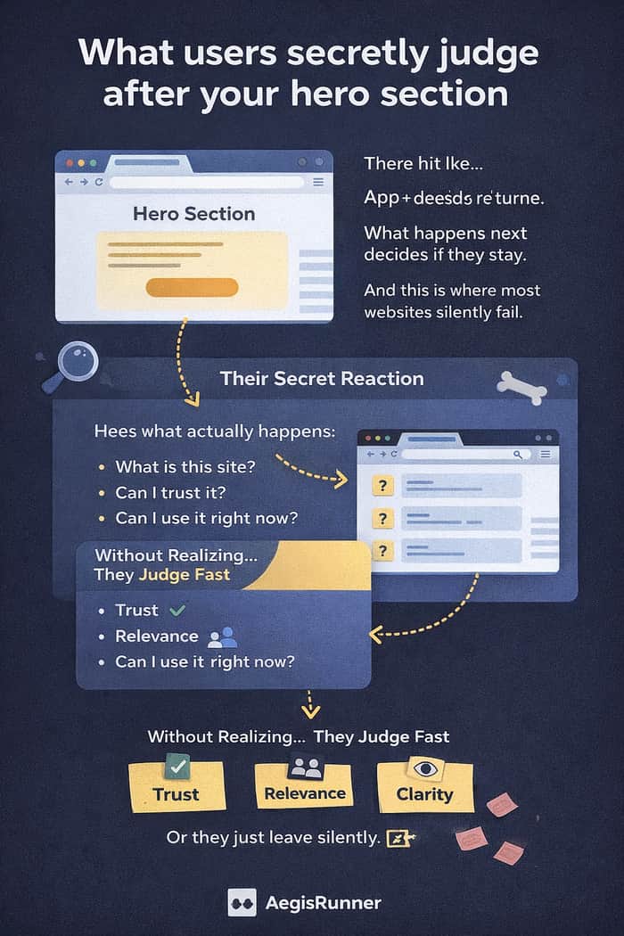
Hey IH 👋
For a long time, I believed the hero section was the most important part of a website.
But after watching real people use my tools site (AllInOneTools), I realized something uncomfortable:
The hero doesn’t decide if users stay.
It only decides if they scroll.
What happens next decides everything.
The silent 3-second judgment
Here’s what I started noticing:
A user lands on the site.
They glance at the hero.
They scroll once.
And then, almost instantly, they judge:
“Okay… but is this legit?”
Not consciously.
Not analytically.
Just instinct.
And that moment determines whether they continue or leave.
What users are actually looking for
They’re not reading paragraphs.
They’re scanning for quick confirmation:
- What exactly is this site?
- Is this for someone like me?
- Can I trust this?
- Can I use it immediately?
If those answers are clear → they stay.
If there’s hesitation → they leave.
Even if the tool itself is good.
The mistake I made on AllInOneTools
Originally, the section after my hero talked about:
- My idea
- My vision
- My thinking
It sounded good.
But it didn’t help the user.
Because users don’t care about your idea first.
They care about their task.
The simple change that made a difference
I stopped explaining.
I started confirming.
Instead of:
“Welcome to a powerful platform designed to improve productivity…”
I used:
Free browser-based tools for quick daily tasks. No login. No limits. No friction.
Same product.
Very different feeling.
It immediately answered their real question:
“Am I in the right place?”
The mental model I use now
I think of the homepage like this:
Hero section → Permission to start
Next section → Permission to stay
If the second section creates doubt, the session ends quietly.
No feedback.
No complaint.
Just exit.
What changed in how I build now
I used to design for explanation.
Now I design for reassurance.
Because clarity builds trust faster than storytelling.
Especially for simple tools.
Curious how others think about this
When you land on a new website and scroll past the hero…
What do you judge first?
- Clarity?
- Trust signals?
- Features?
- Design?
- Something else?
Would love to hear how other builders approach this.

Local Python scripts have a structural advantage in the current market: they're immune to the SaaS subscription backlash. No recurring costs, no vendor risk, no data concerns.
The positioning challenge is that 'script' sounds less polished than 'platform.' Worth double-down on the positioning: 'the tool you own, not the subscription you rent.'
I agree — the subscription fatigue is real. For simple tasks, people often just want a quick tool, not another product to manage.
For me,
I noticed while building AllInOneTools:
If users scroll past the hero and still feel even a little confused, they leave — silently.
When I changed that section to simply confirm
“Free browser-based tools. No login. No friction.”
engagement improved without adding any new features.
Clarity didn’t just explain the product.
It made people comfortable enough to continue.