What's New: Five essential UX/UI design tips
(from the latest issue of the Indie Hackers newsletter)
User-friendly, aesthetic interfaces take your product to the next level:
- Create visual uniformity, visual hierarchy, and user-friendly dropdowns. Also, be sure to design mobile interfaces for thumb-friendly touch.
- Offering an unlimited design, development, or marketing service can create a booming one-person business. Use the power of scarcity to grow.
- $3K in pre-sales in just a few days. Dan Mindru built a prototype, posted on X showing how it worked, then built the landing page.
Want to grow your business? Try running a promo in the Indie Hackers newsletter to get in front of nearly 70,000 founders. Use code NEW500 for $500 off an intro section ad.
Five Essential UX/UI Design Tips 🎨

I'm Chief Designer at Creative Tim, and am also launching my second UI/UX book, Roots of UI/UX Design.
I want to share five essential tips for creating beautiful, intuitive interfaces!
1. Use visual uniformity
Visual uniformity is the cornerstone of polished design. Identify a style that resonates with your target audience, and establish clear guidelines to maintain this consistency.
When incorporating stock imagery, it's vital to source from collections that align with your chosen style. This ensures uniformity in terms of style, color palettes, and well-balanced compositions across all your visuals.

2. Design cards using visual hierarchy
Visual hierarchy is key for directing user attention to essential information. Position critical content at the top of the card, and utilize typography, white space, and contrast to emphasize it.
Properly separate content areas that require visual distinction.

3. Create user-friendly dropdowns
Integrating a search function within the dropdown can improve the overall user experience.

The scrollbar serves the purpose of preventing an excessively long list, while also communicating to the user that multiple options are available. This approach helps users locate their desired option more efficiently, and speeds up the selection process.
When designing a dropdown, ensure that its content remains user-friendly. Implementing visual categories or employing dividers can enhance the user experience.

4. Design mobile interfaces for thumb-friendly touch
Design controls that are large enough to be comfortably tapped with a thumb. Smaller controls can frustrate users.
Buttons should be large enough to comfortably tap with a finger (typically 44 x 44 pixels or larger).

Leave enough space around buttons to prevent accidental taps on neighboring elements. Aim for a minimum spacing of 8-10 pixels between buttons.

5. Follow table best practices
To make sure your table presents data that is easy to read, comprehend, and compare, take into consideration the following alignment principles:
- Left-align textual data: Align textual data to the left to capitalize on the user's natural reading habit, which is from left to right.
- Right-align numeric data: Right-align numeric data to facilitate effective data comparison, improving readability.
- Center-align icons or badges: Maintain consistency in icon and badge alignment by center-aligning them, as they tend to be of similar size.

For more UI/UX tips, check out my new book! Use this code for an extra 10% off: book-indiehackers-10

Discuss this story.
In the News 📰

from the Growth Trends newsletter
🐝 LinkedIn highlights confusion around B2B buzzwords.
🚧 Three ways to uncover roadblocks in your website.
💲 Get $100 off an In the News section ad with code MINUS100.
📱 Google Play tightens up rules for Android app developers.
🎶 TikTok expands its Marketing Partners Program.
😁 How to sell anything to anybody.
Check out Growth Trends for more curated news items focused on user acquisition and new product ideas.
Trend Alert: Unlimited Services 📝

from the Trends.vc newsletter
Problem
Businesses need design, development, and marketing work done, without a complex buying process.
Solution
Unlimited services let businesses outsource tasks with a predictable price, scope, and timeframe.
Players
Unlimited services:
- Baked Design: Product and UX design by Nick.
- Stakeholders: Automation services for growing companies by Justin Watt.
- Video Husky: Video editing services by Justin Tan.
- UnlimitedAppDevelopment: Web and mobile app development.
- Phasma: Design for tech companies by Hermione Gogou.
Building and growing unlimited services
-
Build in public to earn trust, get early customers, and score feedback.
-
Reach out to prospects via social media, job boards, and referrals. It's easier to sell your services to someone who needs the job done.
-
Offer a demo call to learn more about prospects, and answer unique concerns.
-
Make it easy to sign up with one click, or under five minutes.
-
Use scarcity. Fear of missing out is a strong buying trigger.
-
Use lead magnets to get the contact details of your prospects.
-
Use recurring subscriptions to earn predictable revenue.
-
Offer a paid trial to make money while testing demand.
-
Let clients pay per quarter or year. They get a discount; you get a retainer.
Predictions
-
Traditional agencies will offer unlimited services to move to a more scalable business model.
-
We'll see niche B2B SaaS apps for running unlimited services. They will make it easier to manage clients and payments.
Haters
"Unlimited is misleading."
The "one request at a time" rule prevents scope creep. This makes it impossible to abuse the system.
"How to deal with the most demanding clients when the cost of service outweighs revenue?"
It may be that your services are not a good fit for the most demanding clients. Those who need a full-time professional may not be your ideal customer. There are clients who have small, occasional needs for your service. This is your gold mine.
"Unlimited revisions lead to bad quality. Why bother if we can revise?"
Poor execution will lead to churn and bad word-of-mouth. Unlimited requests and revisions are part of your value proposition, but the deciding factor is the quality of your services.
Links
- $2M+ ARR with Service Businesses: The thread for this report.
- Build a Report on "Unlimited" Services: The tweet behind this report.
- Position Your Agency for Growth: How to position your agency as an industry expert.
Related reports
More reports
Go here to get the Trends Pro report. It contains 200% more insights. You also get access to the entire back catalog and the next 52 Pro Reports.
Subscribe to Trends.vc for more.
Top Posts on Indie Hackers This Week 🌐
🔎 My SaaS SEO strategy. Posted by Caleb Fahlgren.
💸 We failed to raise funding in 2023. Posted by Andrian Valeanu.
💻 Who does Product Hunt work best for? Posted by Wyatt Feaster.
😔 The most experienced, least successful founder. Posted by Jord.
🚀 How do you promote your product pre-launch? Posted by Yuting Zhong.
👥 Approaching user onboarding. Posted by Amk.
Want a shout-out in next week's Best of Indie Hackers? Submit an article or link post on Indie Hackers whenever you come across something you think other indie hackers will enjoy.
Shipixen Blew Up on X and Brought in Pre-sales 🚢

by Dan Mindru
This year, I've launched five major products. None of them seemed to be able to grow enough to become my main gig...until I announced Shipixen, a landing page and blog generator.
How it started
I stitched together a prototype that required many manual steps, and posted about it on X. It blew up.
175K views later, I knew I was on to something. I had to move fast to come up with a name, make a landing page, and prepare a preorder link.
First marketing push
The funny thing about this product is that I could use it to build the landing page for itself.
I set out to build a landing page with it, and make sales. I came up with the name with the help of ChatGPT, and made a logo with DALL-E.
Then, I generated the landing page in five minutes, deployed, and started on the copy. A few hours later, I had the website ready.
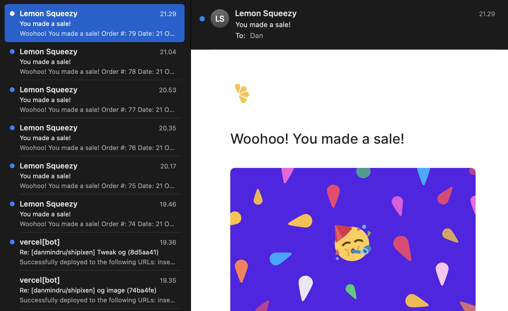
I posted on X again, and within the first five minutes, I had my first preorder.
That post got 125K views, and in less than 24 hours, it brought me $1K in pre-sales.
Second marketing push
In just a couple days, I had gotten 8K visitors, so I limited the preorder number.
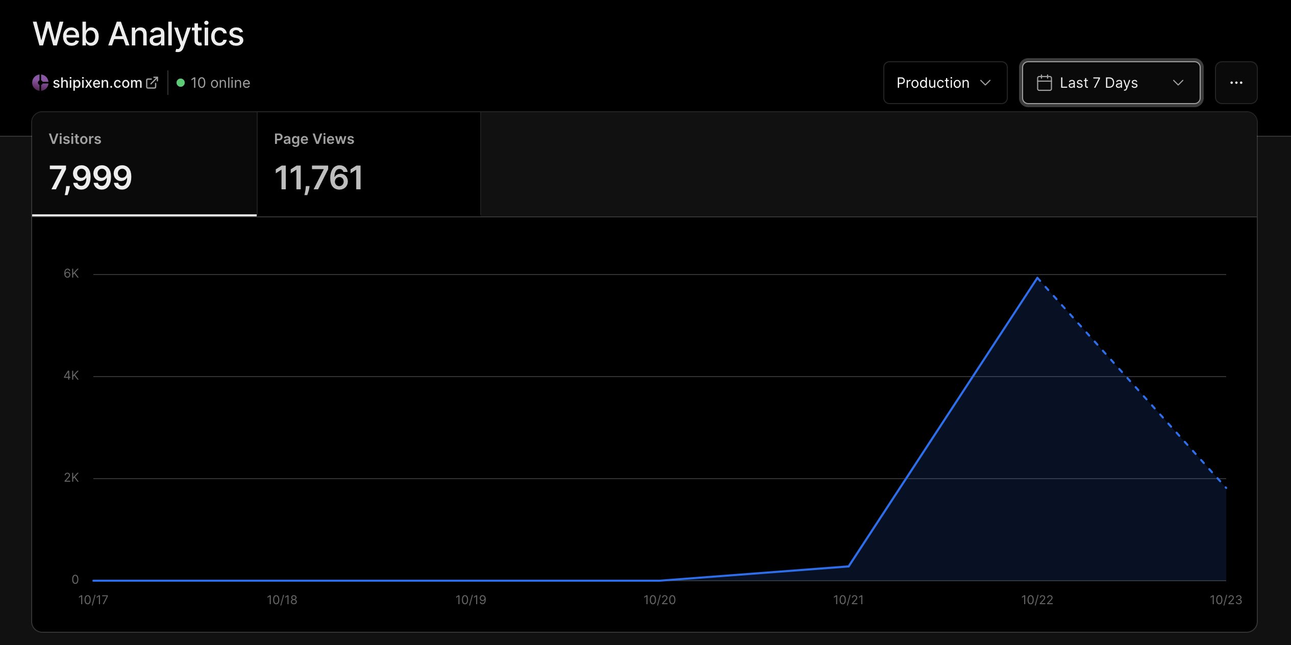
That further accelerated the number of orders. Then, I made a video showing how I built and deployed the initial Shipixen landing page and blog.
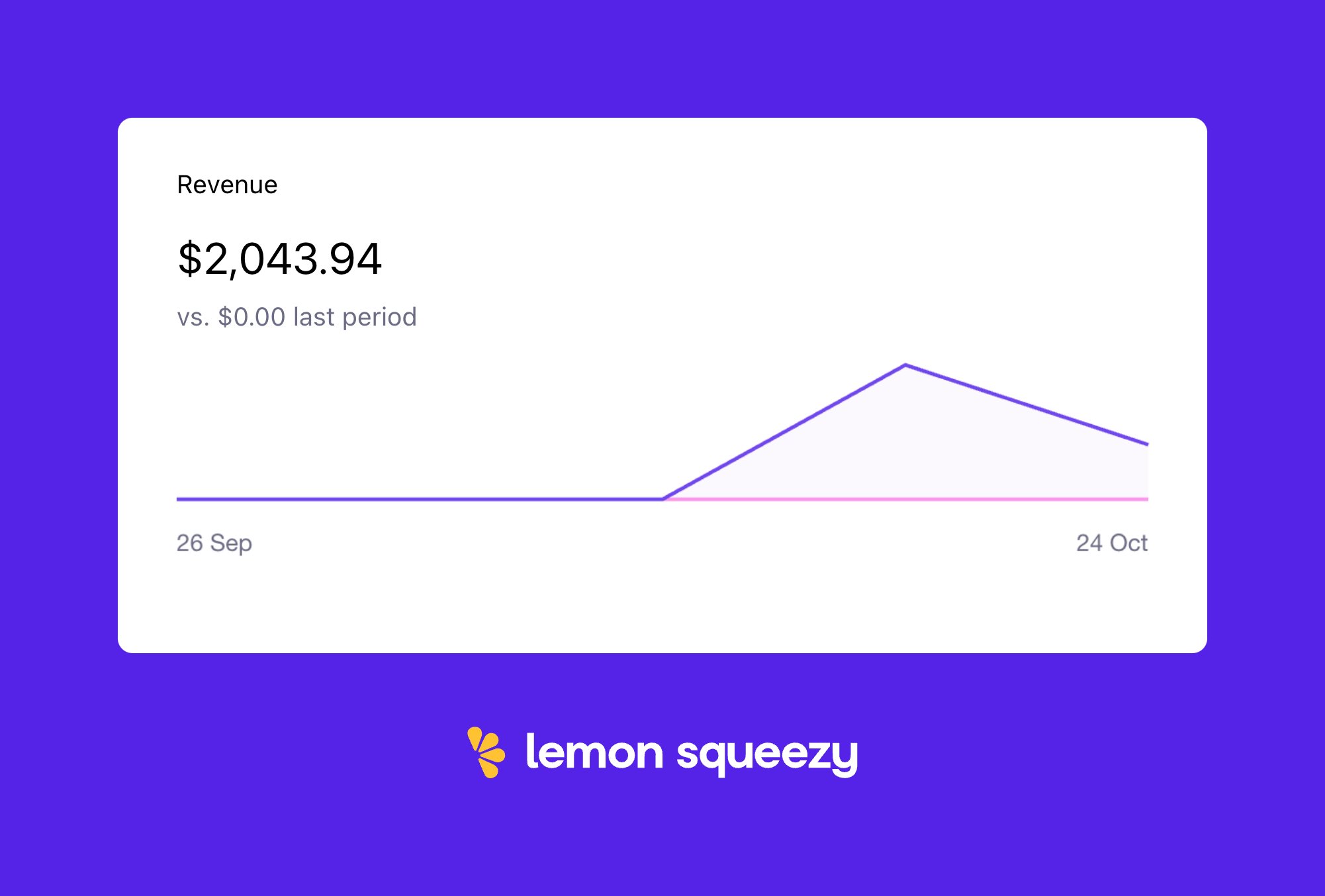
That post made it to 75K eyeballs, and ultimately got me to $2K in preorders just days after announcing.
Mistakes
After the 30th preorder, I increased the price by 20%. That took away some of the momentum. I believe that, even though the price increase made sense, I should have reduced the license duration instead.
It seems that $50 crossed a threshold for what many people were willing to pay to preorder. I could have kept it at $36, and reduced the license duration from one year to six months.
Also, my Vercel analytics exceeded the amount included in the Pro subscription, and I ended up paying $20. Probably could have avoided that.
Next steps
Soon after the preorders, I did a number of user interviews where I watched them use the app. Then, I made the beta available and collected even more feedback, which I implemented. I plan to launch Shipixen on Product Hunt in a week or two.
By the way, here are the other products I've launched this year!
- Clobbr: An app to load test APIs.
- Crontap: A SaaS to schedule API calls online.
- MRRArt: A web app to make ASCII charts that can be shared on SoMe.
- ContentPal: A SaaS to generate SEO content.
- Hunted.space: Product Hunt live stats that can support ads.
Discuss this story.
The Tweetmaster's Pick 🐦

I post the tweets indie hackers share the most. Here's today's pick:

Enjoy This Newsletter? 🏁
Forward it to a friend, and let them know they can subscribe here.
Also, you can submit a section for us to include in a future newsletter.
Special thanks to Jay Avery for editing this issue, to Gabriella Federico for the illustrations, and to Elisa Paduraru, Darko, Dru Riley, and Dan Mindru for contributing posts. —Channing

Loved it. Agree with the 5 tips. So easy, so powerful. Make your user's life easier. Thanks for sharing