Where would your call to action be?
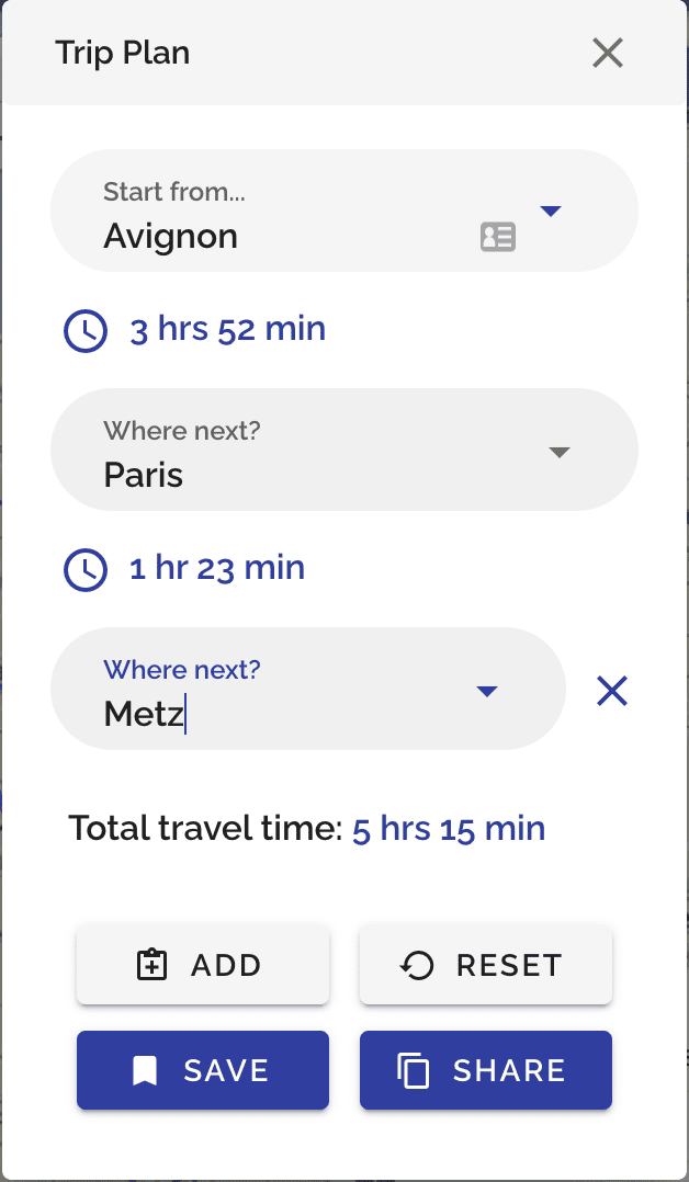
So I want to add a "Buy Tickets" button in the design above. If users click this button and make a purchase, I will gain an affiliate commission. However I also have other useful call to actions such as saving their journey in my DB for later, or sharing it with their friends.
I am wondering how to balance all of these considerations. I do not want the design to be too noisy or for the users to feel I am incentivising them to do the wrong thing.
Another thing to consider is that I could add other call to actions in the future, such as buying a hotel room or finding things to do during their journey. How can I therefore make this design 'scalable' in the future? Do I need a whole new screen for a new set of actions?

Sleek design, here's what I would do:
Get rid of the "reset" button. There's not many inputs, and there's no optional fields they would want to reset before submitting.
Move the "add" button to text only under the destination inputs. Say "Add stop" or "Add destination" to make it clear that's what they're adding. (If you must have a "reset" button, add "Reset form" right-aligned on the same line as "Add stop".)
Move "Save" and "Share" to a small white square button with a caret icon. This should pop open a list of any extra options you want to add.
Next to this square options button with a caret, make "Buy Tickets" 100% width minus the square and margin.
So, instead of two rows of 4 buttons, you'll have one row with a big "Buy Tickets" call to action, and a small options button. When you get to the point of adding hotel rooms and finding activities, you can add a 100% wide white button above labeled "Find".
That's some really nice advice, thanks!
I agree that they can achieve the reset by clicking the x button and removing the stops, so maybe it's not necessary. There is a little bit of 'hidden' functionality here though, in that it can allow the user to create a new trip without modifying the one they currently have saved. Maybe instead of it saying 'Reset', I can add a "New Trip" button to the same dropdown as the "Save" and "Share". This will protect that functionality and the copy encourages more interactions. What do you think?
Also in general having dropdown buttons absolutely makes it more scalable which is what I was worried about!
I think that will work great! Feel free to @ me if you have more questions or share your updates again, I'd love to see the changes.
I've done it! I can't find any functionality to add another image here so if you want to check it out you'll have to look in production :D
Here's a trip I just created. If you click on the clipboard in the top right you should see the form. Incidentally, i'm planning to integrate the form into the screen with the rest of the map i.e. near the bottom, but this still needs some figuring out.
https://trainspotter.co/trip/book-goofy-303
note: on desktop looks like there is a small bug with the menu overlap, but on mobile it should be fine.