Which new logo design do you like better?
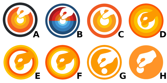
I've been working on a new logo design for Tipalink.com. Please leave a comment with the letter (A - H) corresponding to your top 3 in order (or upvote if the same response already exists). Thanks for the feedback!

H
Agree!
For the top row (A,B,C,D) I had no idea what the icon represents, it looked more like a sun/sunset.
E/F are interesting, but the outer circles are just clutter.
G is weird, it looks like a chicken leg stepping on a round Lego.
lol. how would you feel about G with the same hand/icon as H?
In my point of view, due to the white space between the hand and the coin (and also the size of the coin) the difference between them is (H)u(G)e.
In H the hand and coin look on the same plane, in G it looks like the hand is above the coin and that the coin is laying on a surface.
Once you see both of them it's easy to understand that G is also a hand, but seeing them at first sight (and also by seeing G first) made it a lot harder to understand the icons in G.
great feedback, i appreciate it!
G
I'd say G but the coin inside the hand like on H
The consensus is to stick with H. I'm leaning towards G with the hand from H.
H. The rest wouldn't look good very small (which is a requirement for any logo)
Great point
On logo design I always think about how it would look like in different situations. Such as B/W, favicon, print etc. With that said I think G, H is for the best for me. I personally would tend to a hand like in H with a circle around like G, I like the way the hand holds the coin (like in H) much better.
That's a really good point
H
Something to consider with any logo is how it scales to different sizes and prints in black and white. Most of the other logos have too many colors and the thinner lines probably won't look good when it gets smaller.
Also, this is what I would do. Feel free to take it if you like it.
https://www.dropbox.com/s/47kpeegajtxw8yv/tipalink-logo-maybe.png?dl=0
Thanks for sharing that! A tip jar is a good visual alternative to the hand. Something to think about...
I got the idea for the heart because my 5 year old has been playing Portal lately. It was so cute to watch him fall in love with a cube just like I did when I played the game for the first time :)
I went with a G/H hybrid: https://www.tipalink.com/. Thanks for all the feedback IH!!
For me its H
F or H
g/h
H
E , F, or D
H
G
Stuck on A & B
I vote for H.
I like B.
I'd say H, but looking through the website A seems like an option that would be consistent with what the brand seemingly feels like.
H
H
I would say H!
G, H, E
Probably H? It seems the simplest.
+1 for H, easy to stick on various color background with minimal changes
That's the existing logo, which I included for comparison! Indeed, the more I look at them, the more I prefer to keep it simple like H and G.
H. It seems like the others just have added noise.
That's what I've been thinking, too. H is the existing logo. I'm leaning more towards updating it to G, however, because I like how the it blends in the base of the hand. Thoughts? Thanks
H, G, B. I generally prefer flat/simple designs but I like the colors in B.
Seems to be the common thought. Thank you!
This comment was deleted 5 years ago
This comment was deleted 3 years ago
This comment was deleted 6 years ago