Which one looks better? Decisions are hard!
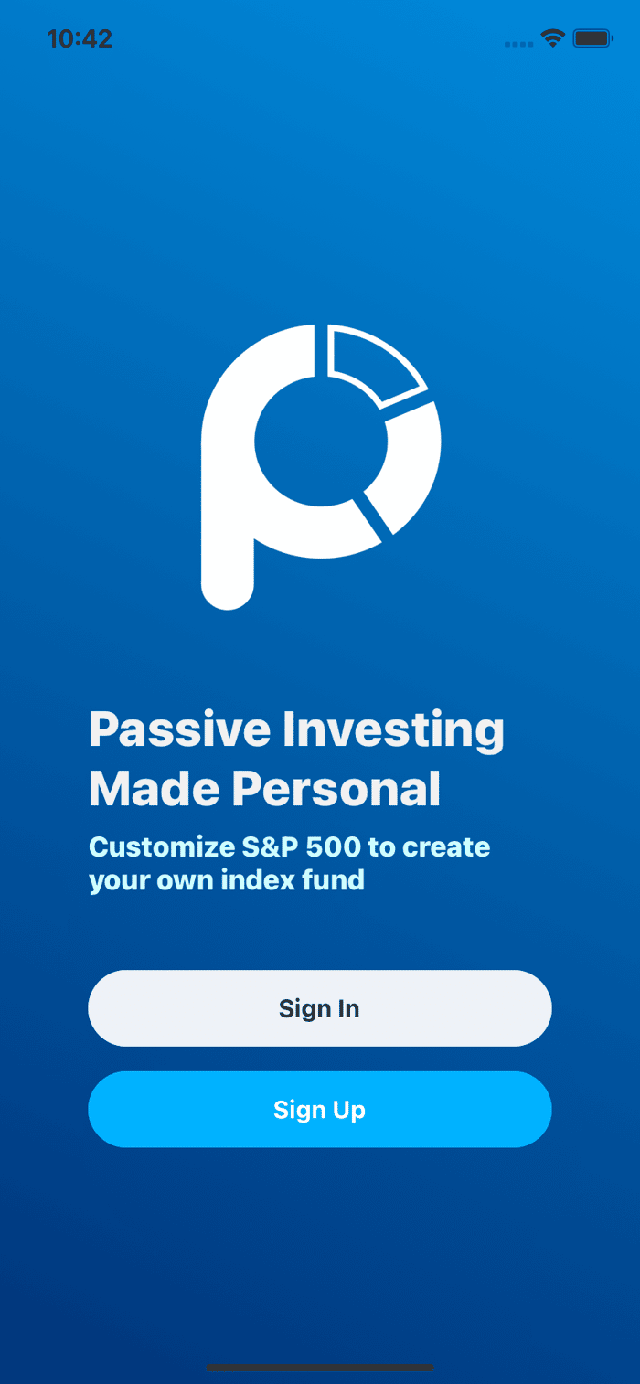
Hello! I'm working on the splash screen for my app and I can't decide which landing screen looks better.
How do you feel?
Hello! I'm working on the splash screen for my app and I can't decide which landing screen looks better.
How do you feel?

One thing I would consider changing is make the "Sign up" button the white one, because it jumps out more.
Also people (especially non-tech) could find the distinction between "Sing in" and "Sign up" quite confusing. I would suggest changing "Sign up" to "Create account" or "Get started".
Thanks! The "Sign Up" action is indeed more important here.
Good call on the button text too! I'll update the CTA!
In updating the CTA you might highlight how quick or easy it is to create an account.
This will reduce friction and increase conversions. Example: “Create an Account In Under 2 minutes” something along those lines.
Take the one that fits better to your brand. I can guarantee you that an A/B test would be inconclusive.
I agree with the earlier comments - the dark one feels more established and “financial” while the lighter one feels more playful. I think it depends on the type of customer you’re trying to attract. But they both look really nice from a design perspective!
Hey @SteveHan
Darker one has better readability. Readability is more important than playfulness or assumed color association.
The fact it looks like PayPal can go in your favor. People might subconsciously trust it more because it looks familiar.
This comment was deleted 5 years ago
I know right! It's so hard to pick. I'm inclined to the lively one since it's built for a younger generation of investors.
Now that you mentioned it. The darker one does feel like paypal. I've been thinking the lighter one feels like twitter 😂