Why does above-the-fold design w/o screenshot convert better?
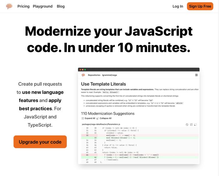
Earlier this month, I've added a screenshot to the above the fold section of my landing page. I thought this was a no-brainer - but in the next week my conversion rate to the signup page was suddenly close to 0.
In the last days I ran the following A/B test (50% split):
With screenshot vs without screenshot (mobile & desktop images attached).
To my surprise (p-value < .1), the version without screenshot performed much better (~50% conversion vs < 10% conversion).
While the results are pretty clear, I don't understand why this is the case.
Do you have any ideas what might be going on?

We can guess, but I don't think anybody can know for sure. Even a simple change like this has so much of a ripple effect on the user's whole experience.
Maybe it's the reduced cognitive load as @hatkyinc said.
Perhaps it's because the new layout moved the social proof above the fold.
Maybe the screenshot gave too much away and visitors weren't curious enough to scroll down and read the rest of the sales copy.
etc.
It would be interesting to see some more metrics for the A/B variants (time on site, how far people scrolled before bouncing etc.), but I think I'd be inclined to just pick the high-converting layout and move on to the next split test without trying to second-guess why it worked. 😊
Totally! I was looking for ideas on what could be the causes, so I can design the next experiments, and this discussion was super valuable to me.
Absolutely! And I didn't mean to imply that it wasn't worth thinking about in more detail, just that I don't think we will ever really know the answer 😊
Visual clutter, Cognitive load, small and a lot of text...
It's not a good screenshot to pass the message
Some thing are easier to screenshot than others
Good point - the application is pretty technical, it could be that screenshots are not the best approach and illustrations would work better.
This screenshot isn't a good choice, in my opinion. It doesn't help me to look more into the product. Maybe if you change it to a simple illustration or video to showcase the core features, that might be better. And the screenshot isn't the only problem. The hierarchy of the entire header is a mess. Use two columns layout, align text to the left. Grammarly's above the fold is a good example of what I'm talking https://www.grammarly.com
Thanks for sharing the grammarly example - there animation is a great alternative to complex screenshots.
I think in this case, the image takes away from the messaging instead of enhancing it. Images draw attention and are often the first thing people look at. This particular image also doesn't direct attention to the headline. Since it's a screen shot with mostly text, it leads people down instead.
Interesting - what kind of image would draw the attention to the headline?
Arrows are the most obvious directional cues, although those most often point to the form or CTA.
If you use images of people, their gaze can direct people to a certain area. Here's a couple of images from an eye tracking heat map that demonstrates this.
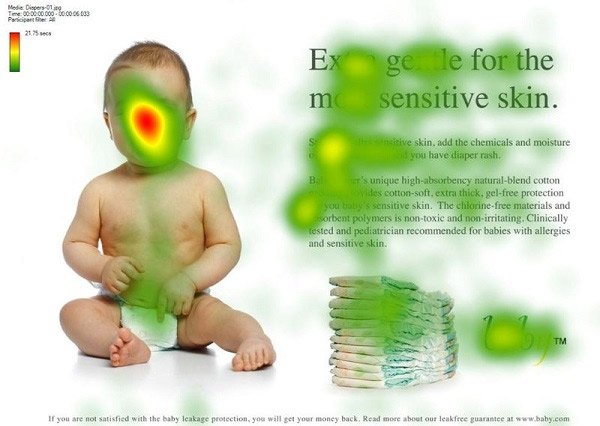
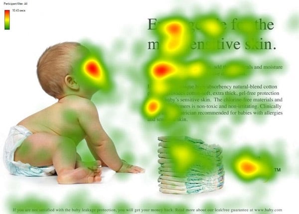
This could really work for anything that has movement. Let's say you had a car or plane, for example, you would want that pointing to the text instead of off the page.
Sometimes something as simple as lines, coloring or angles can direct attention where you want.
Obviously, some of these wouldn't make sense for your page unless you built a concept around it, but some might work. The best way to know for sure is to test.
Ah I see - I have some illustrations with the robot that fit that concept, but I chose to go for showing the tool instead, since it's a software product.
Are you still using that picture on the page? just in a different location? Or are you going to replace it with another?
Side note: what are you using for the AB testing?
I haven't changed it out yet. I rolled my own small A/B testing solution (bc I needed a cookie-free/privacy preserving solution for GDPR and didn't feel like spending a lot of money on launch darkly yet).
Ahh gotcha. How are you doing the AB testing without the cookies? Is it persistent between the user browsing away from your site then coming back? Or does it just pick a different one based on the page load and a random number or something?
It's random when you reload the page. I know that's a downside, but everything else requires tracking which falls under GDPR. And weighting randomizing on page load against a cookie/consent banner, it's a price I'm ok to pay (but I acknowledge it can affect the experiments to some degree).
Yeah that GDPR will getcha! Hahaha I've been recently looking into different options for accomplishing something like this that still would be GDPR compliant. Thinking maybe something around sessions like what PHP has. But it seems like PHP sessions are based in some amount of a cookie, but storing some more of the data on the server itself.
The other possible option that I found is doing some sort of hashing mechanism of the user's IP, their user agent, and maybe some other piece of information to create a unique identifier for that individual. But I I'm not sure if that would fall under DMCA or not.
Haha I've looked into those options as well - like you said, tracking sessions is like a cookie. The EU GDPR directive just mentions storing information on the client and retrieving it - doesn't matter if it's cookies, browser storage, session tracking hashes or any thing else. So I ruled that option out for me.
Regarding fingerprinting, even tho it might be borderline, it's still tracking in my books, and I found out that a) Apple is cracking down on it by e.g. removing detailed browser versions, and b) retrieving the IP on the client would require a server call, which delays rendering and has UI impact.
This comment was deleted 5 years ago
I think the opposite. modernizing sounds great, but the screenshot's content shows a simple rule. "template literals instead of string concat" people probably think "oh is that it?"
the screenshot itself is probably a good idea, it's just that this one specifically didn't work. I'd try a better example and instead a git diff, side-by-side comparison, showing some more features from average code to 10x code.
Hm that also makes sense. Maybe I'll run a few more experiments with different screenshots / images vs the no-screenshot baseline.
Interesting - makes sense to me. Maybe a screenshot is not ideal for that part of the landing page.