Why I Ditched Generic Templates for a Custom "Dark Slate" Glassmorphism UIThe Reality
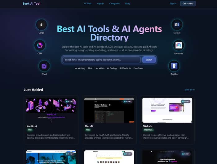
Today was all about visual identity. I spent 8 hours stripping out standard Tailwind components from https://seekaitool.com/ to build a custom interface that actually feels like the "future of AI" rather than another cookie-cutter directory.
The Deep Dive
Most AI tool aggregators look like spreadsheets from 2014. If I’m building a premium discovery engine, the vibe needs to match the tech. I settled on a Dark Slate (hex: #0f172a) base combined with Glassmorphism for the tool cards.
The challenge? Readability vs. Aesthetics. Pure frosted glass often fails WCAG accessibility standards. I had to engineer a multi-layered approach:
The Backdrop: A subtle mesh gradient moving at 0.05x speed.
The Card: backdrop-blur-md mixed with a 1px border at 10% opacity white to catch the "edge light."
The Interaction: A neon glow effect on hover that pulls the primary brand color from the tool’s favicon using framer-motion.
Here’s the CSS logic for the card container:
.glass-card {
  background: rgba(255, 255, 255, 0.03);
  backdrop-filter: blur(12px);
  border: 1px solid rgba(255, 255, 255, 0.1);
  transition: box-shadow 0.3s ease;
}

.glass-card:hover {
  box-shadow: 0 0 20px rgba(var(--brand-rgb), 0.4);
  border: 1px solid rgba(var(--brand-rgb), 0.6);
}
It’s subtle, but it makes the tools on https://seekaitool.com/ feel like they are floating in a 3D space rather than stuck on a flat grid.
The Ask
For those of you building in Dark Mode: how are you balancing "cool" aesthetics with long-term eye strain? Do you stick to pure blacks (#000) or find that deep navy/slate grays provide a better UX for heavy reading?
