Why is my Landing page not converting?
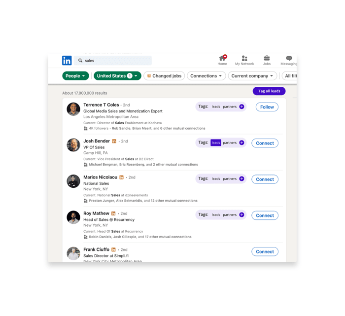
I'm the founder of SnapLead, a tool designed to help businesses efficiently tag and manage leads on LinkedIn. Check it out here: SnapLead Landing Page.
Despite seeing traffic, my conversion rates aren't great. I would really value your feedback on a few points:
- Design and User Experience: Does the layout make you want to engage?
- Messaging: Is the purpose of the product immediately clear?
- CTAs: Are the calls to action compelling?
- Product Value: Can you see the value in this product for businesses?
Any insights you can provide would be hugely helpful!

That's very helpful, thank you. I'm updating it now.
I built a tool for exactly this kind of problem called ConvertScope — it generates a scored clarity report showing what's hurting your conversions and how to fix it. I'm in early testing and looking for feedback, happy to share access if you want to try it.
your tool seems cool. but the landing page needs a retouch.
The purpose of the product is not immediately clear from the headlines and subheadline.
Great LinkedIn lead tool, but conversions stall without a quick hook.
Quick fixes:
Punch up the tagline to "Tag & Organize LinkedIn Leads in Seconds, Without Leaving the Platform." Add a 3-step "How It Works" (1. Install extension, 2. Tag on the fly, 3. Export/CRM integrate). Anchor pricing mid-page to nix cost questions. Catch bounces with exit-intent chat auto-answering FAQs like "HubSpot integration?" or "Vs. LinkedIn native?"
My AI platform for small biz: Automates lead gen (LinkedIn+), appointment booking, CRM, and voice/chat bots—turns your tagged leads into auto-booked calls/nurtures, saving time and boosting sales via personalized interactions.
Done this for 20+ bootstrappers; a 7-day A/B could 2-3x clicks/trials. Want a tailored 1-pager mockup?
Hit me up
It's a bit short. You can apply clichés.
Hi Stephen,
So I would say try to show how would someone do the same without using your product and then show them how much easier, faster and organised it is if they use your product.
Emphasise the problem, so they can emotionally relate to it.
All in all, I would say try to incorporate videos or gifs of the product while using it. Try to speak the language of someone who might need this product. If that person is someone doing sales, imagine all the daily frustrations they go and try to write the copyright with that person in mind.
Hope it helps. Good luck 🥳