Why most analytics dashboards are lying (even when the data is correct)
Yesterday, we saw a large spike in traffic on one of our dashboards. It looked like a clear growth moment, exactly the kind of graph you want to screenshot and share.
Nothing had changed. No campaign, no release, no obvious trigger.
It was a bot.
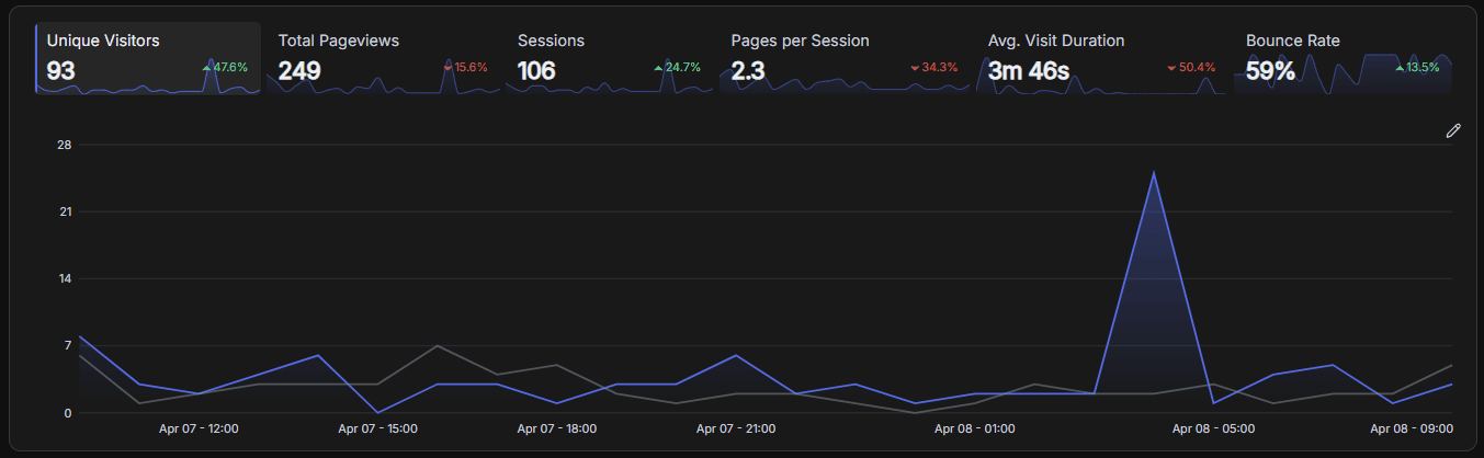
This kind of thing happens more often than people expect. Not because analytics tools are broken, but because they present data in a way that makes the wrong conclusions feel reasonable.
The problem with clean dashboards
Most analytics dashboards are designed to simplify. Data gets aggregated, averaged, and grouped into clean charts that are easy to read.
That works well for getting a quick overview, but it also removes the context you need to understand what's actually going on. By the time you're looking at a graph, a lot of the important detail is already gone.
Averages hide real issues
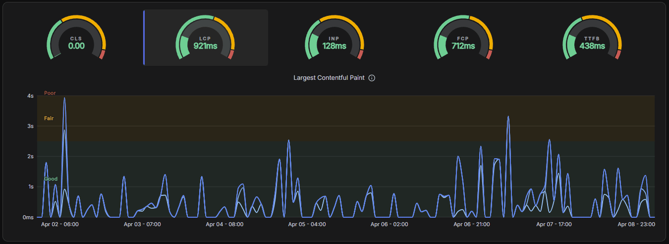
Take performance as an example. If most users have a fast experience but a smaller group experiences severe slowdowns, the average can still look perfectly fine.
From the dashboard's perspective, everything is healthy.
In reality, a meaningful percentage of users is having a bad experience.
Looking at distributions instead of averages usually tells a very different story.
Context is where the truth is
The same issue shows up with aggregation. Problems are often tied to a specific browser, route, or short time window, but dashboards tend to group data by day or page.
A bug that affects a subset of users for 20 minutes can disappear into a daily chart as a small dip: easy to ignore and hard to investigate later.
And when you look at metrics like traffic, performance, and uptime in isolation, it becomes even harder to understand what actually caused a change. A traffic drop might not be a marketing problem at all, it might be a performance issue or a brief outage.
What we've learned building Betterlytics
Working on Betterlytics has made this pattern very clear: the issue isn't incorrect data, it's missing context.
We've been focusing on showing distributions instead of just averages, and on connecting signals like traffic, performance, and uptime so changes are easier to explain. Even small things like annotations make a difference when you're trying to understand why something happened.
Most dashboards don't lie because the numbers are wrong. They lie because they simplify reality just enough to make the wrong story believable.


Spot on. Looking at average LCP or TTFB is exactly how you miss the fact that 20% of your users are having a terrible experience. Are you guys planning to show p95/p99 percentiles by default to fix this? Love the philosophy behind Betterlytics, keep it up!
Appreciate it!
We already show p50, p75, p90, and p99 both per page and aggregated across the site, so you can get a better sense of how performance is distributed rather than relying on a single average. On top of that, we've added an "opportunity score" per page to help prioritize where performance improvements actually matter, based on things like traffic volume.
That said, we've also started questioning how useful p99 really is in practice. It's surprisingly easy for it to be skewed by a handful of extreme cases, like someone on a slow connection in a remote area, which can make it look significantly worse than what most users actually experience, especially for metrics like TTFB.
We're currently exploring how to present this better so you get a realistic picture without overreacting to edge cases :)
That makes total sense. The "opportunity score" sounds like a lifesaver for prioritizing the backlog. And I completely agree on the p99 frontone user on a bad 3G connection during a train ride can completely ruin the chart and trigger false alarms!
Thanks for the detailed breakdown, looking forward to seeing how Betterlytics evolves.
We ran into exactly this. A merchant we were researching had 100K daily visitors in his analytics. Turned out 99% were bots. His real traffic was 600-1000 humans. He was optimizing ad spend against fake data for months. The problem isn't the dashboard. It's that most founders treat analytics as truth instead of as a hypothesis that needs validation. The first question should always be "is this traffic real" before "why isn't this traffic converting."
The data can be correct.
The chart can be correct.
Yet two people can look at the same signal and assemble completely different conclusions from it.
Most people read it like this:
signal + dashboard + context → conclusion
But the actual formula is closer to:
signal + dashboard + context + interpretation → conclusion
Dashboards do not just compress reality.
They create room for projection.
Correct data + incomplete interpretation → distorted conclusion
Sometimes the hidden variable is in the reading.
Hit this exact thing with sprint metrics. 30% velocity jump, two months in a row, team was feeling it. Turned out we had just started logging smaller task types. Accurate data, completely wrong story.
the bot traffic example is such a good way to open this because everyone has experienced that moment - you see a spike, get excited, dig in, and it's nothing.
the averages hiding real issues point is underrated. p95 and p99 latency tells you so much more than mean response time but most founders never look at it until users are already complaining.
the part about context being where the truth is - that's the whole problem with dashboards in one sentence. you end up reverse engineering what happened from a clean chart that had all the useful information stripped out before you even saw it.
how are you handling the annotation side - is that manual or are you building something that auto-detects when a deployment or config change might explain a metric shift?
Really like the direction of Betterlytics—privacy-first analytics is clearly where things are heading. The fact that it’s cookieless and GDPR-compliant by default makes it super appealing, especially for founders who want insights without dealing with consent banners or legal complexity.
Curious to see how it evolves, especially around advanced features and integrations—great potential as a solid alternative to traditional analytics tools.
The “dashboards don’t lie, they just remove context” framing is spot on.
What you described feels like the difference between observability and reporting. Most tools optimise for clean summaries, but real debugging happens in the messy edge cases those summaries hide.
The bot example is a good reminder that spikes without narrative are basically noise. Without context, you end up explaining data instead of understanding it.
Curious how you’re handling the balance though, showing distributions and connected signals is powerful, but can also overwhelm users quickly. How do you keep it usable without losing the depth?
Curious how every single comment of yours ends with "Curious ......" hmmmmm