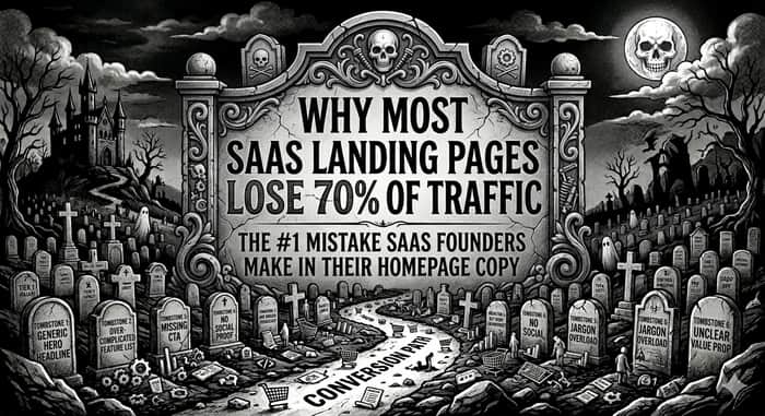
Why most SaaS landing pages lose 70% of trafficThe #1 mistake SaaS founders make in their homepage copy
Here’s an uncomfortable truth most SaaS founders don’t want to hear:
Your landing page isn’t underperforming because of traffic quality, bad ads, or weak SEO.
It’s underperforming because people don’t understand what you actually do.
And when people don’t understand something within a few seconds — they leave.
Quietly. Permanently. Without telling you why.
The 70% drop-off nobody talks about
Open your analytics and look at your homepage bounce rate.
For most SaaS products, a huge chunk of visitors leave without scrolling, clicking, or exploring anything further.
That’s not because they’re the wrong audience.
That’s because your message didn’t land fast enough.
In the first 5 seconds, your visitor is asking one simple question:
“Is this for me?”
If your page doesn’t answer that instantly, you’ve already lost them.
The #1 mistake: Writing for yourself instead of the buyer
Most SaaS homepages are written from the founder’s perspective.
They talk about:
The product
The technology
The features
The vision
But the visitor isn’t thinking about any of that.
They’re thinking about their problem.
Their frustration.
Their workflow.
Their pressure to get results.
When your headline says something like:
“An all-in-one AI-powered workflow automation platform”
…it might sound impressive.
But it forces the reader to translate what that actually means for them.
And translation is friction.
Friction kills conversions.
What high-converting pages do differently
The best SaaS landing pages don’t try to sound smart.
They try to be understood.
Instead of describing the product, they describe the outcome.
Instead of listing capabilities, they show transformation.
Instead of making the user think, they make the message obvious.
Compare this:
“AI-powered analytics dashboard for modern teams”
vs
“See exactly where your revenue is coming from — without digging through spreadsheets”
Same product.
Completely different clarity.
One makes you think.
The other makes you feel the value.
The real job of your homepage
Your homepage doesn’t exist to explain everything.
It exists to do one thing:
Make the right person stay.
That’s it.
Not impress.
Not educate in depth.
Not showcase every feature.
Just make the visitor feel, “This is exactly what I’ve been looking for.”
When that happens, everything else gets easier — clicks, signups, conversions.
Why founders struggle to fix this
Because you’re too close to your product.
You know how it works.
You know the features.
You know the edge cases.
So you naturally explain it in the way that makes sense to you.
But your customer doesn’t have that context.
They need simplicity, not completeness.
And that gap — between what you say and what they understand — is where most of your traffic disappears.
A simple test (that most pages fail)
Show your homepage to someone unfamiliar with your product for 5 seconds.
Then ask them:
“What does this product do, and who is it for?”
If they can’t answer clearly, your page isn’t working.
It doesn’t matter how beautiful it looks.
It doesn’t matter how advanced your product is.
Clarity beats everything.
The hidden cost of unclear messaging
This is where it gets expensive.
Because unclear copy doesn’t just reduce conversions — it makes everything else less effective.
Your ads feel overpriced.
Your SEO traffic doesn’t convert.
Your product feels harder to sell than it should.
So you start fixing the wrong things:
You tweak pricing
You test new channels
You add more features
When the real issue is still sitting at the top of your homepage.
The shift that changes everything
The moment you stop asking:
“How do I describe my product?”
…and start asking:
“What does my user want to achieve?”
your entire messaging changes.
You move from:
Explaining → Showing
Features → Outcomes
Information → Clarity
And that’s when people stop bouncing — and start paying attention.
Let’s make this a bit uncomfortable
If your homepage isn’t converting, one of these is probably true:
Your headline is too vague
You’re leading with features instead of results
Your page is making people think too much
Or your message simply isn’t clear enough, fast enough
Most founders don’t have a traffic problem.
They have a clarity problem.
Final thought
You don’t need more visitors.
You need more of your visitors to understand you.
Because when people get it, they stay.
And when they stay, they convert.
A small invitation
If you’re reading this and thinking, “This might be happening on my page” — you’re probably right.
If you want, drop your homepage link below.
I’ll tell you exactly what a first-time visitor understands in the first 5 seconds — and where you’re losing them.
No fluff. No pitch. Just clarity.

The mistake I keep seeing: founders write the homepage from the inside out - what the product does - instead of outside in - what the visitor is currently struggling with.
Your visitor arrives with a problem already in their head. If the headline doesn't mirror that problem back to them immediately, they spend the first 3 seconds figuring out if this is even relevant - and most leave before they decide yes.
The test: take your hero copy and ask 'could a competitor say this exact sentence?' If yes, it's not specific enough. The goal is copy that only makes sense if you're exactly the right customer - which paradoxically makes the right customers feel immediately understood.
It's super tough when you're too close to your own product messaging. I actually know a few SaaS founders who are struggling with low conversion rates who'd likely be happy to answer your questions on this.
Hey merc you want to connect or not ?
Hi my email is quratulaincreatives@gmail.com,let's connect there and with them too