Work = Energy spent everyday!
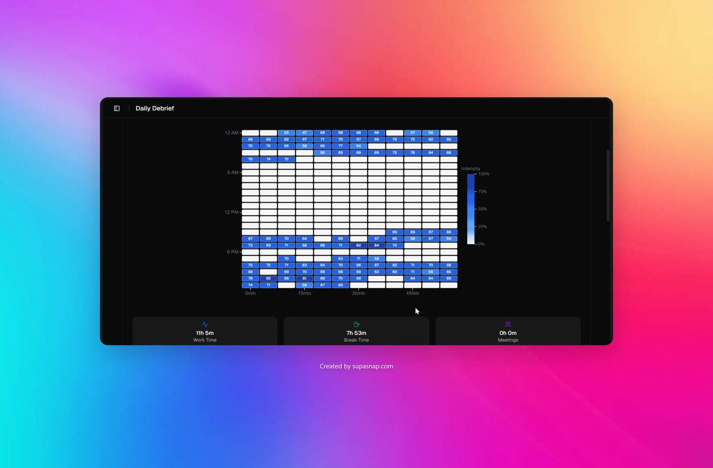
This is Work Rhythm Chart from our HealUp Platform.
It's like having a heat map signature of your brain in a dashboard.
Understanding Your Work Rhythm:
• Each cell = 5-minute average intensity (0-100%)
Intensity Calculation:
• Keystrokes & clicks per minute
• App switches & window focus time
• Active vs idle time ratio
• Meeting app detection (purple cells)
What Patterns Mean:
✓ 40-60% steady = Optimal flow
⚠️ Frequent 80%+ spikes = Overload risk
✓ Regular gaps = Good recovery
• Consistent rhythm = Sustainable pace
Optimize Your Day:
• Schedule deep work at peak times
• Break every hour for 5-10 min
• Steady intensity > constant highs
We want to make the chart measuring and reading experience effortless for our users. One of our user feedback was to build a insight layer that give them energy and focus suggestions throughout the day.
My suggestion was very simple, colour the cell according to the intensity. Red for high, Green for low.. I think you get it. Maybe, we could release both in the next version.
Get your own energy and focus dashboard: https://healup.me

